I like that…
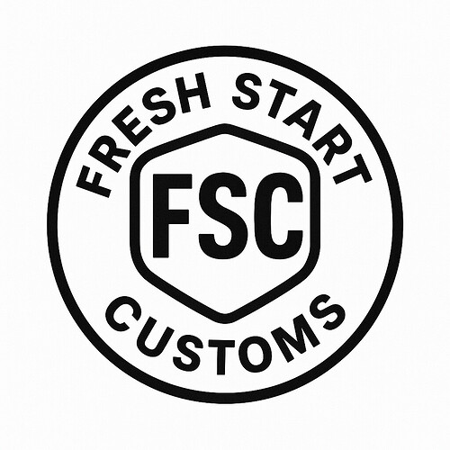
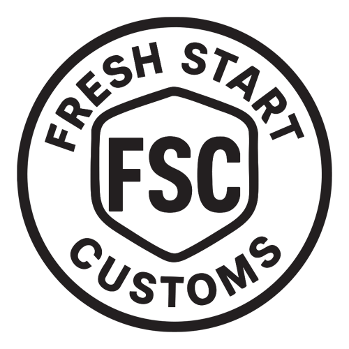
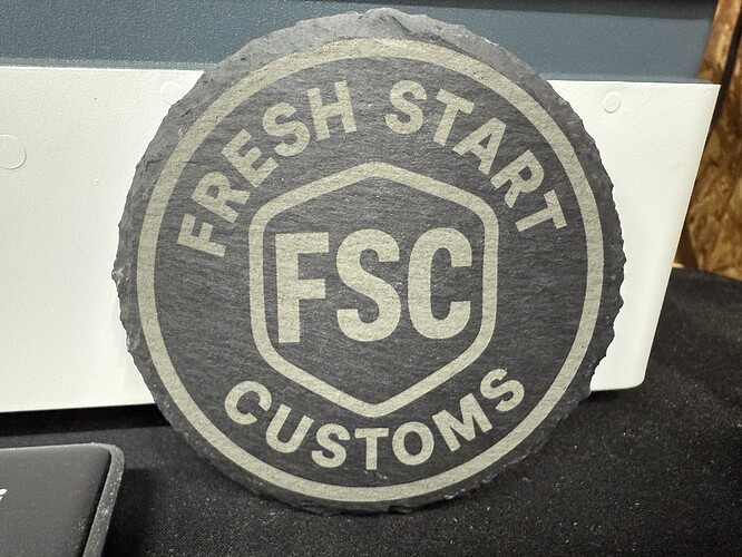
Ok how about this. I incorporated all the feedback, as simple as possible, name in circle, and no laser related item so opportunities for future expansion. It’s hard for me to stay basic but this isn’t bad.
I like. You can even leave off the text and sustitute “dashes” around the perimeter for small versions…
It’s definitely clean, and there’s even an easy spot to add the year if you want to track things ![]()
In case this is an unwanted comparison, it reminds me of the butt stamp for bullets. Repeating the shield shape on the exterior would completely remove that comparison.
“Winner winner, chicken dinner”.
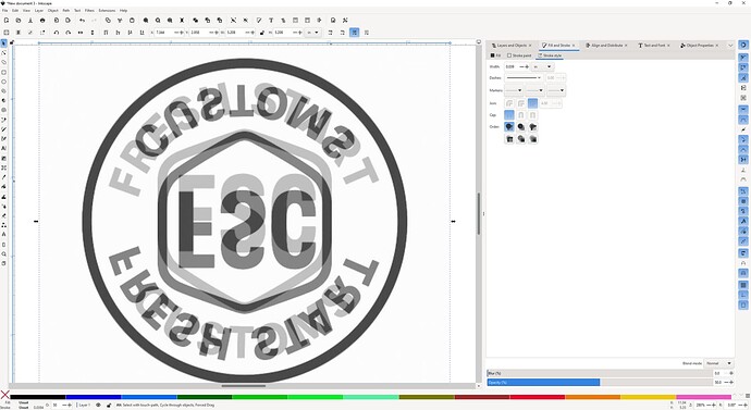
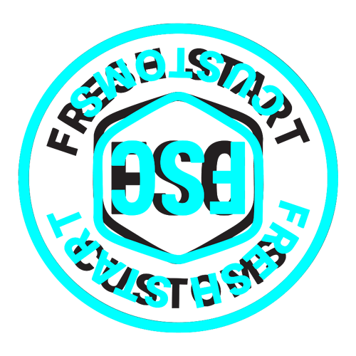
One way I like to check for slight inaccuracies is by making the image 50% opaque, then pasting a second copy on top of it and flipping it around. You can spot small misalignments really easily.
FSC is definitely not centered, but you may have known that. The shield isn’t symmetrical vertically so it isn’t impossible that FSC wasn’t meant to be dead center vertically.
What is a little more subtle (and therefore maybe not intended) was the inconsistency of the gap between the border and FRESH START versus the gap between border and CUSTOMS. You can see that they’re not exactly the same; FRESH START is closer to the border by a bit.
Not sure if you mind, or if it was even intentional – sometimes “misaligned” looks better to our eyes in some situations, the “weight” of the letters and where it sits can matter visually.
All I know is that I looked at the logo and immediately spotted the difference. Flipping just confirmed it.
Looks to my eyes like the text around the circle, and the shield, were “centered” vertically. As the shield is not a circle, its center point is lower than the eye would perceive.
The shield isnot vertically symmetrical, so it is centered but the weight is top heavy [You can see that, where the top and bottom points of the shield align perfectly on the flip]. The “FSC” is not centered vertically, which can be intentional.
The text surround doesn’t look correct to me. You can see it on the top edge, the H in FRESH is higher than the first S in CUSTOMS, and it continues with the S in START is closer to the circle than the CUSTOMS O.
It’s not surprising that they aren’t the same. You have two different strings, and one is offset inside and one outside of the circle. In my experience (in Inkscape) this means that you have to reverse the circular path and actually build the two strings separately and composite it all together. Generally this is a manual process and hard to match because fonts are weird™. That’s exactly why I check it, it’s really tough to get it perfect by eye.
Again, this is how it’s aligned. It might be the right call visually, that’s really up to @wenning08.
Hmm just spun the whole design, and the circle appears lumpy too, probably because it’s not centered. This may all be a fire drill because I was assuming that the circle was centered in the square image. Take everything I have said so far with a grain of salt. I’d be able to be sure if I had the vector version, but this raster image isn’t up to it.
this applies to everything I have said since 1966…
Better is up to you, but it’s definitely symmetrical!
i would drop the hexagram shield down just a little bit. it’s probably actually centered, but the shape makes it feel too close to fresh start compared to customs and the baseline of the F feels closer to the hex than the top of the F does. you might need to manipulate that a little bit to allow it to fit both parts.
I was thinking that too but was told to make it symmetrical. I will probably lower the shield just a bit.
start by making everything literally symmetrical, but then adjust for optical.
and while you want things to be symmetrical, in an irregular shape like that badge hex, it only needs to be symmetrical left/right along the vertical spine. but you want it to “feel” centered in that circle more than be literally centered. when i was taught how to frame/matte a photography in college, we learned that vertically centering a photo actually looks a little low off center optically. so you move it a smidge closer to the top edge than the bottom edge and it looks right.
I really enjoyed this discussion way more than expected to. A lot of us really do think alike.
You could also rotate the name so it occupies the upper half of the circle and then use the lower half for different specific target markets. So Fresh Start Customs on the top and Laser Designs or Wood Carving or Graphic Design, etc. on the bottom half. They’d be product/market specific so folks would know what to expect but also tied together as a family.
Just beware the unnecessary group think and hyper conformity resulting in nice corporate homogeneity.
it definitely feels more optically centered. that gap between the bottom of the shield and the top of the T is basically the same as the corners and the Rs in fresh start. that feels better.
