My Glowforge showed up last week. Unfortunately, I haven’t had time to play with it as much as I’ve wanted. I’m trying different materials before deciding on what everyone is going to be getting this year for Christmas.  This weekend was tile. I made a trip to Home Depot and picked up some different kinds of tile, ceramic, marble, travertine, etc. I already had some cheap tile I use for hobbies and gaming materials.
My conclusion is that the cheap. glossy tile worked the best. I am not complaining about that. Some of that tile is not very cost effective, to say the least. It seems like the more expensive tile has thicker glaze and the laser has a tougher time getting through it. The natural stones, marble and travertine, work fine for bold images or text, but do not take well to variable power engraving. The natural inconsistencies in those materials make smooth gradations tough. I haven’t tried black marble yet. I have a feeling that one will look nice, with good contrast.
Anyway, here are a few of the tiles that came out pretty nice…
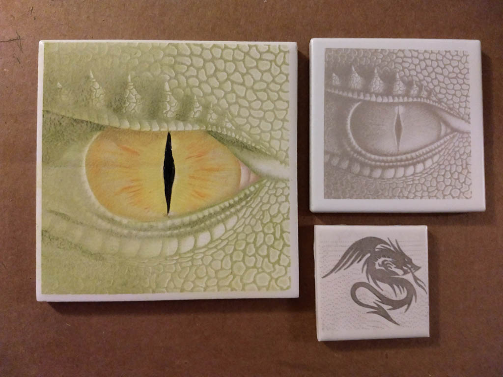
The upper right one is right out of the machine with no post-processing. That’s a 2 inch tile.
The small one is 1.5 inches and was rubbed with some black paint and wiped clean. The laser seems to have sealed the exposed tile to the point where the paint was not staying. It did, however, expose the fact that the background on that image wasn’t a pure white background (notice the dots).
I was trying a couple of things with the larger one. That’s a 3 inch tile. I took the original image and broke it into 4 quadrants to see how noticeable it would be if I needed to break an image up for something large. If you look close, you can see the quadrant edges. The center line ran through the pupil, which was a poor choice on my part, since your eye is drawn to that anyway.
The color is some Liquitex Basics Acrylic paint. I’d paint a little on, use a damp paper towel to create more of a wash and use the paper towel to push the color around. Then I’d scrub it with a dry paper towel to remove as much paint as possible from the glaze. You can build up extra shading with layered color, but it does have a tendency to remove some of the existing paint, so you have to go easy on the subsequent layers. The orange streaks in the iris and the pupil are not watered down.
All three of these are the cheap, slick tiles. I buy a sheet of tile and just pull them from the backing.
With a little sealant, I can see using something like this for accents or as a backsplash. I hope this provides someone with some ideas.


