After seeing @karaelena’s Dredd engrave, figured I’d try to engrave a 3D depth map… For a test, didn’t want the variable of my own 3D model conversion to depth map, since I know how to produce depth maps from 3D models, but am trying to figure out the engrave itself.
On the advice of @karaelena I removed the black background, and cut it out, and used the outer selections (in thick black in this example I made to make it visible - it’s not really like that, but you can’t see an invisible path…) in Photoshop to generate a work path which I exported to Illustrator as the cut line.
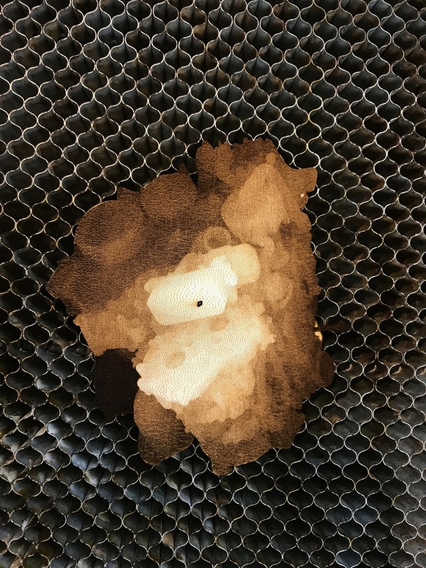
So on the suggestions, I Set the power to 50%/90, and figured, hardwood would be the material of choice… Kinda meh result. Will play around, but while if you know what this is supposed to be, you can see it, but without it it’s a tad tough… Might actually need more power to engrave more deeply to give a wider dynamic range.
Not always. i.e the Dredd badge was one pass. But when I did the glowforge coins, those where one pass at 340LPI at a lower power. Then 675LPI at a higher power for the finishing pass. Then I realized it looked the same just going for broke and just starting with the higher power/lpi. CNC mentality there.
We haven’t rolled out Proofgrade settings for 3D engraving yet. It took us dozens of test prints to get the settings dialed in, so I’d have low expectations right now.
That said, @takitus has done amazing stuff. The difference is largely that this source art is a poor choice for 3D engraving. As a quick sanity check, imagine it carved perfectly out of 1/8" thick wood: it wouldn’t be very visually distinct.
I can barely make out the details in the bitmap, and when those extremely small differences in brightness are translated to depth, they will represent tiny fractions of a millimeter of variation. Many important features are tiny gradients, which on natural wood will be all but invisible.
For example, the dynamic range of the pulley in the bottom left is from grey level 65 to 75. Those are out of 255. That means if 255 is engraving all the way through 1/8", the variation in depth will be (75-65)/255 * .125" = 5 one-thousandths of an inch. You might see that if it was a ridge, but it’s a gradual variation across the whole pulley.
I’d start with an image that’s designed for 3D engraving: high dynamic range, high contract, lots of local variation.
Is there, or will there be in the future, a separate 3D engrave operation? It seems like grey scale can be interpreted two ways. Either to produce a flat grey scale image by burning the dark areas more, or as 3D depth to be obtained by multiple passes with different focal depths.
Would programatically pumping up the contrast of an image give better variation in depth? Say something like take the average of all the low points and multiply them by X, and then do the same for the high points?
Cool image! To my eye there’s still not enough contrast though and would cut pretty flat, but that’s pure uneducated speculation on my part. I know it’s tough compare the difference of an uploaded, compressed jpg though. I can’t wait to be able to experiment and see the different results one can come up with. I know there’s a steep learning curve, but practicing and undersigning / learning the machine is exciting to me. Love this stuff
Some of it would work wonderfully and some not well at all.
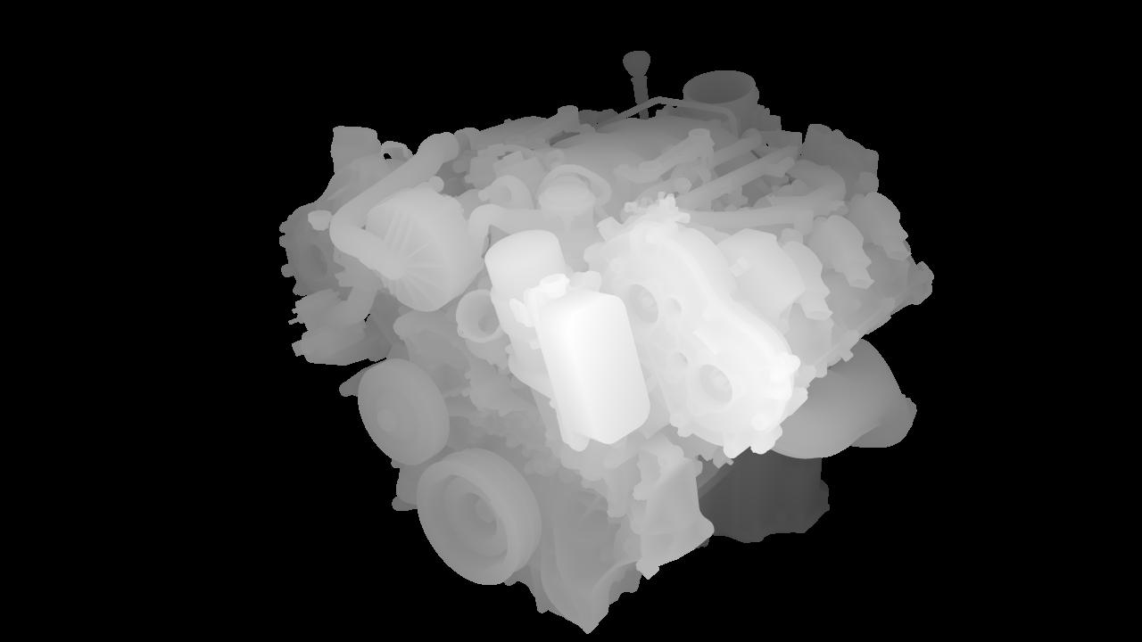
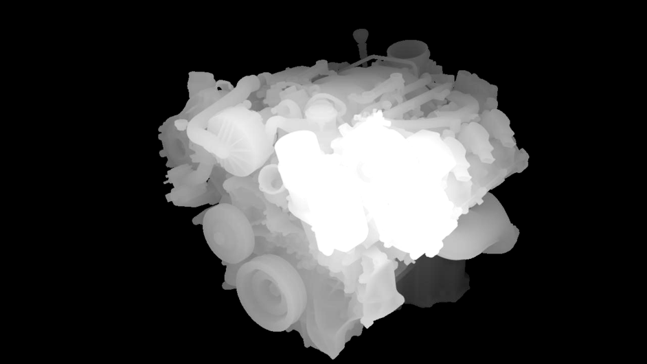
The thing to keep in mind with 3D models and depth maps is that the more depth the actual 3D model has, the less pronounced the details in the depth map will be. This is because there are only 256 levels of perceivable depth and those levels have to be divided across the full model.
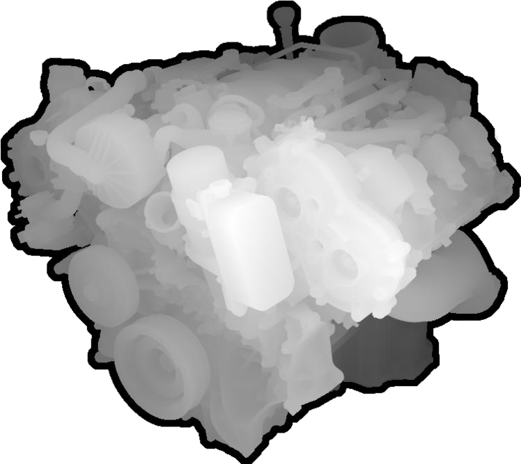
For example the engine above, apparently someone modeled a fully 3D object, likely intended to be 3D printed. Because it’s a full model with just as much depth as it has height and width, the detail gets washed out.
Had the model been sculpted in 2.5D instead, say in a program like ZBrush, where the actual depth of the model was relatively limited but still contained the detail, a depth map would produce a fantastic engraving.
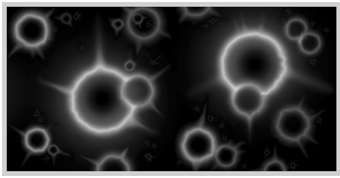
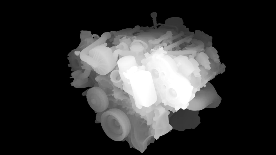
Boosting contrast washes out details as in this image:
Adjusting Curves allows more control. You can adjust specific color ranges without affecting other areas. In this example I used curves to adjust the mid-level grays and basically “compress” the dynamic range without affecting the whiter areas too much.
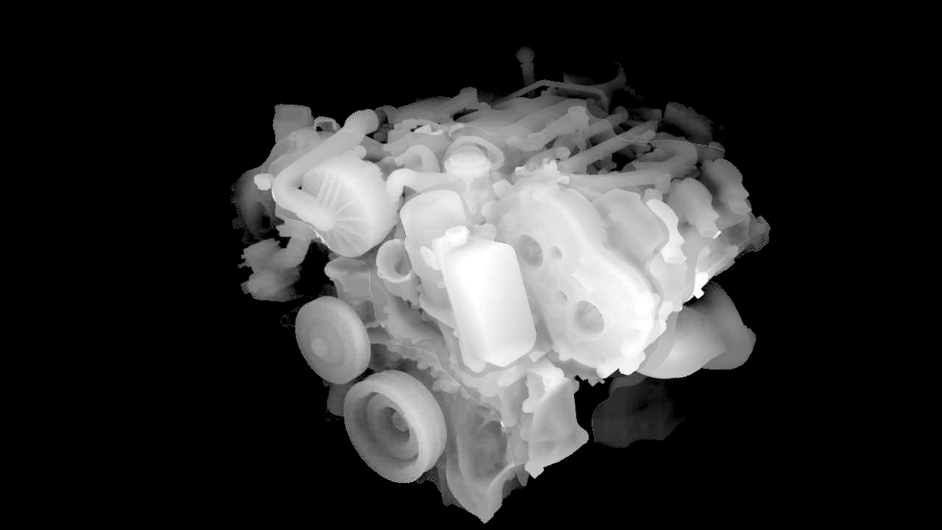
Yeah that last one, I split into three layers using the lasso selection tool to make layers of the light, medium, and darker areas, then adjusted levels on each layer independently. The trick here is that on each layer, you need to delete the areas you’re not working on. Example: the “medium” layer shouldnt have any “light” or “dark” image information on it, because you wont be able to adjust levels as much.
This one I just kinda hacked it together real quick and lost some of the darker detail in the process, and some of the lasso borders between the three main shades might be visible.
I also used a little bit of airbrush and sharpen tools to give some of the shapes a little more punch.
Were you working in Photoshop? How did you do the levels selection? (I think I saw something once on using the tilde key…but it’s been so long ago I can’t even pretend to remember how to do it.)
I used GIMP, but in Photoshop, levels is CTRL+L and it should be under the same menu as brightness/contrast and Hue/Saturation. I forget the menu title in PS, in GIMP iit’s called “Colors”