Raster file resolution: DPI equal to LPI, or DPI = 2 * LPI?

This is a spinoff of off-topic discussion in thread “Print&cut-- From Inkscape SVG, how to engrave (raster) & cut (vector) superimposed correctly [Solved]” because Glowforge’s forum software doesn’t seem to allow Glowforge staff to move selected forum postings to a new thread.

Also, I’ve had to remove the hyperlink from the above paragraph because, “Sorry, new users can only put 3 links in a post.”

I will quote the relevant postings from the previous thread:

From the linked topic: (“Preparing a Photo…”)

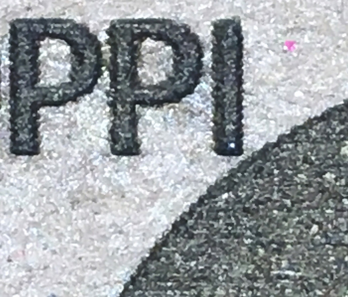
Since jbmanning5’s tests were done with 270 LPI, and the question is, “which is better, DPI equal to LPI, or DPI = twice the LPI?,” the relevant DPI in jbmanning5’s tests would be 270 & 540. The closest offered by jbmanning5 in the “Preparing a Photo…” topic were 300 & 600 DPI, so I’ve copied-and-pasted those below:

jbmanning5’s 300-DPI closeup:
https://community.glowforge.com/uploads/short-url/rmXGNUzQg1l1ZgXyfWGT7OYhG9M.jpg

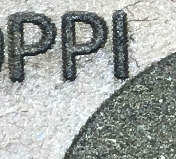
jbmanning5’s 600-DPI closeup:
https://community.glowforge.com/uploads/short-url/ox7NiyJdMAwGHQBbp495ivYhDNr.jpg

In my opinion, there isn’t any significant difference between the image quality of the 2 above photos. There is some smudging between the two P’s in the 300dpi photo, but that’s in the middle of a big triangular area of smudging (from the upper-left corner of the left-hand P to the top & bottom of the I) which could just be due to surface texture of the material, or turbulence in the ventilation airflow (depositing char onto the material). The ellipse does look a little smoother at 600dpi, but then the curves of the P’s look smoother to me at 300dpi.

The following are the test files that I made. The ZIP file contains two Inkscape SVG’s and two PDF’s, one PDF made from each SVG:
DPI = LPI versus 2 times LPI (source files).zip (45.3 KB)

The only difference between the SVGs should be that one has text saying “450 DPI” where the other SVG says “225 DPI.” Other than that, the only difference between the PDFs is that each was rasterized at the respective resolution in Inkscape’s PDF export dialog box. You’ll notice that the 450 DPI PDF has a bigger filesize.

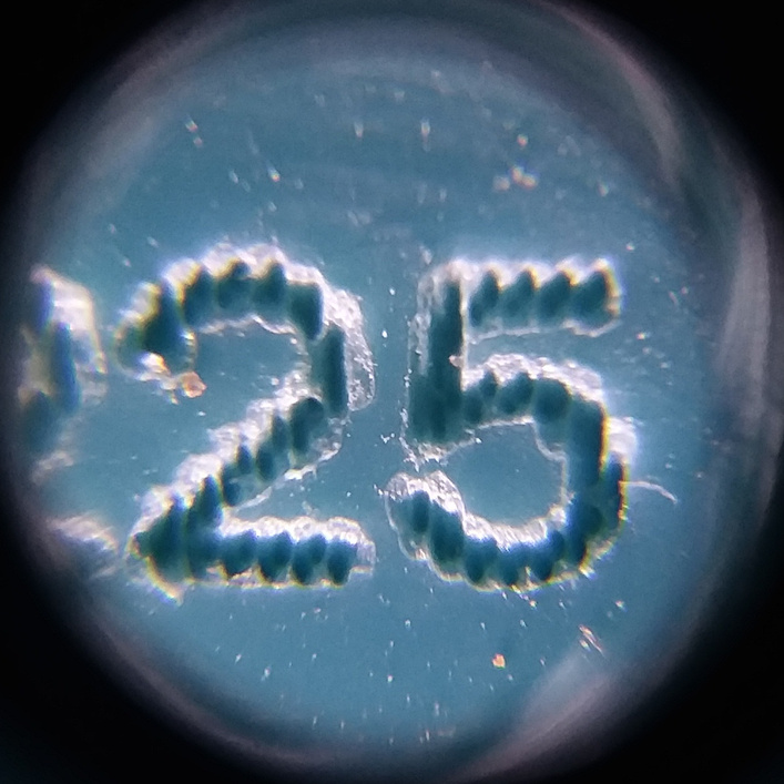
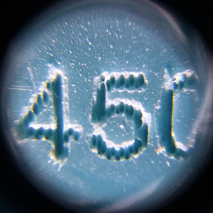
We ran the 2 test PDFs on Glowforge teal acrylic. Each PDF was lasered in a separate run so the raster resolution of each PDF wouldn’t affect GFUI’s processing of the other. Using GFUI, we positioned the engraving areas next to each other on the same sheet of acrylic. Again, we didn’t notice any clear difference in image quality between the 2 rasterization resolutions. Following are closeups we took with the only camera the makerspace had (a handheld microscope attachment for a cellphone) that can focus that close:


I notice that this forum converted the 2 PNGs to JPEG, so here are the PNGs in a ZIP so you can view them unaltered: closeups.zip (2.6 MB)

Both closeups have a 5 in them, which can be used to compare the resolution between the 2 photos, and to me there isn’t any real difference in laser image quality.

It does look like some dust got onto the acrylic before the photos were taken, but I don’t think this should affect our opinion of the laser process.

Anyone who reads this thread is welcome to use my uploaded PDF’s to repeat my testing. I recommend using a homogeneous material that doesn’t char, such as opaque acrylic, rather than something like draftboard that can have variable surface texture & can deposit a variable amount of char downwind of the laser beam.

As to a theory of why (DPI = 2 * LPI) doesn’t seem to provide any better image quality than (DPI = LPI): The idea that DPI should be 2 * LPI seems consistent with the Nyquist Sampling Theorem, but I have another analogy. In this case, we have to fit our raster file through somebody else’s (GFUI) processing. Maybe this is like an analog voice-band landline telephone modem, in which the telco samples the line at 64kbps, and there is just no way a modem can fit more than 64kbps through that channel.

5 Likes

I almost never go over 270 LPI on wood or acrylic, except in the case of very small details that require very slow speed and very low power, otherwise I feel that the heat-affected zone is too large. If you have some anodized aluminum laying around, you might want to try the tests again on that, since it is capable of very high fidelity. Tile and slate might also be good candidates.

3 Likes

I endorse this idea!

1 Like

If I understood this post correctly, I’m not sure it really answers the question of which DPI is better. My understanding is that this really matters when you’re talking about taking a picture and dithering it to grayscale with a laser. These tests seem to be focused more on crispness of raster images, which I think is a different problem, and as @jbv points out, is going to be dependent on the material being used.

I’m going to have to test that out. I usually do 340 as that was what I got used to for the settings from back at the start of pre-release when I was trying things out. If I am doing some small bit of vector text, I always thought it made a difference. But haven’t texted it out in two years.

I find many reasons to go to high LPI. The primary one is that at a given speed and power the higher LPI cuts deeper where lower speed would burn and higher power would burn. This primarily an issue with variable power where the actual depth is relevant which it is not with images that are dithered, in which the lowest LPI that gets all the dots is crisper as it does not run them together.

Where a single depth vector engrave is done it is basically the same as the variable power photo engrave that you can get a deep engrave with low power and high speed with a high LPI.

My posting wasn’t about what LPI to choose, it was about what DPI to choose for a given LPI. DPI is set in design software upstream of GFUI, although you can also influence DPI (imprecisely) by resizing raster artwork in GFUI.

I don’t have any comment about what LPI to use. The remarks about LPI in this thread may be helpful, though.

I don’t understand the difference between “dithering a picture to grayscale with a laser” and “crispness of raster images.”

If “crispness of raster images” was a typo for “crispness of vector images,” well, LPI isn’t applicable to vector work (or at least I don’t understand why it should be), and my original posting in this thread was about raster images.

My closeup photos show black-and-white text (no grayscale) that was rasterized in Inkscape using my glowforge-rasterize filter and Inkscape’s PDF output. The test files that I uploaded to this thread, which were used to make the closeup photos, include gradients that were rasterized to grayscale the same way as the text (GFUI currently doesn’t support gradients that are in vector format in an SVG file).

My proposed answer to “the question of which DPI is better” is, “There is no significant benefit to using DPI greater than LPI.” But users are free to use whatever DPI they prefer.

I still don’t understand what you’re trying to show. The crispness of rasterized text or basic shapes is a much different problem than making color pictures look good when lasered in a format that relies on the number, spacing and size of dots or lines.

Your original post is interesting, but all it shows is that there is no significant benefit in the specific situation that you are referencing.

That is OK. jbmanning5’s earlier closeup photos were about rasterized text & basic shapes, so I followed up in kind. jbmanning5’s pointing out those earlier closeups was a reply to my posting of artwork that consisted entirely of rasterized text & basic shapes, which I suppose is a kind of artwork that many Glowforge users may want to engrave at times.

I had assumed that to understand about the crispness of rasterized text & basic shapes would be transferable to color pictures in a “linear superposition of signals” kind of way. That is, maybe a color picture is a linear superposition of the kind of “step functions” that my & jbmanning5’s closeup photos showed.

No problem.

This topic was automatically closed 32 days after the last reply. New replies are no longer allowed.