so this looks like a really good explanation of scan gap and why it matters, especially when setting the DPI of an image in an image processing program. i now think i understand how scan gap works and why.
later this week i need to look at @jbmanning5’s tables and convert some images and burn them.
for now, it’s play with the new dog time. especially since she’s been a little “velcro” on her first night so far and i don’t want her going up the stairs yet (still has stitches from her spay).
I should note the script doesn’t convert to 8-bit at any point, which is required for converting to bitmap.
In Photoshop, resized, but didn’t resample, down to 6x4 (so about 1000 DPI).
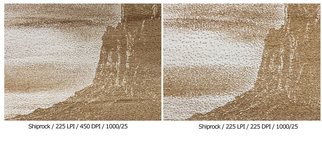
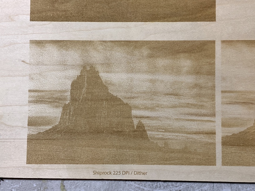
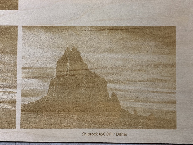
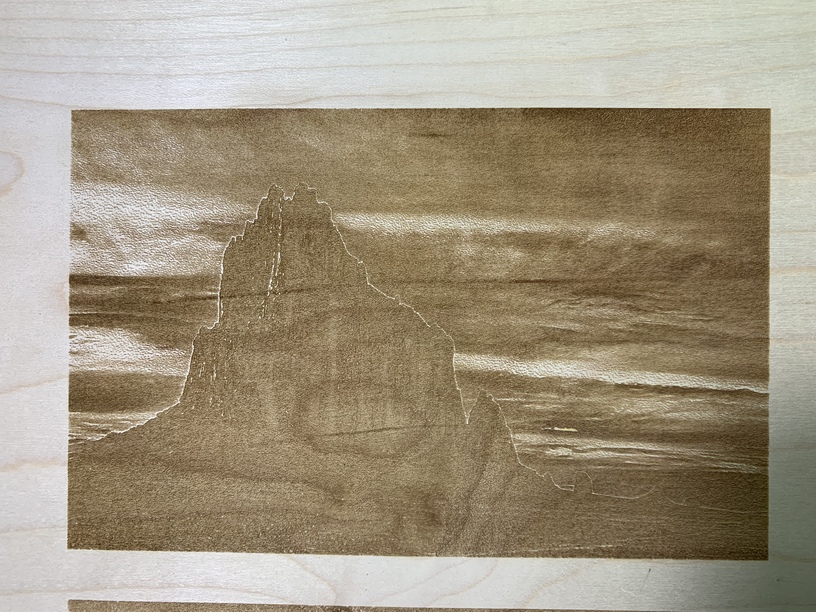
Decided to run the tests at 225LPI, ran the Photoshop dither script with default settings for 2 different instances, one at 225 DPI, one at 450 DPI (LPI * 2). I cropped them as similar as I could for comparison’s sake, but I didn’t get it perfect.
i think 1000dpi is way too high. especially for something like wood that just won’t give you that kind of resolution. i think very few people are running his scripts on images that high of a resolution. he showed one at 1000 dpi with paint on tile, but that was with the special lens he’s been developing, not a standard lens.
if i understand sean’s script correctly, you want to accurately map the DPI of the picture to the scan gap. and you want to properly size the picture resolution, so final size at the DPI to match the scan gap.
i need to go back up to the table and do some math and thinking about that conversion to the GF scan gap, but my gut reaction is your DPI was too high. and that you need a different substrate to be able to take advantage of that kind of resolution. it looks like the best results i’ve seen have been painted tile for the really high res stuff.
side note, it’s interesting that you said it didn’t convert to 8bit at some point for you. it does change to 8bit, that’s the grayscale conversion that’s the very first step.
It was about 1000 DPI after I resized to 4x6” (because I didn’t resample). The script resamples it when it runs. So the test runs were with 225 DPI and 450 DPI images at 225 LPI.
All it does in the first step is change it to grayscale, it doesn’t change it to 8-bit. You can only convert to bitmap with an 8-bit grayscale.
i still have to sit down and look through those tables again and decide how i’m interpreting them to the GF. that’s a project for tomorrow night or saturday. been a long week at work, haven’t gotten home before 10 until tonight, plus a new dog, so no glowforge time this week.
The scan gap is really just the math, I believe. It’s not going to be the same as other laser units - it just depends what you can put into the resolution tab for that software (since they all call it different things - resolution, LPI, scan gap, etc.).
I definitely see a difference in the fine details at going 2x LPI - especially at the bottom left corner of the bottom pictures, the slope of the rock. It has a lot more smoothness in the higher DPI sample, which is more real to the image.
i think the point of trying to match that scan gap is to get the resolution to the same thing, so that the laser cutter interface isn’t trying to interpret, say, 300dpi into 240lpi. you want the photo software to do that because it will do a better job. so you want the LPI and DPI to match, so every line of the image maps directly to one line in the engrave.
Yeah, I get that concept of it. That’s exactly what the first test was, 1 for 1: 225DPI at 225 LPI. The second copy was LPI * 2, and the details are definitely finer.
I’m thinking you’d want to do 450lpi at 450dpi. or 340 at 340. i can definitely see better detail when you 2x, but i’m thinking you’d get even better results if they matched at higher res/lpi. not sure where the LPI will peak out and you’ll run into the law of diminishing returns on wood. and not sure what wood you’re running this on.
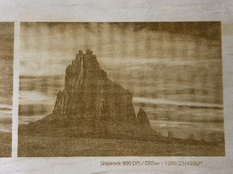
I have a 450/450 running right now, as well as a 450 LPI at 900 DPI.
I’m interested in seeing how you test this. I feel like it’s being overthought? The scangap in mm or whatever doesn’t really matter (as far as the Glowforge), except for comparisons sake to what someone else sets up on another laser. Scangap is just output resolution.
I should probably wait until I can post pictures, but the 450 LPI / 900 PPI is turning out fantastic compared to the 450 LPI / 450 PPI. This is on maple plywood. I think it’s called Top Choice Sky Ply - just some stuff I had cut up at Lowe’s.
So I’ll add photos here…
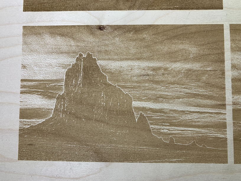
here’s 4 variations.
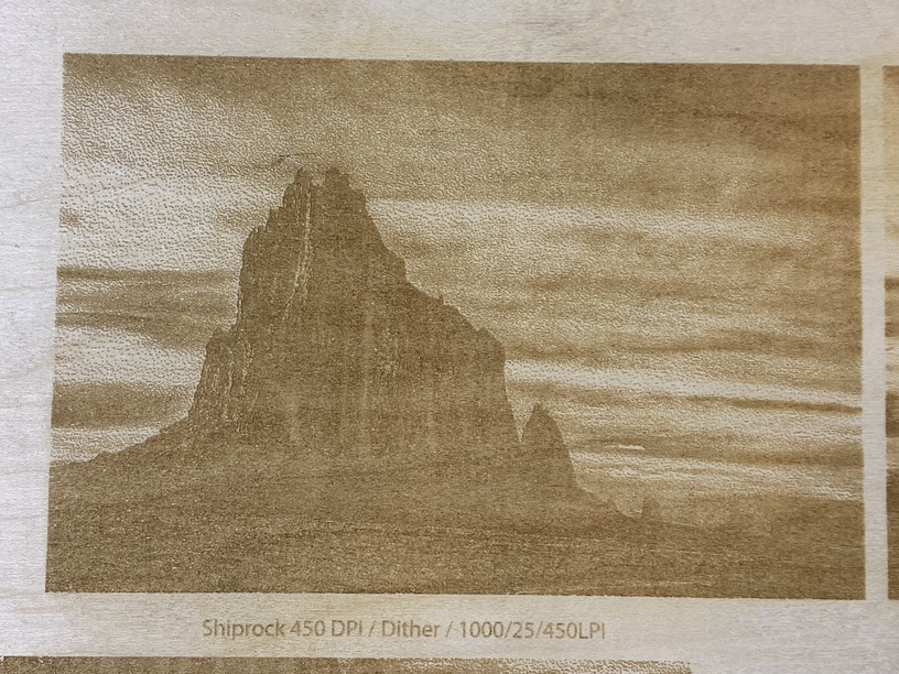
All were ran at 1000 speed/25 power. To preserve the resolution, I brought the saved image into Illustrator and embedded into SVG files.
Variations were:
225 LPI with 225 PPI image
225 LPI with 450 PPI image
450 LPI with 450 PPI image
450 LPI with 900 PPI image (I had just enough resolution to do this without interpolating any image data)
In a perfect world, I would have lowered the power for the 450LPI engraves, compared to the 225 LPI engraves - that would be step #2 in nailing the image down. (Honestly, I’d edit these a bit different than the script did as well, but we are mostly concerned at this point about getting details out of the engraving)
For 225 LPI, the 450 PPI image engraved better. The sky is smoother, the edge details are much better.
For 450 LPI, the 900 PPI image engraved better with one caveat - for some reason, I ended up with very strange vertical banding. I don’t know if it’s some sort of moire pattern or what? It photographs worse than it is in reality, but it’s still definitely noticeable in person. But, the smoothness of the 900 PPI image far exceeds the 450 PPI image.
Edit: so reading some comments from Sean, who created the script (probably only of interest to @shop), the script isn’t setting the PPI of the image - the halftone resolution is independent of the resolution requested in the script, so resize and resample to the resolution required prior to running the script and set the halftone resolution to match that. I’ll run some more tests to see what that looks like.
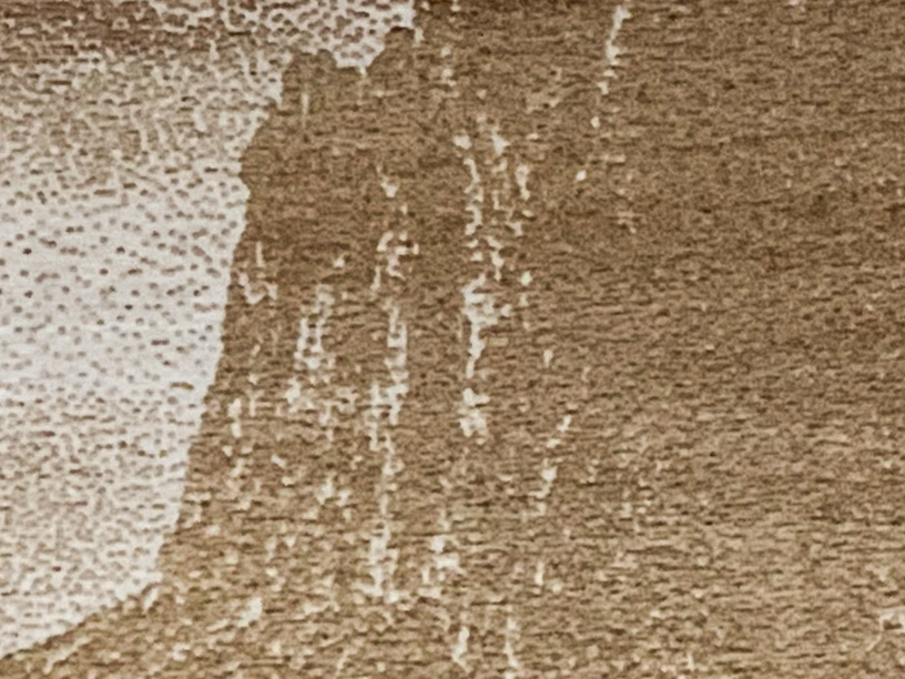
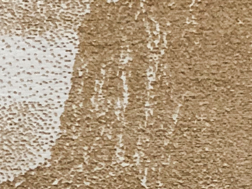
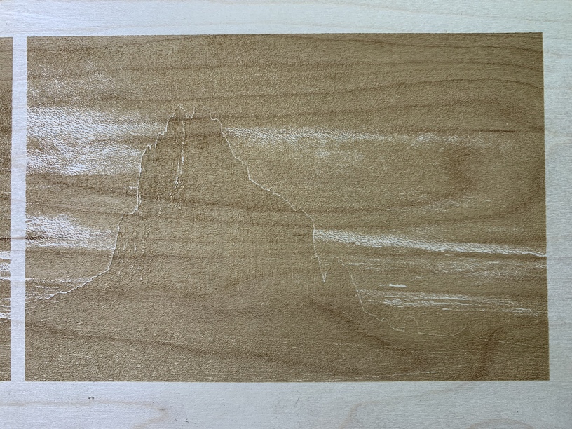
Keeping this in mind, I ran a few more tests but resample the image to the correct PPI, since the script doesn’t do that part. And screwed up on one, but it still serves as a test.
1: 270 LPI / 270 PPI
2. 270 LPI / 450 PPI (this was the accident, meant to go 2x LPI but brain farted - can basically treat this is a random PPI as input)
3. 450 LPI / 450 PPI
Number 1 turned out the best as far as details, which is presumably matching the input resolution (PPI) to the LPI (scan gap, output resolution). Note the sharpening was way too heavy through the script on this image (all of them), thus the halo effect.
Number 3: didn’t resolve details very well, probably exceeded the threshold of the wood, though I’m a big fan of the previous days 450/900PPI image, and the detail it resolved (other than the banding)
I think part of the details thing is taking the image down to 4x6” and that makes the details that much finer. I could also pull out more detail with editing it differently. The sharpening is too much for this image at this size for some areas, like where it halos on the ridge. But, it’s good for the details in the rock, so it really needs selective sharpening.
ok, i think i realize what the true issue is here.
there’s no way to send a photo through the GFUI that doesn’t redither the image.
so…
the secret is to turn that step in the action to prompt you, and then cancel it before it runs the dither (or halftone). i ran a whole bunch of tests before doing that with varying levels of success.
i skipped the dither, ran it at what had worked best for me with the dither on the new file. voila. 1000% better.
also, i’m running 1000/60 or so for my most successful ones on BB. i wonder if you might benefit from a little more power.
Sure. Just engrave it as a vari-power. That will render just the dots in the source rather than applying its own dither algorithm. Since the dots are all 100% black, it will engrave those at max power that you have set.
More power might work, but i was trying to get more of just a surface print rather than depth. Even at 18-20 power, I still get some depth.
What might help wanting to go that route is defocusing the engrave a little bit. Defocusing will tend to darken the area hit more than being purely in-focus. Of course, you’d have to worry about fine details. If I were going for the best representation of the image (rather than just looking for details, like in the rock face), I’d modify the settings that the script applies a bit (brightness/contrast/levels). I think it just uses auto-levels? Either way, I generally have a decent idea of what the image will look like when I edit those parameters.
for some reason i was thinking vary still did some conversion on the back end. i will have to try that as well. running a vary without dithering right now. will try one with dithering right after. still just running three small areas in the original photo above (eye, mustache/teeth, shirt) to find something i like, then will run the whole image again.
Maybe? It should be a conversion to grayscale and then a pixel analysis determining the grayscale value, 0-255, of the pixel. But other than that, it’s a “constant on” with the power modulating as the head sweeps; it doesn’t perform any dithering of the image itself.
FWIW, the couple that i did on vary after script dithering were muddier than the couple i did on dot without the script dithering. details may be slightly harsh from up close. will take some pics in a bit after i make dinner.
I’m doing 2 right now. Both vari-power, one dithered by script, one not-dithered (just grayscale photo).
Rather than the script default, I edited these to my liking to get more details out of them, and reduce the sharpening.
The dithered by script is getting a lot more detail than the default edits I ran before (this is largely image dependent). But, goes to show you that one needs to learn to be able to adjust the parameters to get the best result. Still using lower power just because.