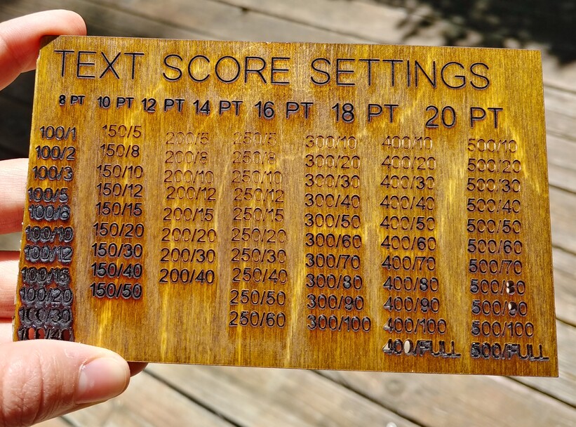
It took me about 15 minutes to map each Score setting and about 20 minutes in the Glowforge. I made sure to label each setting with both its speed and power so that it’s easy to double-check once you’ve got them all mapped. For the title I used 125/12. If you don’t scale it, it measures about 5.3x3.3" The text will be true to its point size. The numbers are at 12 pt size.
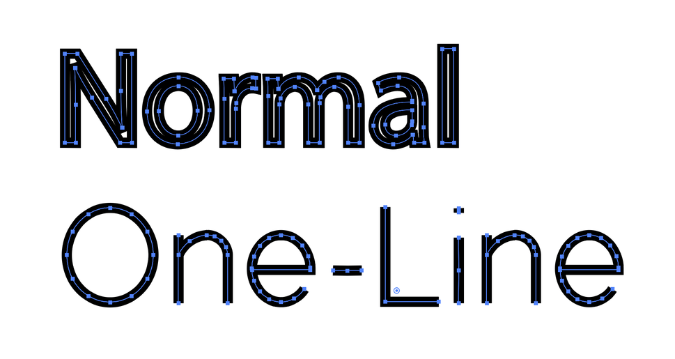
A note on fonts - There are fonts made for laser cutting since each letter is made from a single line and can be traced by the laser in “stroke” or “cut” mode. Most fonts are a filled shape, so cutting around the outline of the font doesn’t look like the original font - plus it takes twice as long!
I purchased the fonts I use from onelinefonts.com. They even have some one-line-fonts for $5 if you want to cheaply try scoring instead of engraving your text. The font I used here is Simple Sans Regular. Another font of note is Stencil which I use when I need to peel off backing paper/plastic and don’t want to spent a ton of time picking out the O’s and A’s in my text.
Even if you aren’t scoring text, I hope this is still useful to get familiar with the score settings on your Glowforge. Happy cutting!
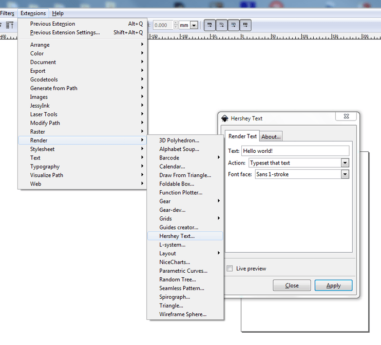
My MS Windows version of Inkscape can render text using the “one line” Hershey font (invented to “stoke” text on ancient X-Y CRT screens). You can find it under “Extensions->Render->Hershey text…”.
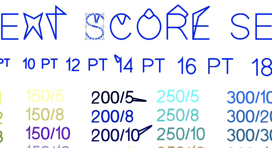
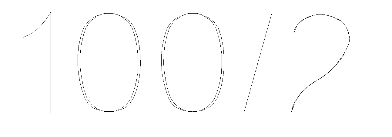
I hate to be the bearer of bad news, but I feel like I should point out that this test file is not actually made up of one-line fonts. Illustrator does not render OLFs as true one-line fonts, even if you purchased a One Line Font from somewhere. It sees the OLF as open paths and closes them automatically.
That’s not to say they won’t work, and even (maybe) look good, but the laser will still spend much more time on each letter than it would need to if they were, in fact, true one-line fonts.
It’s more obvious on some of the individual glyphs than on others, but all of them are in fact double-lined. An easy way to check this is to use the Direct Selection tool, select a single node in the middle of a curve, and move it a little.
Inkscape does true OLFs with the Hershey extension mentioned above, as do some of the design softwares that come with plotters (Sure-cuts-a-lot I think does, Flexi12 certainly, not sure about the cricut/silhouette softwares, but it wouldn’t surprise me). No idea about Corel or Affinity.
For AI, the best I have found is the free MonolineText Jongware script, which produces usable results but only has the one font (Ann), and the results are not in text form any more, so they can’t be edited after you hit ok (although you can mess with the resulting vector paths to your heart’s content)