It eventually has to be rasterized for the engrave anyway, whether it happens in the cloud or on your computer. 600 DPI ought to be good enough to have no visible artifacts. (Don’t export to JPEG of course, that would be asking for trouble)
While you’re waiting for the engrave, you can spend some quality time with your design software trying to figure out how to combine all the paths properly. It can be a huge pain in the butt!
If you need it ASAP then ignore what I am saying, but I have been working on a graphic for the last little bit and learning how to “cut” the white out of things in inkscape. Seems like a skill worth learning if you have the time on this.
No rush, I am just here to learn.
If you are able to document your steps for this magical procedure, I would love to have the benefit of your wisdom!
Thank you,
–Ben
This rankles my inner bitmap purist because of the loss of fidelity incurred with each transformation of an image.
No matter what the source of the image, vector or raster, the Cloud processing is going to re-rasterize it to match what is required by the laser. Not only is it going to reprocess the vertical line spacing, it is going to reprocess the horizontal dot pitch based on the speed of the engraving.
As @chris1 points out, if you render to a high DPI, like 600 (and probably even 300) the cloud servers will have enough information to filter the image to achieve a very good result.
The type of transformation that would severely degrade the image would be an older style of processing that used pixel-picking (picking the closest pixel to the target) rather than interpolation or filtering. Also, to be able to see pixelization in the output you would typically need to be starting from, or going to, a much lower resolution.
Using bilinear filtering, the value of a pixel being output uses information from above, below, and to either side of the fractional pixel position that represents the location in the source that corresponds to the position in the destination image. Depending on the exact filters being used, it may take into account information from several pixels away from that location. Video game consoles do this same kind of thing when they cannot run a game at the highest resolutions. They will create a lower-res image and then scale up to the final HD image. You cannot really see the original pixels in the output. Things are just a little fuzzier than if the full-resolution image could actually be created.
All that said, there might be a slight difference in quality if you were able to flatten the SVG so that all of the cut-outs were properly subtracted from the paths. (There are a number of threads here about doing that–I’m a n00b on Inkscape and Illustrator, so can’t help there). The resulting raster created in the cloud would be created with as much precision as possible. But I doubt you’d find a noticeable difference and just doing as @chris1 suggests is likely much easier.
I took a crack at it just to see, it wasn’t actually that hard. I used Illustrator, and I actually only needed was selective application of the Pathfinder “Minus Front” tool on pairs of layers that had purple in the back with white overlapping. After a few false starts and undos, I got them all right, combined some of the groups into compound paths just to suit my neat freak sensibilities, and exported. It turns out the resulting file was too complex to load into the GFUI so I ran a Simplify at 100% curve precision, 160º angle threshold to get it down from 3175 to 1855 points, and then it loaded.
Of course, one could argue whether the loss of precision from the path simplification is better or worse than that lost by rasterizing it.
Wow. Thank you!
Interestingly, when I load this in the GFUI, it looks fine.
But when I use my (crummy) raster Corel PaintShopPro X8, it looks quite confused (as if a lot of points are missing…)
Is there a way to “proof” an engraving on cardboard or paper (i.e., some inexpensive material that I have on hand)?
Thank you!
Here’s one weird trick that helped me several times when I found myself confronted by these inscrutable controls:
I just create a new document, draw a red square, draw a blue square on top of it, and experiment with different buttons to see what they do.
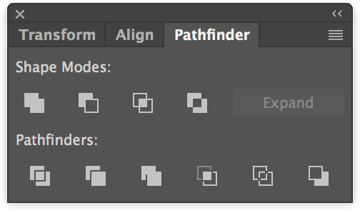
Sometimes the “live” document you’re trying to fix just has too much going on to make it obvious what the effect is, but once you’ve found the right tool, you can go back to it and it makes sense. Either that, or read a handy tutorial like http://www.bittbox.com/illustrator/pathfinder-explained
There are also tutorials for it in the Tips and Tricks Matrix, if you don’t want to learn how to use it by poking around.
The one to start with is this one. It will answer a lot of questions about what the interface is looking for. (Ultimately saving a lot of time and frustration.)
(Plus there’s a whole category for tips and tutorials on using a lot of popular design programs with this thing.)
I’ve generally avoided the Tips and Tricks section though because it’s of unpredictable quality and some of the content is wrong or misleading. That particular tutorial, however, is excellent.
The basic lesson to take away, FWIW, is that “layers” in your graphics program have nothing to do with distinguishing different elements that are going to get cut/engraved on the GF. It’s all about the colors and the fills or absence thereof.
Another reason why I like to make a distinction between the layers as they exist in the design software control, their effects in the exported design, and the Glowforge operations or steps menu. One layer with different colored objects as to strokes or fill will produce multiple operations. Five layers in the design that you broke into layers for ease of editing or for whatever reasons will come in as one operation if they all have the same stroke color (allowing that there is no fill defined.)
If there is a operation/step generated in the GFUI operations space, that will correspond to the color of an object(s). These operations do not depend upon layers in and of themselves. It is the color of the object fill or stroke that determines the number of operations. If you have two operations where you think there should be only one, then you go back to the design program and look for an object that has a different color. And remember that white fill or stroke is a color.
There are also some interesting choices that go into making sepate operations appear by default in the GFUI operations space. You can have four objects, each with the same stroke color but each with different fills. They will come in by default as cuts, but will give four separate operations. That’s interesting. If each object has the same fill and a different color stroke, defaults to four different different operations. The only way you can get one operation for several objects is to have each the same stroke color and either no fill or the same fill for each.
Also I’d like to endorse cleaning up the SVG and figuring it out how to get the design right so the operations come in the way you expect. It gives you much more versatility both for future use and for use in the Glowforge. For example, you can’t at the moment rotate a bitmap in the GFUI. That can be a constraint you want to do without.
However, there are efficiencies to be gained by doing a raster export, the most common and reasonable efficiency is to not have to remove clip paths, overlays and masques from a drawing. Just export the bitmap and all those issues go away.
Yea it is way easier to do in illustrator than inkscape unfortunately. Altho that particular image isnt bad, add a few more overlapping elements and it gets annoying