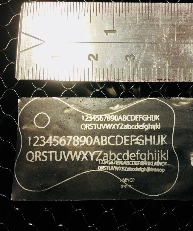
If you open the image large, and zoom in to the smallest text, you’ll see each scanline (look at the capitol D) is offset either to the left or to the right from the previous scanline.
I’m thinking it could be a function of the resolution (LPI setting) that you used. Also, some materials do show more artifacts than others. What material is this? I think Support will likely want more details on this from you.
Obviously the lower LPI will show it better.
This isn’t blocking my work. But thought it would be good to raise with the dev team.
I do realize it is rather nit picky
But I figure, if we can see it, if it is regular, then it can be tweaked a bit.
And who doesn’t want a little bit o perfection. really.
Are you talking about the step pattern at the edges? @cynd11’s got it I believe…just increase the LPI.
The beam can create a stair step pattern at the edges for low LPI values. (They see it at Faires because they’re usually in a hurry to process as many images as possible for so many customers.)
(We can go up to 1355 LPI with this machine. Very, very fine, and super crisp.)
I assume your file has rounded edges on the bone shape and the circular cutout inside the bone, but the results have what look like flat spots, upper right for the bone and lower right for the circle. The whole bone shape just seems to be less than symmetrical when I look at it. I assume it’s intended to be symmetrical. That seems like a bigger issue than the text.
@Jules Not looking to solve this for my own project - I know that I can bump up the LPI. This issue isn’t blocking me. I didn’t come here for help with my own project.
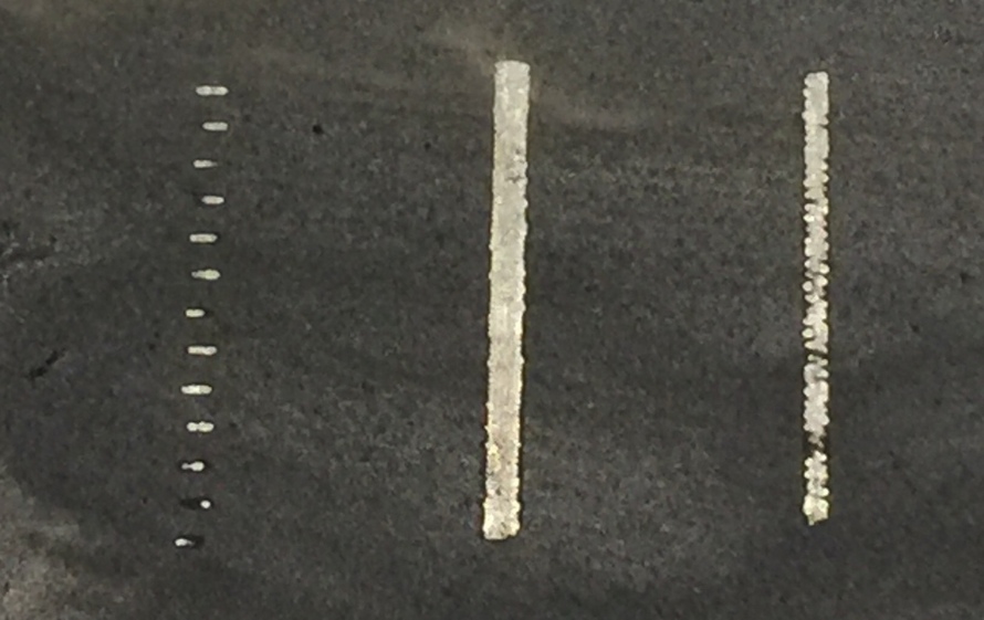
Please notice that I am testing a vertical line, there should be no stair-step due to “pixels” (quantization from coarse sampling the source art)
Looking to help improve the GF, since I think I found a (very very slight) calibration issue.
There is a slightly larger burn when the line starts, and it starts on alternating sides as it travels back and forth…is that what you’re talking about? (I don’t think they can change that movement pattern, it would double the engrave times.)
Just trying to clear up what you meant. If it’s just a suggestion for them that’s fine.
@Jules It’s a suggestion for GF. For example, they could time the burn start just a little earlier (or a little later, depending on the actual offset).
I just wonder if this is similar to why my all in one scanner + inkjet printer goes through auto calibration, I feel like I’ve seen the same effect when my inkjet was badly calibrated… Basically print a test pattern, then scan it back in, then the printer adjusts it’s offsets for starting each line, since it attacks each line from a different direction, and there is latency between when the the nozzle spray starts and when it hits the page.
@rotors Let’s ignore the bone. It’s purposely asymmetrical, and not relevant to the interlaced offsets we’re discussing, since it uses “cut”, and cut will not have this artifact. Only engraves will show it.
This is a great topic. Thanks for posting, especially the results of the vertical engrave of an SVG.
My pre-release exhibited alternating waves in vertical engravings, as evidenced by my original founders ruler print. They were not in an alternating line series, but were spread over a number of raster lines. Evidently it was an artifact of manufacture and how the axes and their rails were fixed or something like that hardware wise.
This is definitely different and warrants some other tests by other machines on several materials to get a base line. It’s like the lines give an alternating phase here.
I’ll try the design in acrylic with different resolutions to see how it works.
I suspect the stair stepped pattern is related to power delivery. Either in not delivering enough power at the beginning of the cut or tapering the power in anticipation of the end of the cut. I don’t know if the GF utilizes powering the resonator on and off for bream control or if they use an optical gate/shutter. If it’s the former that would certainly explain the quality of the cuts you’re getting. Have you tried that same level of power with a slower feed rate, or accordingly lower power to match a slower feed rate. I suspect slowing it down would reduce the undesired effects.
I think it does if I recall correctly. If true, then that would mean that this is related to the latency in starting the laser, rather than related to something else such as backlash in the gears&belts.
Thanks for the feedback. This issue is currently out of our scope. However, if you see this again on Proofgrade materials using Proofgrade settings, please post a new topic and let me know.