I’m doing a child’s name for above their bed for a customer and I’m noticing most fonts, once blown up quite big, have ridges and bumps etc. Nothing noticeable with smaller sizes, but made more noticeable as the letters get bigger.
Does anyone have a smooth font that they use for big prints? Maybe something fancy? It’s for a baby girl so the mother would like it fancy, curly, elegant etc. I just want a font that when blown up the edges are smooth and even. I’d prefer free but it doesn’t have to be. Just as smooth as possible.
If anyone has font recommendations and links or if anyone knows how to make a font smooth I’d REALLY appreciate it.
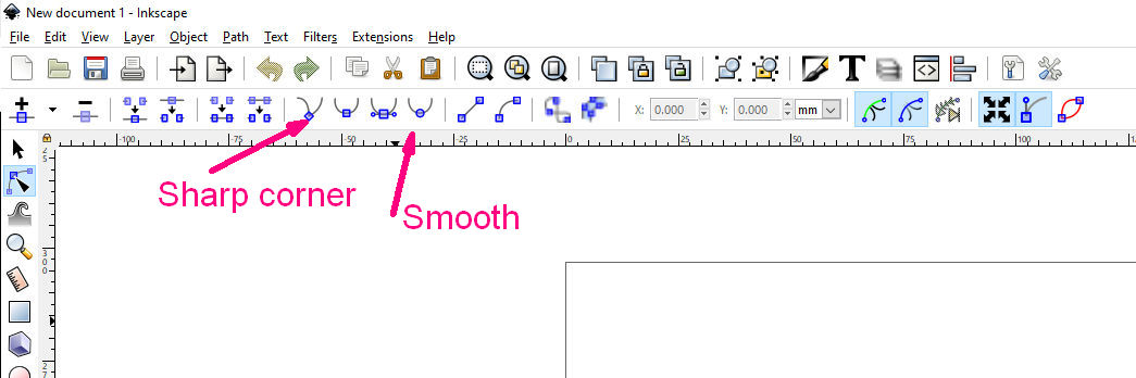
After selecting the font and hitting Object to Path, ungrouping, and welding (or union-ing) the letters together how I want them, I usually go through and delete any nodes that might be causing it to look off. It’s just part of the clean up process.
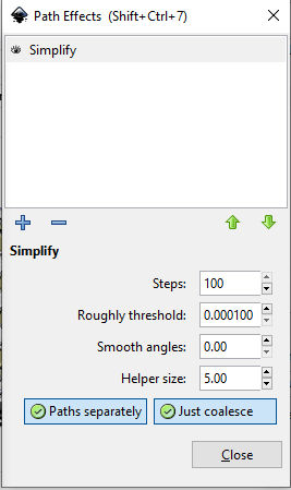
So would that have the same effect as “simplifying nodes” i believe is what it was called in the video? It went from a bunch of nodes to very few only necessary ones. I didn’t try cutting after experimenting with that though. I wasted enough product that learning the passthrough for this lol.
If it’s the same concept I will try to print after doing that.
Thank you! Im very new hahaha in case you couldn’t tell:joy:
I can do basic tasks in Inkscape bit thats about it. I will try to do what you just explained. Thank you again!
It has been almost exactly 3 years since I downloaded and opened Inkscape for the first time ever. (And did not even have a Glowforge to try things on.)
Thanks for this too. I’m a newbie to Inkscape and finally found some tutorials to get me at least started. Most of the time I need to ‘do’ something before i know what i need to learn so it’s a vicious process. Not just with inkscape, with any learning. It’s so helpful to find this sort of info.
I would love someone to do Inkscape for Glowforge to teach me how to do things specific to what we need to print files…of course if i ever get proficient in this i may look back and laugh at this post:-)
Without a Glowforge to build for (and not having a good idea what would work or not) I just played a lot with it trying every command to see what it did. It was not everything but it was a good start.
Even back in early Autocad days I was amazed to find that many folk had a few commands they knew and had no idea how the rest of them worked.
Hmm, maybe I’m misunderstanding the computer stuff. I call anything with nodes vector. What I really mean is convert from text to object. Object to path is what I click. Text itself I can’t edit in Inkscape until I converted it to an object. I’m technologically illiterate.
I corrected my post to eliminate any confusion by my improper use of terminology.
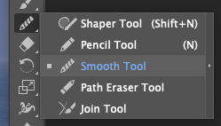
Either may help, but there is a difference and you need to play around with it to figure out what works best with the individual shapes in your design.
Often this is a part of the problem as the nodes crowd together like too many birds on too short a wire. Straight up Simplify however, does way too much and makes a mess which is why I posted the way to make a tiny difference a hundred times and thus not crazy.
I highly recommend that you learn how to do this step without shortcuts. In part because you’ll get exactly the results you want, but more because it’s pretty much the foundation of vector editing and understanding it will make all of your work easier.
If you click on your image with the dark arrow head tool (under the regular white arrow), you’ll see a bunch of dots, or nodes. Think of it like a giant connect-the-dot for the laser. You typically don’t need all those dots to get the shapes you want. You can click on individual dots to move them, or delete them entirely. When you delete a node, the rest of the path stays, but is altered just a bit because it no longer moves along that path. You can also “twist” the nodes to shift the path. Take some time to zoom in on a design and play around with it to see how it works. I’m sure there are videos for this, but once you play around in there, you should be able to tweak your designs. I do this to make some strokes thicker without changing the whole design, to smooth out connections that look wonky, etc.