Here are my initial attempts with the cabs. Clearly, my approach needs some fine tuning, but I learned a few things along the way and that much is good:
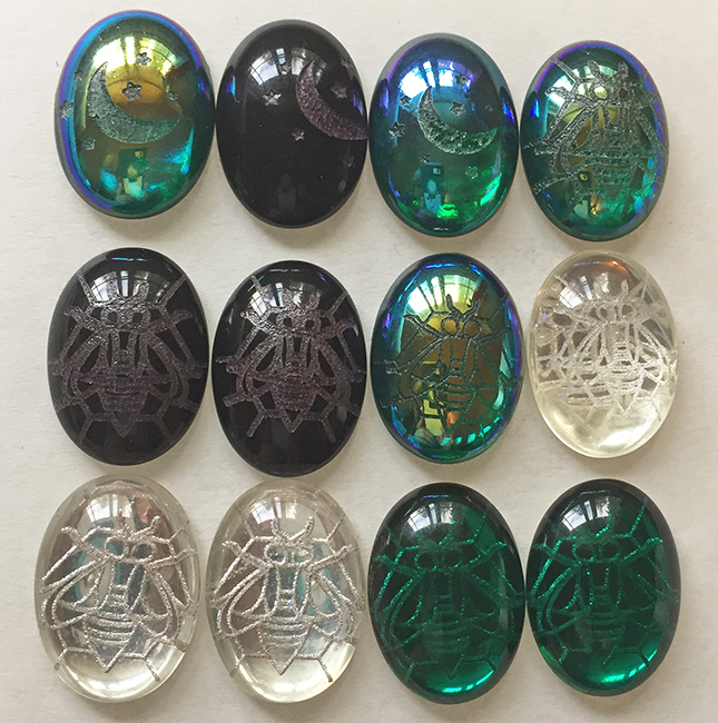
Placement shows the order of attempt, from left to right, top to bottom. The first row was done with a wet towel, and I found design placement very challenging with that method. I also realized quickly that finer lines seem to work better, so I switched up the clip art.
In row 2 I started using the dish liquid, which worked very nicely and also afforded easier image placement. By the last two cabs in row 2, I’d also refined the settings a bit more (though they still need more tweaking). I was able to follow in @jamesdhatch 's footsteps a bit, using settings similar to the ones that he used for his glass tiles (low power/high LPI).
Row 3 is where I started playing with reverse etching. These results are still a bit too grainy for my liking, so I’ll keep tweaking settings. Part of the issue may also be how the etching is interacting with the foil. Since I have buckets of culls with damaged foil, I’ll remove the foil from a few of those and try doing some unfoiled engraves to see if that changes anything.
These are some of the larger stones that I have in this style, so they’ve got a decent bit of weight to them. Thus, I was able to go jig-less (which my autocorrect wants to change to “jiggles”  ) for these quickie attempts. A couple of the stones did shift around a little, so I’ll definitely need to sort out the jig concept before moving down to any of the smaller sizes.