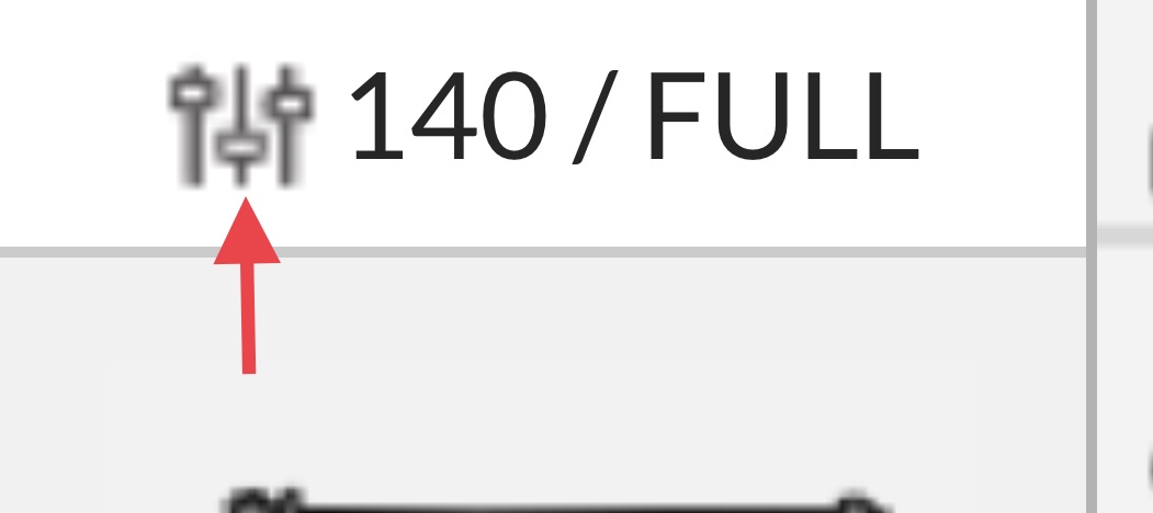
I tried searching and I could not find an answer. What do these 3 little symbols mean when I use manual setting? Thank you very kindly for all relies.
1 Like
It just indicates you’re using manual settings. 
3 Likes
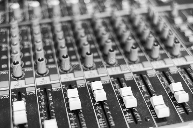
They’re skeuomorphic simple illustrations of control board sliders.
9 Likes
They are the little robot Meerkats watching to see how you are doing.

OR what they said above.
16 Likes
I learned a new word today. ![]()
10 Likes
ROTFLMAO!!! I am not doing so well.
2 Likes
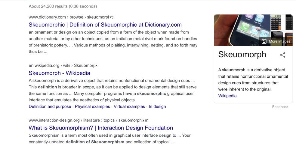
Here is a screen shot. I had to look up the definition. In my humble opinion I believe when a word like this makes it to Wikipedia it might be at doctorate level. Someone has probably written a thesis on it.
5 Likes
Well skeuomorphic design principles kind of were in the news for a while because the Iphone famously wiped out skeu design all at once (mostly). They went from old school “buttons that looked like actual buttons” or a book reader that mimicked turning pages and had leather patterns to make it look like an actual book and whatnot to the more modern “flat” design that you see everywhere now on phones and google and even right here.
Look at the buttons in discourse, they’re all flat abstractions, nothing looks like real-world buttons. Skeuomorphic design feels dated most of the time, everything has moved on.
6 Likes
WOD!
2 Likes
Nope, I’m going with this one 
1 Like
Wow just wow!!! Are you the one who did their thesis on skeuomorphic design principles? When I was single woman I would fantasize about marrying a very intelligent man. All of my friends wanted a rich man.
When my husband came home I asked him if he knew anything about
skeuomorphic design principles. Instantly like you he gives me a full blown explanation.
Both of you have intelligence beyond everyday conversation at that is special and impressive.
Thank you so very much for taking your time to reply to my post.
14 Likes
Whew. Sounds like you married the right guy! 
4 Likes
Well thanks but I’m a mile wide and an inch deep I’m afraid. ![]()
As for knowing a bit on this topic, I’m a front end software developer by profession so web design is kind of where I work. Now I’ve passed on this bit of trivia, and my work here is done!
11 Likes
I was wondering what the heck was a wile wide was! Then it hit me: typo.
I was about to google it.
When you drop phrases like, “ skeuomorphic design principles”, it allows you to get away with things like “wile wide.” If I were @evansd2, after this event, I’d consider dropping phrases like “wile wide” just to mess with people.
6 Likes
If only it weren’t just that I am an awful typist… fixed. That’s what I get for foruming on my phone.
2 Likes
I liked that move, mainly because it demonstrated that Jobs didn’t get everything right. That was a huge thing.
1 Like
It’s arguable that he did get it right in terms of encouraging early adoption, the early ui was really approachable for all of us as we learned what a smartphone could do. Later once we all decided that iPhones/smart phones were indispensable and no physical keyboard wasn’t crazy*, ditching skeu design made a lot of sense to really take advantage of what these new devices could do.
If you look at the old interfaces now they seem cluttered and inefficient in terms of how they use screen space. The trick is not to fall into dark ui patterns (cough cough iPhone multitasking) because you went too minimal. It’s a constant evolution, and done carefully you barely even notice the subtle changes… good design is 99% invisible, as they say.
* it’s amazing how recent all of this was. 2006/2007. No smartphones before that. People were ready to throw down because they wouldn’t have their physical blackberry keyboards. Seems so long ago, stuff moves incredibly quickly now.
7 Likes
Oh, this is kind of fun:
5 Likes