"Total Power" Comparison - Settings for Depth Engraving Acrylic

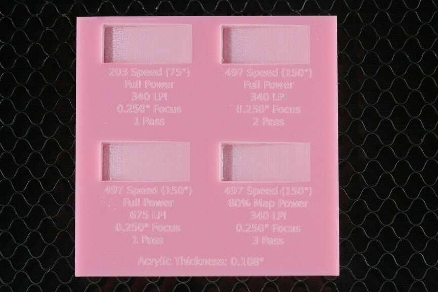
Ran some bitmap gradient tests today.

I made 3 samples, each with different settings that, if you go strictly by theory of Total Power, all received equal total power levels… or at least fairly close to it.

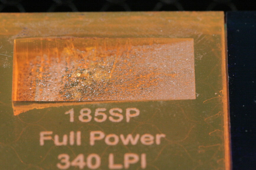
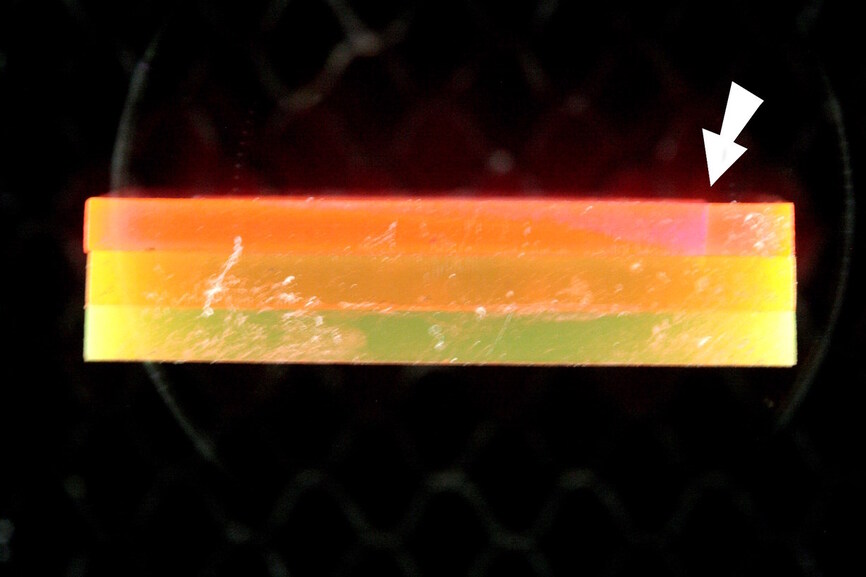
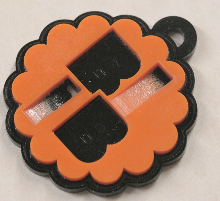
These are all fluorescent colors from the same vendor (non-PG) and I glued up 3 layers each, total thickness of 0.345". Size is 1.5" square.

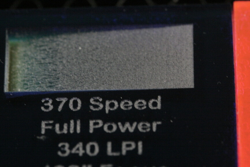
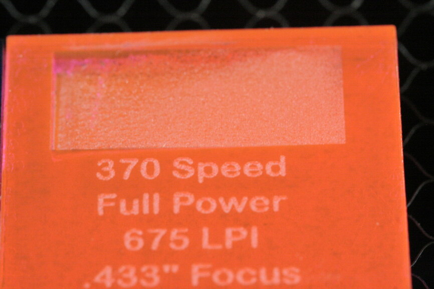
The engraved rectangle is a gradient bitmap with power levels mapped to gray.

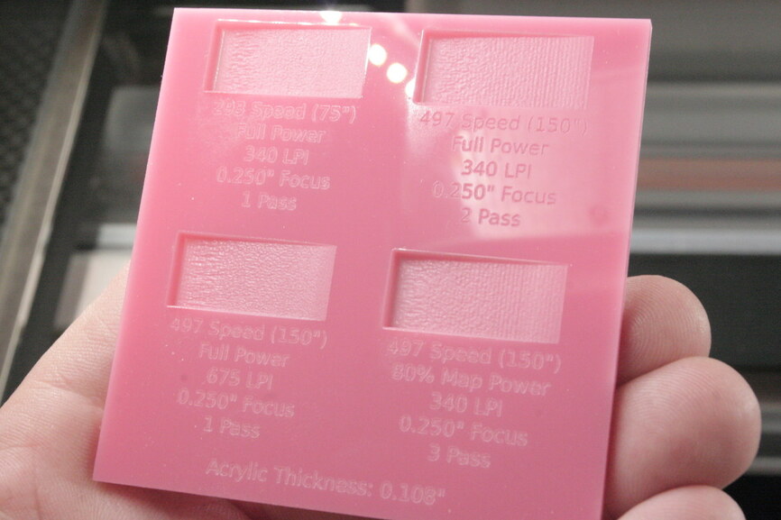
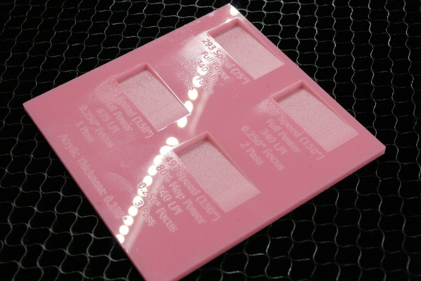
I’ll let the photos do the talking but it sure looks like as actual laser power increases, surface smoothness drops judging from the appearance across the gradient engrave. They all seem to get less controlled and more “melty” at the deeper area where the bitmap is black and calling full laser power. The orange sample at 185 speed just simply melted away LOL.

Looks like when surface quality is the intent, the blue/green one with multiple passes to spread out the power density is the way to go.

28 Likes

Very useful! :grinning:

(Had you given any thought to taking the tray out so you can defocus a little farther? I’m not sure how much to give it, but that slagging of the acrylic at the higher power settings is pretty unattractive…I wondered if a little more distance might cut the effect at the middle power ranges? @takitus might know… )

Great testing! I’m so looking forward to learning to do this soon. :+1:

3 Likes

I think you mean they all received the same total energy. Energy would be proportional to power * LPI * passes / speed.

1 Like

@Jules, If I were using thinner material I could really defocus, I ran some 1/4" tests last night and defocused to 0.400" and the result was still kinda grainy like the blue one above, but glossy grain instead of a flat finish. But I burned through the bottom of both those LOL.

@palmercr yes total energy to be technically correct. Given that time between all three is basically equal, time cancels out and you’re left with power as a term that laymen have a better understanding of.

4 Likes

Well it confused the hell out of me as they all said full power, so obviously were the same power. It took me a few mioments to work out what you actually meant.

Power is rate of delivery of energy, so what is accumulated over time is energy. Does the layman really not understand the difference between power and energy? They would have a hard time understanding their electricity bill in that case.

1 Like

Super! Thanks for the pic! (That is shiny!) :grinning:

Do you think setting a different range for the power would make a difference? (Like not 0-100%, but 0-80%?)

1 Like

I took .25" acrylic to .43" focus and had great results using the old proofgrade settings. I still have a copy of the original settings file around somewhere with power/speed for that engrave, so if youre interested @mpipes, I can look it up.

4 Likes

Very few people understand the difference between power and energy. Or know what a Watt is a measure of. But they understand their electricity bill just fine: they are billed by kWh used, and beyond a base charge they are charged a standard amount per kWh used. They don’t have to understand what a kWh is, or how it’s calculated to understand their bill. They know if they use less electricity, then kWh goes down, and they are charged less. And the opposite.

5 Likes

When I talk to folks about building my electric car project, they clearly have no understanding of the differences, and correlations, of total battery pack energy, instantaneous power output of that pack, and motor power output. They are curious about it, but only electricians and the technicians/engineers get it.

I have no doubt their electric bill confuses them, it’s how the utility keeps them under control.

5 Likes

I wouldnt mind taking a look for comparison.

So far I have been bad about recording settings so I think I just need to keep burning them onto the actual samples like these above. :slight_smile: 
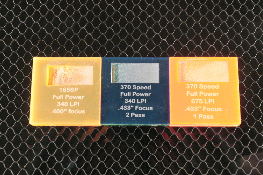
Makes me actually plan these so I can put the settings into the artwork.

Thanks!

1 Like

Keep in mind that the speed units they use in this file are not inches/min. They are in mm/min IIRC.

{
  "id": 18,
  "name": "Acrylic - Colored",
  "thickness_name": "1/4\"",
  "thumbnail_url": "https://glowforge-files.storage.googleapis.com/materials/26/original/Magenta_Acrylic.jpg",
  "type_name": "Colored Acrylic",
  "cut": {
    "speed": 320,
    "power": 100,
    "corner": 50,
    "focal_offset": 5.8,
    "passes": 2
  },
  "vector": [{
    "color": "",
    "speed": 2540,
    "power": 75,
    "corner": 50,
    "focal_offset": 5.8,
    "passes": 1
  }],
  "raster": [{
    "scanGap": 6,
    "color": "",
    "raster": {
      "dither_method": "o8x8",
      "rescale_method": "LanczosFilter"
    },
    "speed": 8500,
    "power": 50,
    "corner": 50,
    "focal_offset": 5.8,
    "passes": 1
  }],
  "validators": {
    "speed": {
      "min": 100,
      "max": 8500,
      "message": "Speed ranges from 100mm/min to 8500mm/min"
    },
    "power": {
      "min": 0,
      "max": 100,
      "message": "Power ranges from 0 to 100%"
    },
    "corner": {
      "min": 0,
      "max": 100,
      "message": "Corner ranges from 0 to 100%"
    }
  },
  "default_focal_offset": 5.8

The engrave settings would be this section:

  "raster": [{
    "scanGap": 6,
    "color": "",
    "raster": {
      "dither_method": "o8x8",
      "rescale_method": "LanczosFilter"
    },
    "speed": 8500,
    "power": 50,
    "corner": 50,
    "focal_offset": 5.8,
    "passes": 1
2 Likes

Actually if these have been done with the new speed settings it is not constant energy because 185 is not half the speed of 370, is is 1/3 as fast. This is what is so crazy about the new settings. You cannot do experiments like these without a spreadsheet.

5 Likes

Ha, that is exactly what I proposed here: Well THAT'S new - #79 by palmercr. Speed should go from 10cm/m to 850cm/m and that is actually what it does internally. It just obfuscates it for the GUI.

Gah! You’re right. Well, I got lots of sample chips. :smiley:

1 Like

Surprising question. Of course the answer is Yes. I mean, you can go ahead an get a random sampling of people on the street, but I’d be amazed if you found as much as 10% knowing the difference.

1 Like

I think we need to all chip in and buy you a case of your favorite {varFoodBevProd}. You keep doing all this legwork for us! :slight_smile:

ice cream. :slight_smile:

I’m back with more! Muwahahaha!

I’m letting the sample tell the story because any one of these is perfectly acceptable in my mind but if I was gonna be a Picky Pete, it’s gotta be a combo of the lower speed, and @Jules idea of limiting max power (ie: I used 80% power in the GFUI, no modifications to the artwork) and then using additional passes to get the depth.

That gradient on the top left is so buttery smooth it’s unreal, before it gets into the higher power area.

22 Likes

That’s just awesome.

I wonder if the higher-power area you’re talking about isn’t a result of the power, but the focus. So if it were possible to vary the focus-per-color it might be smoother?

2 Likes

Squee! (And I’m so pâques at having to focus on something else for the next couple of days…you have no idea! And August is going to be worse…always a busy time with the business.)

I’m jelly.

Which way up are these when they are engraved? I am guessing sideways on as the raster lines seem to be vertical.

Yes the dreaded ripple seems appear as it gets deeper. It would be interesting to see it rotated 90 degrees. The deep end would be visited once each line so might get less melty.

1 Like