I am having trouble engraving ‘fine print’ onto laser-able metal. I posted a few days ago about issues with speed and not engraving correctly and some of the suggestions given have helped me greatly so I thought to try again!
I am printing a 4 x 1.5 metal plate (same as my last post) with gold lettering and the lettering had to be smooshed a bit to fit on the plate. In the Adobe Illustrator Program, I am using Arial font and even tried to engrave with a Narrow Arial Font to see if there was any difference (it didn’t provide much of a difference). I am engraving at a 700 speed and 90 power with a 170 LPI but the letters still seem to ‘bleed’ together. Has anyone else faced this issue and/or can recommend anything?
That small you will want to use the highest LPI that you can tolerate. The higher the LPI, the finer the result, but it takes a long, long, loooooong time. And make sure that the text that you create is saved at a high PPI as well, or you might see some pixelization.
It’s a trade-off, but engraving on metal (or grains of rice) is the only time I recommend using the highest LPI setting, and usually only for small prints. You can also try using a larger font, or adjusting the kerning between the letters…that can make a big difference.
For full bed prints, the lower LPI is fine, but when you are working with something incredibly tiny, you want to use a high LPI…even though it takes ten times as long to do it. The results are better. 
4 Likes
I have tried using the highest LPI for the smallest text (and even the largest text  …learned quickly on that one) and oddly enough it actually makes it even worse. I will see if adding space between the lettering will help to minimize that smooshing effect!
Can you show a picture of what you are talking about? (Just drag and drop the jpeg onto a new line in a reply and it will upload here.)
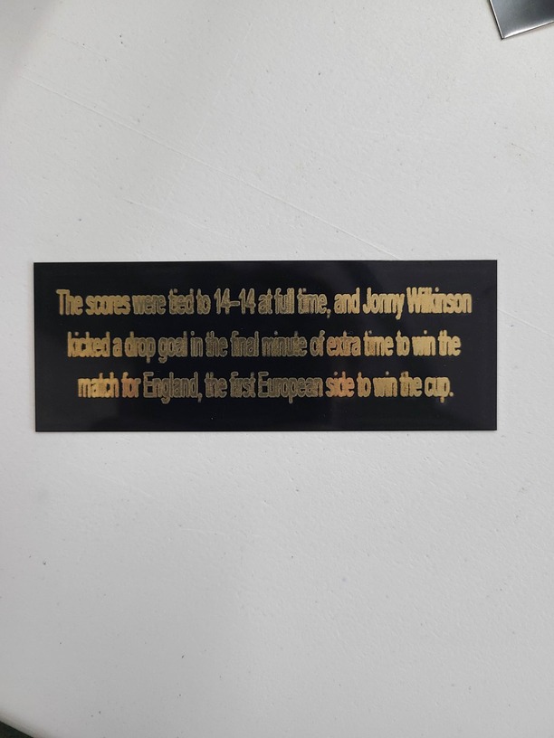
Yeah, I’d definitely space the letters just a little bit. But it also looks like the edges of the letters are not really clean, and that might be a function of the paint on the metal. You can try higher power to try to burn it away clean, or maybe just scrub it with a brush to flake that away. Definitely higher LPI.
I think that’s just going to take some experimenting to get the right settings for that material. 
How was the text generated? The edges of the letters is really jagged.
1 Like
It almost looks like a focus issue to me actually. It doesn’t appear to be a particularly small font size. How many points is it?
2 Likes
@dklgood is right, the fonts look bitmapped…
are you using Illustrator? when you export turn your fonts into outlines
that may help sharpen them.
1 Like
Very much this - they are completely on top of each other
Maybe try a single line font if your project doesn’t require Ariel.
Hello! @sales31 I am sorry to hear about the engraving problem you are running into. I will do my best to get this resolved for you. It looks like you’re getting great advice from our forum community.
I do want to make sure that there isn’t a problem with the Glowforge itself. If you could run a test print for me I can establish a baseline for the trouble we are seeing.
Please perform the following test print.
Print the Gift of Good Measure on Proofgrade material, using Proofgrade settings.
When the print finishes, leave the lid closed and wait until the fans stop and the picture updates.
Check the completed print:
Take a photo of the print and attach these photos to your reply.
Let me know how it goes and thank you for reaching out on the forum!
Just thought of one other possibility and it’s a little bit out there…but try putting white masking on top of the black tile…it’s possible that the black color of the tile caused the focus to get out of whack, or that the auto-focus missed that tile entirely, making it print out of focus. Put a sheet of white paper underneath the tile on the bed as well, so that the auto-focus will have something to land on if it misses the tile.
Try that and see if it cleans those up a little, after you print the Gift of Good Measure. 
1 Like