Thought this look to be a rather easy to adapt to the Glowforge’s capabilities. I’ll be prototyping in Fusion360 and then setting aside some card board in anticipation of the email and subsequent arrival of my Glowforge.
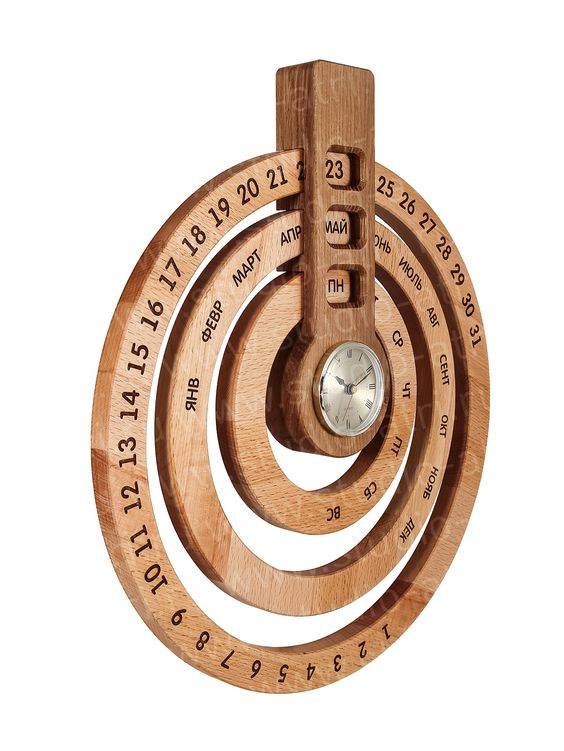
The Russian isn’t the issue.
The issue is all the dead space.
It’s pretty, but I want the numbers and days spread across the entire circumference, and I want the full ward rather than the abbreviation, so I can check my spelling.
My Russian professor tried to point out that spelling is for English kids because Russian is straightforward, but I still am no good.
personally unless you’re making it much smaller i think it looks better with some gaps in the text. having it uniform around every circle makes for a heavy design imo.