Thanks for the pointer. That’s the same board I found last night and ordered. It arrived today and I have it up and running. Thanks for posting the updated word definitions that matched the cheap board. That helped a lot. The real challege I had was getting it working on an old Nano ATmega168 that I had on hand. The code was too large for it and I had to strip out the optional “moon” code and start-up seqence to get it to fit. I also updated the timer board to a DS3231 that should provide better accuracy over time than the DS1307 did.
Sweet! Glad it fit.
I dumped the moon code as well, mostly because i was not using it.
I also did a version based on a teensy 3.2 and the internal clock you can get from that if you add a crystal. That required about 90% of the code to be rewritten as all the clock functions were different.
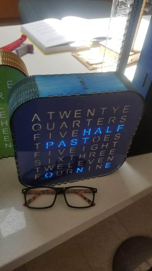
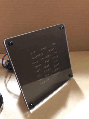
@evansd2 I tried cardstock printed black with reverse letters, but the toner wasn’t opaque enough. I happened to have some black on clear acrylic from inventables. After engraving the wrong side and engraving with the plastic on, I finally got a clean engrave.
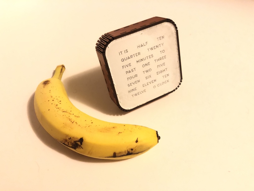
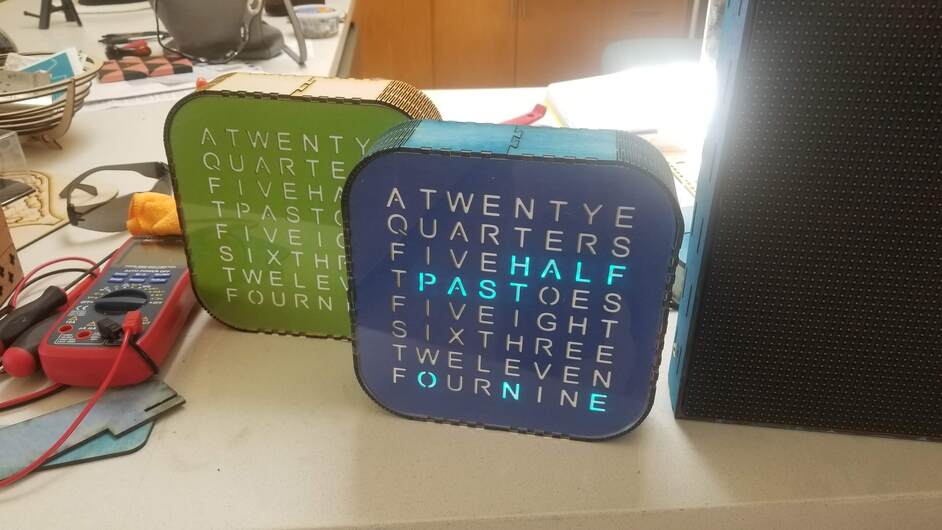
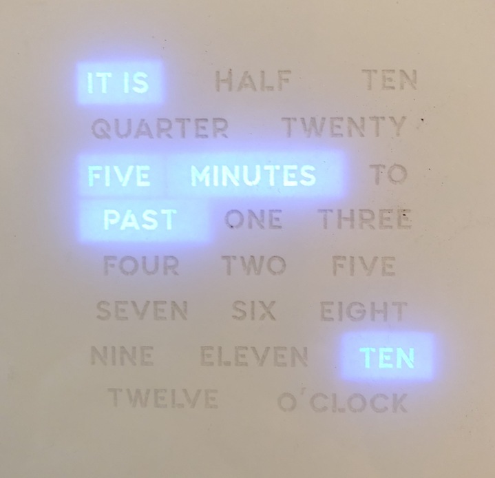
@mark14 I wasn’t a fan of the word search clocks. I was surprised that no one had adapted the word array clock to a 8x8 matrix.
Yeah that was always going to be my go to if I decided to make a word clock using the glowforge. My solution for larger scale clocks was screenprinting onto clear substrate. (personal opinion) I think stencil fonts are to be avoided, aesthetically.
I wanted to try a different font, but I used all of my two tone acrylic. It just dawned on me I could use the same technique I used on the ceramic tiles. So I tried on some scrap 1.75mm acrylic i had and spray painted the back black and did a reverse engrave. I think I went a bit too deep. But much cheaper than buying it.
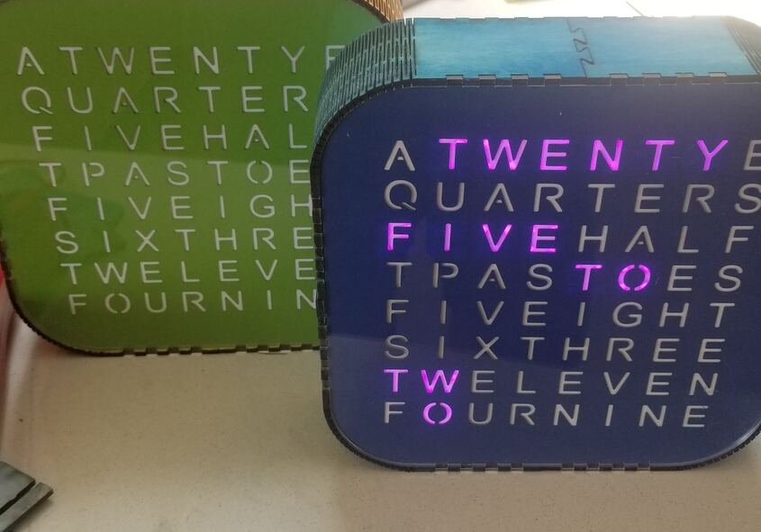
@evansd2 I made another cover. When I went back to the last file to get the settings I found out that I scored the letter. So that explains why they looked so deep and had an outline. I just thought I engrave to deep. Here is my latest attempt.
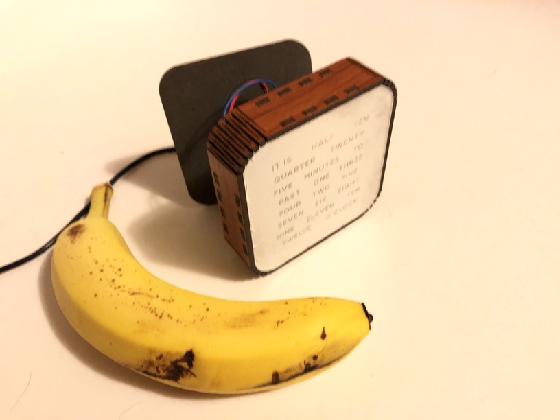
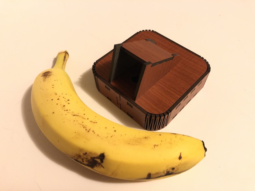
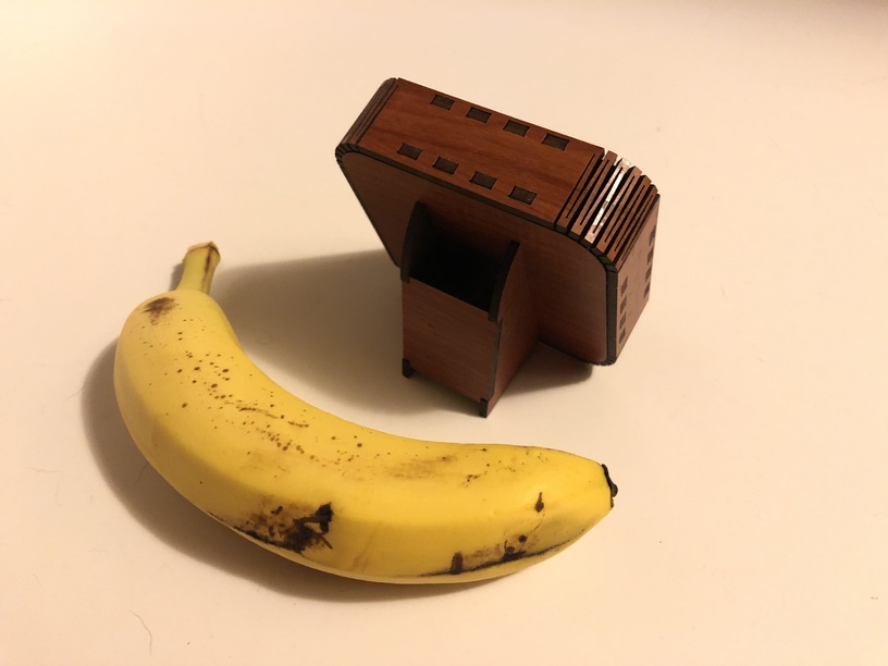
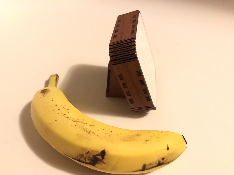
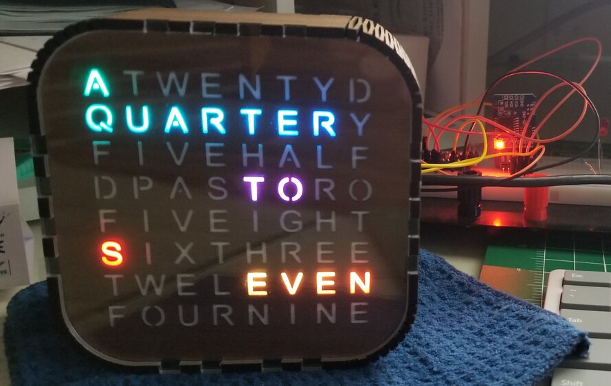
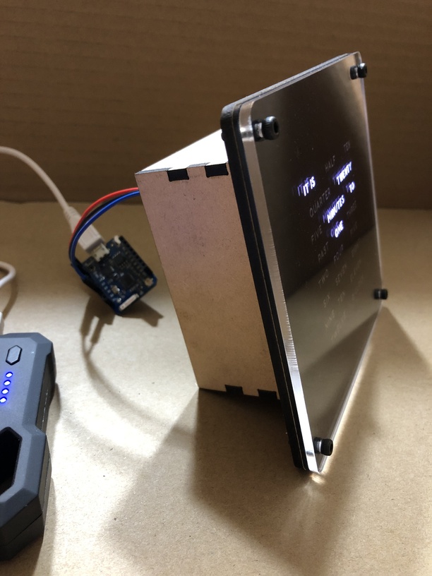
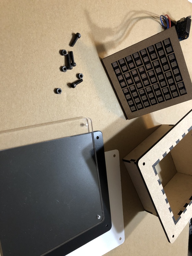
I got some more JPP durowood and made one box like your design. Trying to make it as thin as I could get away with. I will have to solder my board (the jumpers are too tall to fit in the box). I had a scrap piece of acrylic that wasn’t perfect. I can cut a new one when I have more time. I just wanted to see if the design would work.
I had an idea to decrease the radius of the corners of the front and back plates. The living hinge provides enough give and tension to hold them in. No glue or fasteners needed!
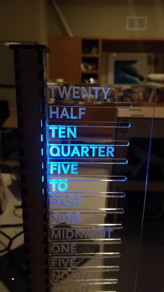
Adafruit has an interesting twist on the word clock with a vertical layout.
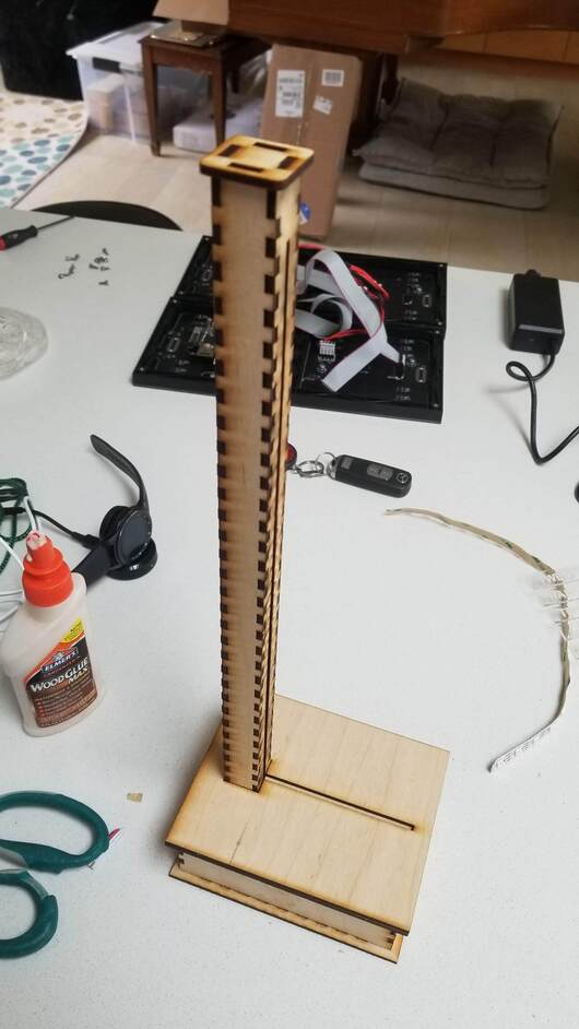
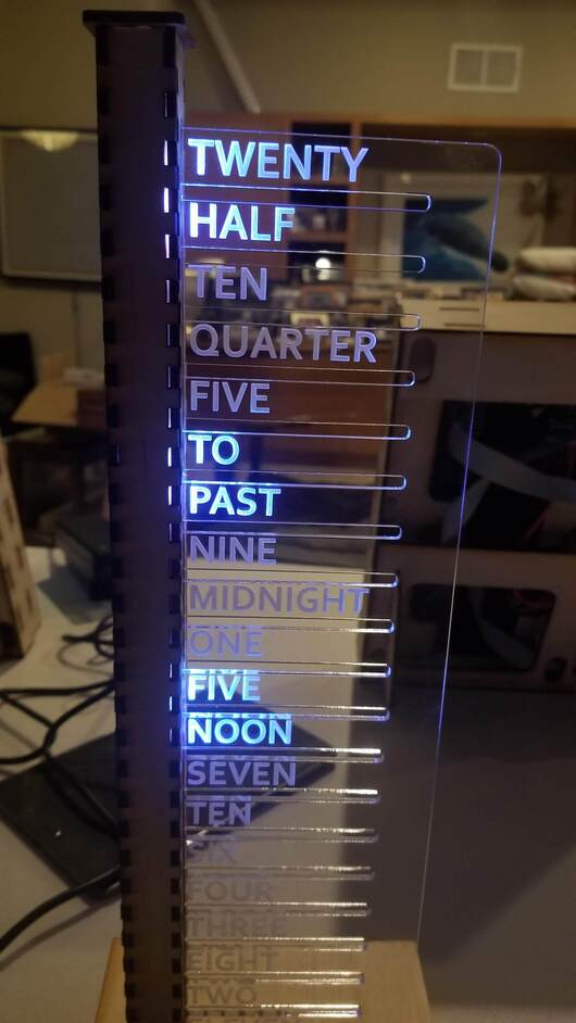
I could not resist. Their version used a laser for the text plate, but simple cardboard for the rest. That simply would not do. Along the way, I changed the wording order and added some light guides internal to the tower to prevent the light from bleeding into the other words. Similar LEDs to the above but only a short strip of 20 of them vs the grid of 64.
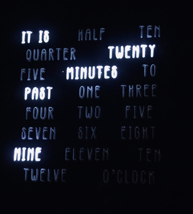
So, 4 LEDs per letter. The mapping had me stumped for a while but eventually I got it worked out. Managed to get it perfectly wrong on my first try ( the letters were mapped to the mirror image of what I wanted. Luckily a long walk with the dogs gave me time to figure out that ‘255- x’ would mirror ‘x’ on the grid. Made a pair of them. They will be available in the Tracy Park Gallery in Malibu later today.
 14 pt.