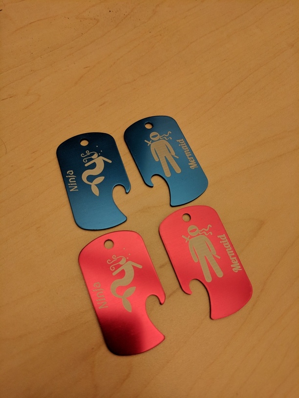
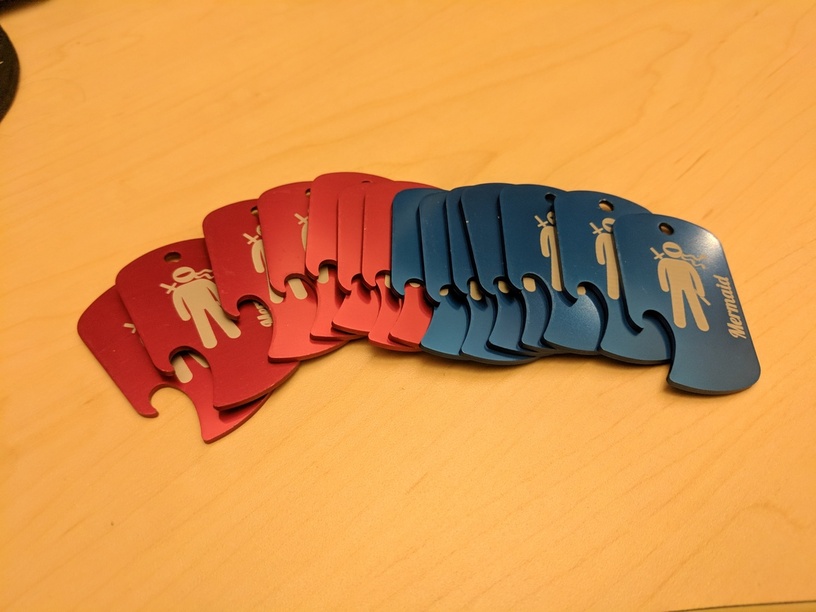
My boss asked me to make some keychains for her to give to her group of friends. They call themselves the “ninja mermaids”. I had her pick out a couple of svg’s from the noun project. I engraved at full pews and zooms on a pro. 340 LPI. For the ninja font I used Medieval Sharp Oblique. For the mermaid font I chose Lobster.
Both her and I are really happy with how these came out. I’ve got some spares blanks left over so I can do some more for other people.
Apologies for a reply on a several day old topic, but I realized I forgot to include some information. I like to add learnings that I take from projects or things that I tried differently that worked out or didnt work out.
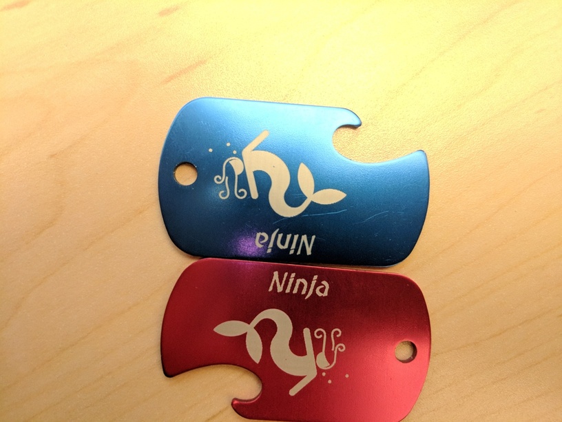
One thing that vastly improved the process of making these was rotating them so that they were oriented horizontally for the laser. This improved the clarity of the text and helped remove some pixelization. It also made it print much faster as there were fewer raster lines required since the “height” (rotated width) was about half the actual/original height.
The red one here was printed vertically, the blue horizontally. The difference is most noticeable on the text. In particular I think the “j” shows a big difference. I’m not sure if it’ll show in the image because you have to look pretty closely. But its fairly evident in person.
Can I suggest you might be having a hardware issue? You might not. My first Glowforge had what appears to be the same issue… waviness in the y axis. To confirm the issue I was having, I simply generated 5 straight vertical lines and 5 straight horizontal lines in Illustrator, maybe 10 pixels thick, then engraved them onto some Proofgrade material. It was clear the vertical lines wavered while the horizontal appeared very straight. They replaced my unit because of it. You might want to post this image in a new topic on Problems & Support. If you do, you may also want to do a simple line test on Proofgrade to help Support identify such an issue.
It’s possible, but I don’t think it’s actually a hardware issue…rather just a limitation. The engrave of course happens one horizontal line at a time. With the slanted font, the only way the machine can draw the slanted or curved lines is by shifting each horizontal line over a little bit. This results in being able to see the stair steps. I don’t notice any waviness overall in the images and haven’t had any issue with other projects I’ve done.
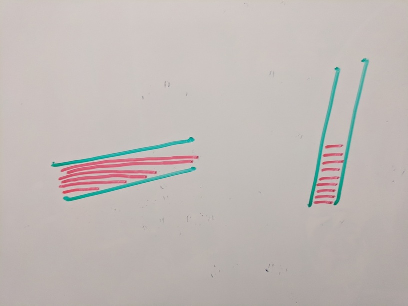
I think the difference in rotation helps because of the angle of the slanted lines. It’s hard to explain without drawing…so I took to the whiteboard.
Imagine the green is the path to engrave for the first leg of the ‘N’ while the red is the actual lines drawn by the laser. When that leg is oriented such that the lines to draw it are longer, there are fewer lines available to accomodate the slant. So you get larger stair steps. When the line is more vertically oriented, the actual raster lines are shorter and there are a lot more of them. Resulting in many more stair steps and thus the steps being less noticeable.
True, but LPI can have its disadvantages as well (e.g. longer print time). In the end, the distance being covered ends up being a mm or 2. So even increasing LPI significantly only increases the number of lines by ~1/20 of the LPI (and results in having to do the entire image at the higher resolution). By rotating it, i was able to increase the distance to be the height of the line instead of the width. Thus increasing the number of raster lines by probably 5-10x without having to up the LPI at all.
The best solution is all dependent on the individual scenario. In this case I was already engraving at 340 LPI and didn’t want to double or triple my print time in order to half the step size.
Oh I agree … totally design and material dependent. It shows more on things like aluminum and acrylic. Less on woods so it’s not always necessary there.
you could have the text and graphics in different colors so that each “job” is independently controlled. If you wanted the text to be higher quality to avoid the “wobbly” edges, you could just turn up the lpi for that portion and leave the lower lpi for the graphic.
Also rotating rasters in your vector program will wreck things, but it looks like that’s not going on here because that would have rendered the engrave an illegible muddy mess.
Regardless of the lpi issue, TimeWise he is correct saying that it’s a lot less time to etch horizontally than it is vertically especially on larger images. I think that was the point that was trying to be made here.
Absolutely. I’m doing a project now where I’m doing 3 dozen of something that is used vertically and the engraves are taller than wide. They take 50% longer when oriented that way in the GF vs laying them on their sides so they’re longer than tall. The extra 5 minutes each is a huge difference when doing so many.