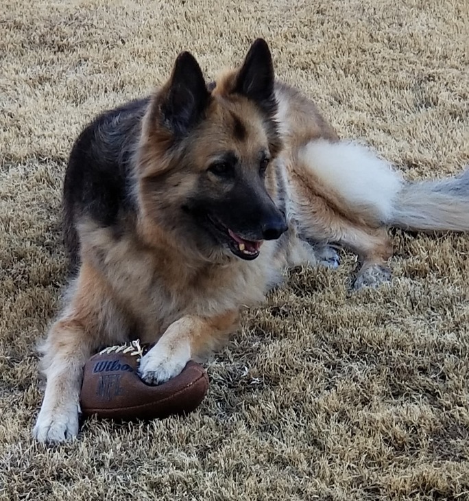
Hi, I have not tried this myself but there was a post on the forum about a year ago that mentioned using a mixture of baking soda and water on your wood prior to engraving that made the engrave darker. The engraving it produced was a darker brown color and looked really good.
Another idea would be to take the original photo and use something like photoshop to play with the contrast levels - or even convert it to a halftone pattern… Contrast is your friend.
Y’all have a wealth of knowledge that helps with my learning curve. Would anyone suggest I keep the same settings and try with the high contrast etc changes?
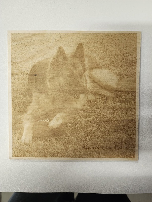
1000/60/270
This print takes about an hour to complete. So was wondering how to move it faster? Or do you just have to be patient and see what the final product is with each change?
You can be annoyed for two hours while it engraves, or annoyed for years that it could have come out better This is my take though I tend to be an extremist on the subject.
Pre-working the graphic pays the most dividends. Extreme contrast is not so much the point as to have as much range as possible. I favor Gimp as an image processor and fogging the background is a way to make things pop. Also using variable power is not the best for an image as the range from nothing to black will end up mostly black in most woods as the nice colors are all in a very narrow range. Using dots all the dots are black but there are more dots in dark areas and fewer in light areas. The higher the LPI the smaller the dots (and the longer it will take). Even in the darkest areas, you want space between the dots, and in the lightest areas you want at least some dots There are adjustments for this in the GFUI.
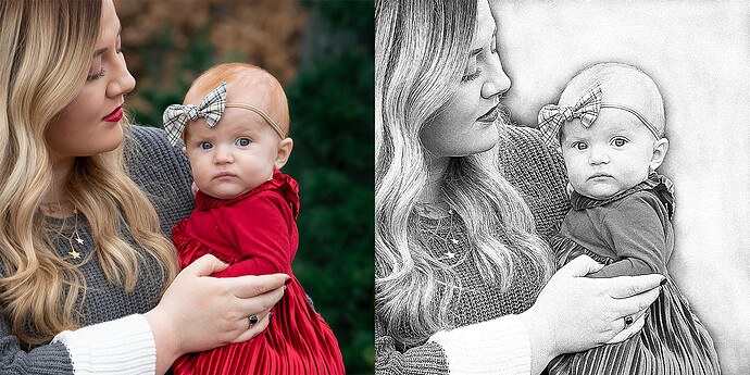
It depends on how your image is processed. Lots of grayscale as a tiff and then 3d engraving looks pretty cool.
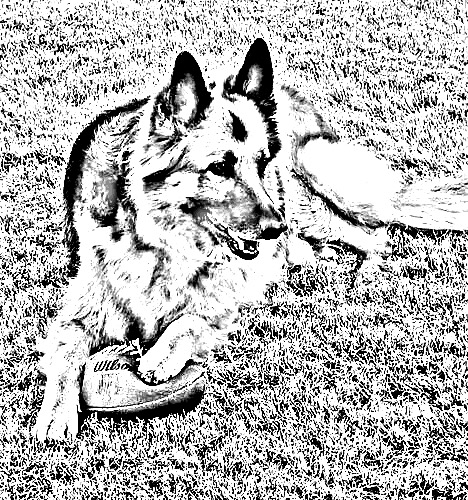
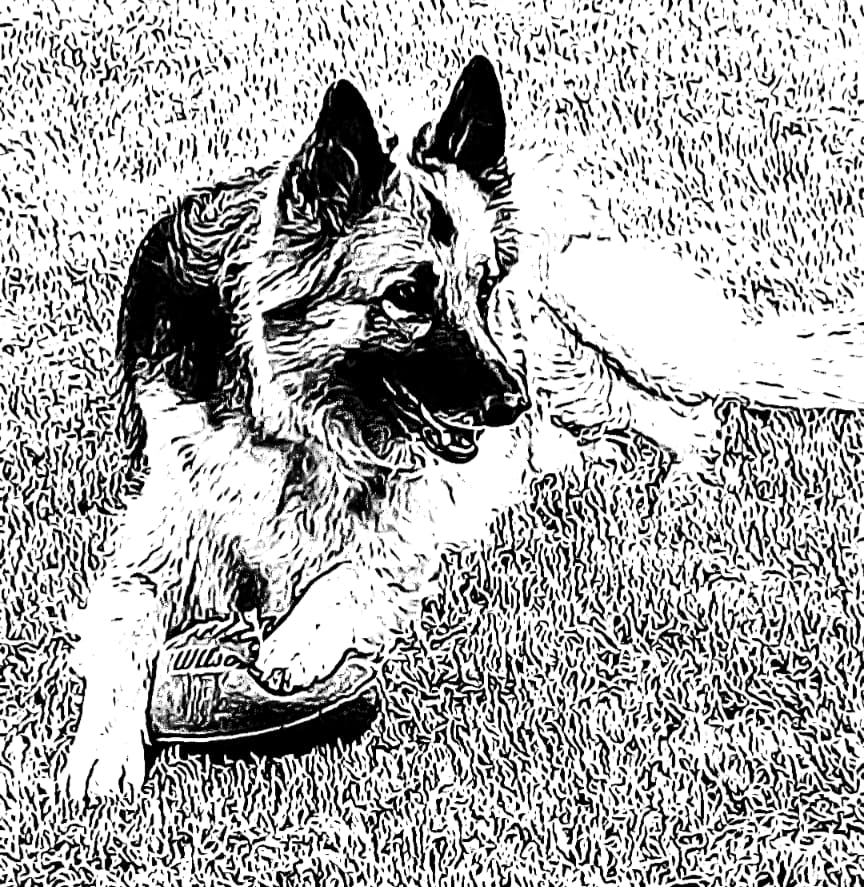
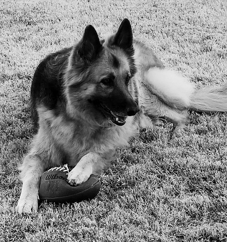
If you just do a straight black-and-white contrast image like I had posted above, even draft photo engrave looks fine.
I agree with @rbtdanforth unless you are trying to mass produce some thing, then I am in full support of going slower and having a better quality image. When I was new to this, I couldn’t wait and just wanted the end product immediately.
I used Pixelmator. I have not done many photo engraves but I have had great success turning photos black and white using Pixelmator and my engravings turned out crisp and clear. The sizes were usually 3 x 4