I have sent this comment out to support@glowforge.com, but wanted to see if there may be any traction on this through the masses.
The GF feature set emphasizes engraving which, in all methods, involves some sort of power variance resulting in deeper cuts in relation to color gradients.
What I am looking for is a pattern etch relationship to color gradient with a single power level setting. Think of a dot matrix or laser printer’s ability to grayscale an image. Color/shade variance is purely by dot density as opposed to a dot burn in.
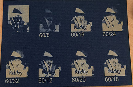
I figure this should have been one of the settings available in the GF, but when I did tests using the dither patterns in the engrave settings the results were unsatisfactory for the reasons stated in the first paragraph. I have included a photograph done on a Epilog laser (when I had 1 month access) to illustrate the results that find possible, yet not available.
The photo includes speed/power settings. Note how low of a power setting is required. With the GF tests, it just ended up being a faded blotch of dots (when low) or various depths (when set high)
(*copied from my last reply for, hopefully, more clarity to the objective
To some degree, I guess I would describe the min/max behavior as: if I raise the min level I get an degree of high power dot burn overall. If I lower the Max, I get a degree of low power dot burn overall. However, the GF seems to put out the same number of dots regardless of these settings. This is not would I would consider a proper dot imaging. It’s behavior is moreover engraving.)
Not sure I’m answering your question, but the GF can utilize three types of engraving: Floyd Steinberg, Ordered Dither, and mapping greys to power. The first two use a single power level, while the last one alters the power.
That being said, if none of these are working to your satisfaction, success is likely to be found by pre-processing your images. Can’t tell you what will give success, but the general processes needed are dithering and/or half-toning. Googling for either one will reveal heaps of tutorials (have you checked the GF tutorial section here in the forum, btw?).
One online tool that you might find useful is called the Rasterbator (hey, I didn’t name it!). It certainly outputs 2-color images that would simply engrave using the defaults on the GF. Photoshop, GIMP, Inkscape, Illustrator, etc. all have similar methods.
I hear what you’re saying. I tried both of those methods, but in my array of tests finding a good contrast and image resolution was only solved by deeper cuts. In other words it still engraves. I was under the impression that FS and OD mappings would use a single power, but the results bore out a depth of cut which meant there is a difference in power applied to the material. Tested on acrylic as well as mat board. It felt to me that the lower power settings only seemed to lessen the power steps. Instead of 100 steps for image settings (min/max), it would, for example, convert to 20 steps in the gray scale (max-min /20).
Pre-processing did not solve the issue on the simple tests that I did. I could do more but an explanation of what I did may highlight some of the issues. I converted a photo to a black and white dither, essentially removing all grayscale factors. I set the photo to a resolution equal to the LPI that I wanted to test (340). What resulted, was that the image imported at the screen resolution of the display, or much larger than the size I required. This meant scaling down the image to fit my material. This effectively resulted in the GF calculation gray scales again, eliminating the bitmap pre-process.
I would like to hear other’s attempts to try this to see if they have other observations or results.
Scaling a black and white bitmap in the GFUI should not result in a gray scale. I can’t post it here, but I’ll post another workaround over in Beyond the Manual:
A browser is going to display an image at the browsers/systems default PPI. So a 2000x2000 pixel image set to 300 DPI will show in Photoshop or whatever as 6.XX" x 6.XX" but when you look at it in any preview or browser, it’s going to be the native 2000x2000.
DPI/PPI/LPI can get all get a bit confusing. And I don’t want to try and reinvent the wheel on explaining them. It sounds like you have an understanding of that probably anyways.
A solution might be better… at least, to the scaling issue you are describing. In Photoshop, go into your Image > Image Size - set the image size to whatever you want the print size to be, and make sure that resample is not checked. Then, save as PDF and you can upload the PDF as your artwork. It should import the image at the proper size into the UI.
I think that oughta work. I uploaded an example of this to the interface as such but didn’t print and it imported the image at the proper scale. I previewed the file on my Mac and it looks like the resolution is there… and previewed it in Chrome - and it looks great.
Hmm, interesting approach. Setting ‘Map grays to power’ but forcing power min and max to same value seems counter to it’s definition, but it’s worth a shot.
I wouldn’t imagine that rescaling a B&W dither would result in a grey scale image, but since scaling an image down is imprecise there is no way to tell how the print would interpolate. I wouldn’t be able to scale an image down to a 340 lpi image precisely. All I meant to say was that the engrave lost all detail as blend.
Follow up note - I’m assuming that the preview image in the glowforge app is at least moderately representative. Applying the settings that you mention results in a low contrast preview. Not an image resolution with clear contrasts. So on a precursory note, it doesn’t work.
Yes you are correct, dealing with dpi translations is something that I understand quite well.
I had not done a save as PDF on my image file, instead I saved a jpg image using a correct file size for what I wanted. The resultant upload was at the a DPI rendering instead of the expected image size rendering.
Regardless, the image in the preview could be scaled, but the results were still not as required in the original post.
Perhaps you have the GF LPI set too high so that the dithered dots are effectively overlapping, making the denser areas go deeper. I would guess you need to make the LPI low enough that dots are distinct.
There is some truth to that, I tested the LPI settings with best results at 72, 125 and 151LPI @ 50% power with the following results. 72 lpi is too low resolution, there is a clear separation in lines. 151 lpi reduced the line separation, but started to blotch the image. It’s at this point that I noticed that details are blurring when compared to the 125lpi sample. I felt that the solution to try would be to drop the power settings.
Dropping the power settings did not lower the dither threshold (between printing and not printing) as I would have hoped. Instead, I would say it acted as a power range, it created smaller dots but the end result was just a reduction in contrast. Making it more like a silhouette by still burning a dot where not needed. The only way to increase contrast seemed to be to increase the power range (Min/Max) settings, which is why my original request was made. This results in the gf using engrave to increase contrast.
To some degree, I guess I would describe the min/max behavior as: if I raise the min level I get an degree of high power dot burn overall. If I lower the Max, I get a degree of low power dot burn overall. However, the GF seems to put out the same number of dots regardless of these settings. This is not would I would consider a proper dot imaging. It’s behavior is moreover engraving.
(side note - I’m beginning to think that this extended conversation may need to be moved to another area, but I think there still merit to the feature request. I appreciate most of the comments and I feel like I’ve already attempted most of the theoretical solutions. If any one else is doing test prints, I’d like to hear of your results).
@cynd11 - I will run some samples using png format.
This is why I think the manual should give a detailed description of what GF does with various inputs and settings instead of having to try and work it out with experiments and never know if it will change or not.
Perhaps lower the power to get smaller dots and the increase the LPI so they just start to overlap to get the best resolution and contrast.
I agree, and I realize that many materials can make that difficult.
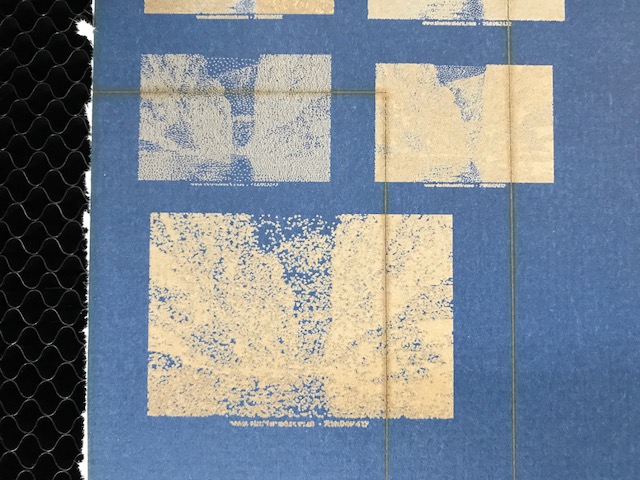
Here are some results of what I have done along with the latest suggestion. As you may tell forcing a single power level does not work well at all. Forgive the scrap card stock.
Top left: color jpg, 125 LPI setting, floydS, min/max = 0/100, Power =1
top right: Pre processed gray scale .png format, 340 lpi, FloydS, min/max = 0/100, power = 1
Lower: pre process (pshop) dithered b&w image size 2 x 1.4 cm, 300 dpi .png. Directly imported with no image scaling in GFA. Same GF settings as top right.
Compare this with the results from previous supplied photo at top of thread. The GF has the capability of doing better, but feel it’s a software item.
Something else to consider when you’re doing this is that you may be trying too hard to do it in one single shot. You may have to experiment with doing it in a few passes, with the same lower power settings to allow for the contrasts you want.
Think of it this way: low power gives you good contrast without blowing out the highlights, but running the same pass over and over the same spot again would gradually add brightness by retracing over the same area. On rock, at least.
It totally depends on the material. Since that’s colored paper, it’s more about the quantity of whitespace as it relates to the foreground color. So it’s all about the tighter stipple pattern.
IOkay, so now I am going to be a bit unfair at this point, because I am comparing to an operational base of another manufacturer. If I understand you correctly, you’re stating that achieving higher contrast may require “doubling up” on the stippling dots. I would disagree, because the first pass would require significantly less print artifacts. The “other” machine example did a complete image in one pass.
Multiple passes are just increasing the burn in depth. This is engraving which is part of the original problem in point. Making multiple passes on harder materials may seem necessary, but it still can be accomplished in a single pass with a proper stipple pattern. To be clear, I love the engraving, but I also request a more representative single layer etch.
The intent of my feature request is not about dis honoring the GF’s capabilities by proving that it is not feasible with the current software options. Finding a work around is not a feature to be added, when it can easily be accomplished on another similar device. I’m hoping that GF can see the merit in my humble opinion and make it a better machine.
I kind of feel the point is being diluted through all the tips offered that really weren’t a solution to the request. I hate to say it because it sounds petty, but look at the number of likes on the initial request compared to the number of likes on the first suggested reply. This can indicate that people believe there is a solution, but IMO it’s false. My case is diluted by those who won’t read any further. Sorry for the rant, but I’m cranky from hearing that I should try proof grade materials (official reply)
This might sound a little weird, but try lowering the LPI and running it again. I’d try 225 to start with.
340 LPI tends to overburn itself a little bit. In the darker areas, it will just deepen the engrave, as you’ve noticed. (For surface engraving, I never take the LPI over 270, and then only use that one if I want it to cut a little deeper.)
Just give it a try, it might get you closer to what you’re looking for with the dithering choices they already have set up for us. (I like the second one, but currently the options appear to be gone so I can’t remember what they call it - not the Floyd Steinberg or the Map Grays.)
I agree though that a half-toning option would be sweet to have in the future on this thing - great hopper potential if they don’t already have it in there.
Kerf is 8 mils. That’s a decent first approximation of the dot size, so that would be 125 dpi. Let’s be generous and say 4 mil dots at low power. Higher lpi will just give you a bunch of 4-mil dots drawn overlapping on a whatever-lpi grid. You also may want to play with speed because in the x-direction I’m not sure what the time resolution of the beam is, so at the highest speeds it might not turn on and off fast enough to match the lpi setting.
I have had to deal with this even with engravings where I want depth: once I’m into overlap territory, doubling the lpi essentially doubles cutting depth, and I have to back down the power commensurately.
I think @curtis is correct in saying GF is missing a halftone mode. That is a regular array of dots whose size varies to make the tone. Since the laser spot is not a well defined circle but actually a Gaussian intensity distribution then it will burn more quickly in the middle, so a short blast of low power should make a small dot and higher power a large dot. The laser would need to be pulsed to give a horizontal DPI equal to the LPI.