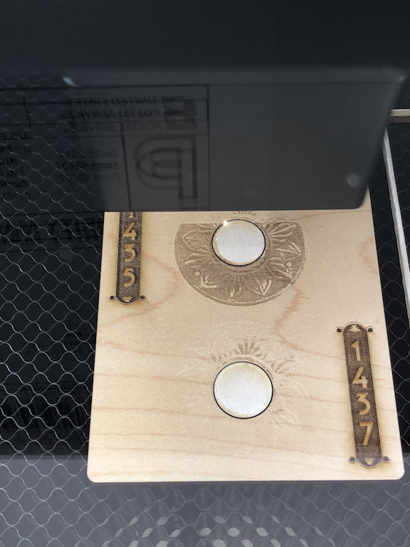
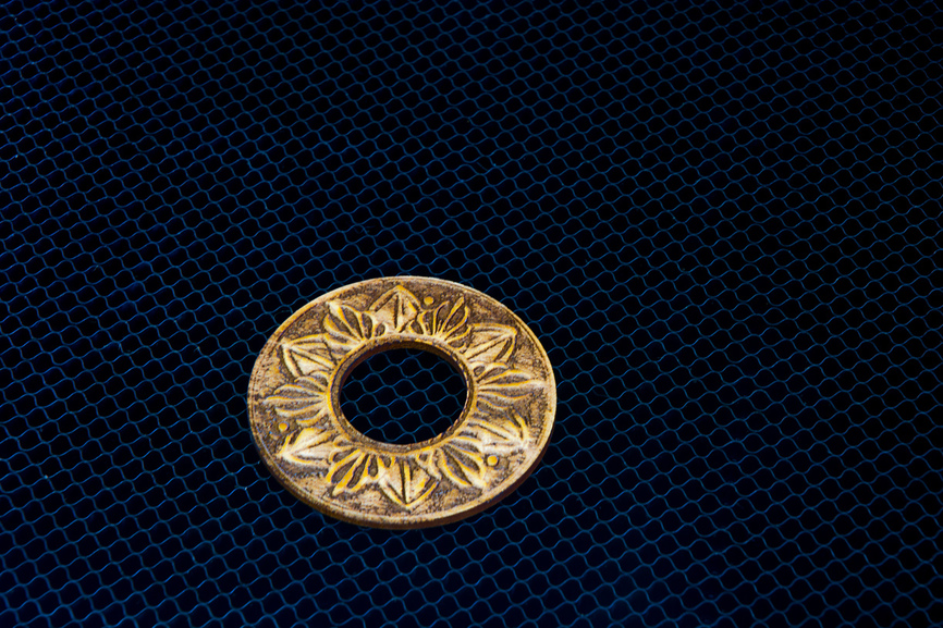
It’s not perfect yet - although the house numbers came out beautiful, I haven’t figured out the best settings to engrave the rosette. The rosette is from a photo of a vintage doorbell button. I want to carve in the depth. It seems possible, but it’s hard for me to get the exposure right on the image.
I’m using “vary power” on the rosette. After this attempt I’ve tried 0-full power with .1875 depth. Feels like I just need to adjust exposure/levels more carefully on the image.
The UPS guy is going to love ringing your doorbell!
What’s the image of the rosette look like? Looks like it has potentially a lot of midtones but not much on the dark side towards black? Vary-power will ramp the power according to the pixel shades (0-255, if you want to know more about that); max power is based off of true black (255), not just the darkest value in the image.
As far as the “depth” - make sure you’re specifying the actual material thickness (that helps with the preview). And then the focus input box should also be the material height (generally speaking). The numbers don’t do anything as far as depth of the engrave - as far as specifying what the max depth will be. That will be based on your power and speed and take a bit of testing.
Cool idea!! Now you’ve got me thinking about a backplate. This forum…
Oh! Thanks for the tip about the depth. I was definitely using it incorrectly. I’ll post pix of the rosette image and different adjustments… but first sleep after a long day of lasering.
Random tip; my wife got some small cedar discs to prevent moth infestations. It turns out that laser cutting into cedar releases a nice smell.
I wasn’t sure which box you were specifying for depth. In the material box at the top-left, you specify material height, which is used for the camera placement.
Then, each operation (tabs on the left), you can specify a focus height. That defaults to the material height when you enter your own material height above, so that the laser focuses on the material surface.
Setting a different focus height is used for a couple of things: focusing “deeper” into a material (I do this for cuts where the image is face down), and intential defocusing for various effects. And probably some others I don’t know about or have forgotten about.
For engraving, putting the focus at the material height gives you generally the sharpest detail. So you might be even happier with your next runs!
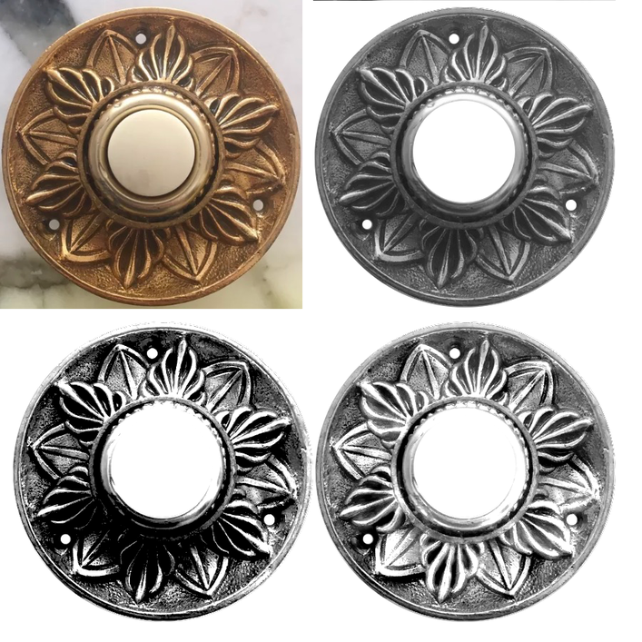
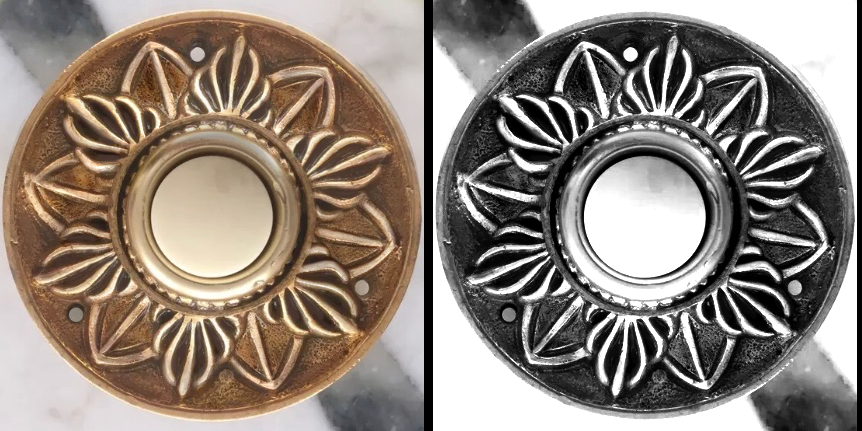
FYI - here’s the original rosette image, and my subsequent attempts to do an interesting cut with it. The lower left one turned out best - except in the lower half. I tried to dodge to correct, but I either overcorrected and/or need to dial in the GF settings better.
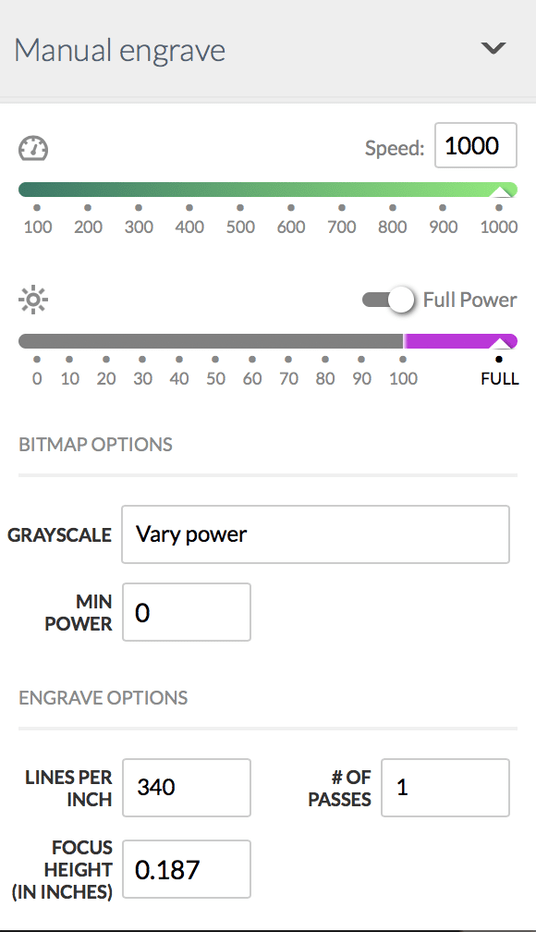
And here are my (questionable) settings.
I imagined that vary power would give me smoother gradients, but I’m not sure that’s true. Any recommendations here?
The reason that I ask, is that the core of the PG plywoods is draftboard, which is an MDF type material. The engraves that I’ve seen and attempted (only a couple times) on the ply and draftboard itself seem subpar. Not the Glowforge fault; it just doesn’t develop contrast in the engraves very well as compared to hardwood. The draftboard seems really “muddy” when you get into it.
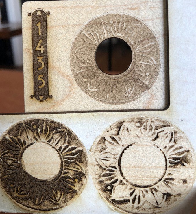
For an example, I grabbed the bottom-right from your 4-up. I put it into Photoshop and brought the black up just a hair in levels and hit it with an aggressive unsharp mask. I dropped it into Illustrator just to add the cut lines, saved it as an SVG and put it in the Glowforge with a sheet of Maple Hardwood.
I used 1000/100 Vary-power engrave with a minimum power of 20, 340 LPI (which was too much, probably for a very low res file), 1 pass, focus height of .125 (set by the Glowforge PG settings). The cuts were just auto settings.
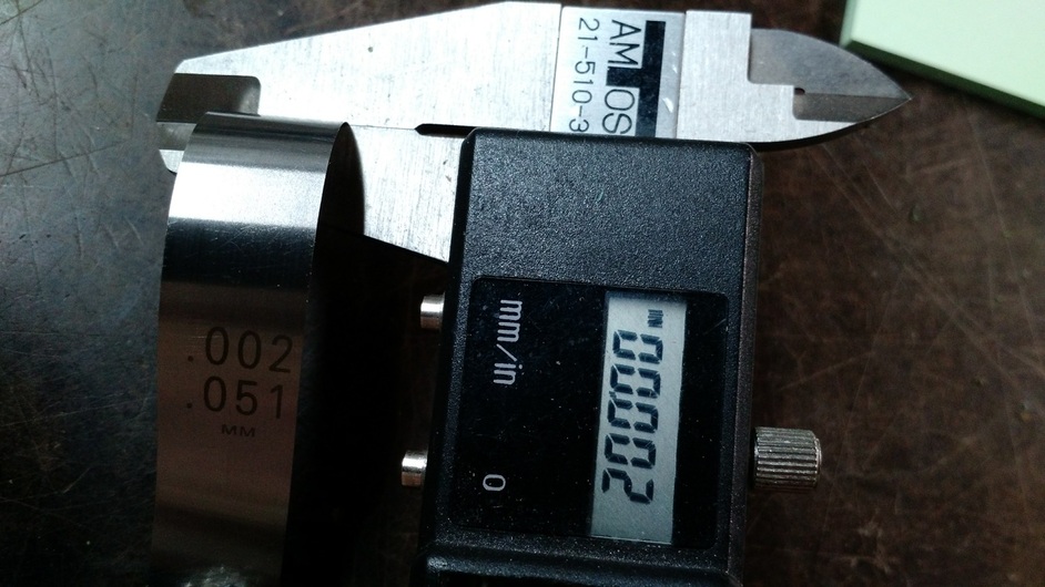
Now - this isn’t an amazing engraving. It could definitely be tweaked… and I’m sure your source image is larger than what you posted - I brought it into Photoshop and it was about 465px square after cropping. Not a great file to work with - but still, the results aren’t too shabby for such a low res file. I’m seeing engraves from just marking the surface to .04" deep, if the calipers are to be trusted.
What I’d do is open this in Photoshop or GIMP or whatever your photo editor of choice is, duplicate the layer then rotate the top layer and use a layer mask to get rid of the shadow at the lower area.
When you do an engrave with varied power to get depth, you need really high contrast to get well-defined shapes. Smoother gradients don’t have that “punch” particularly when engraving wood.
Thanks! That looks fantastic. If I’d known you guys were going to be this helpful I’d have uploaded a higher res version! But the tips about the mask and rotate, the contrast, the multiple passes, and the plywood are all incredibly instructive. I appreciate it.
Might take a couple of days before I have time to adjust and re-print, but will share results soon.