I am no designer, and I have 5-6 go-to fonts. I use Garamond for most things. I am delighted that there are rules or guidelines for someone like me that would like to choose well.
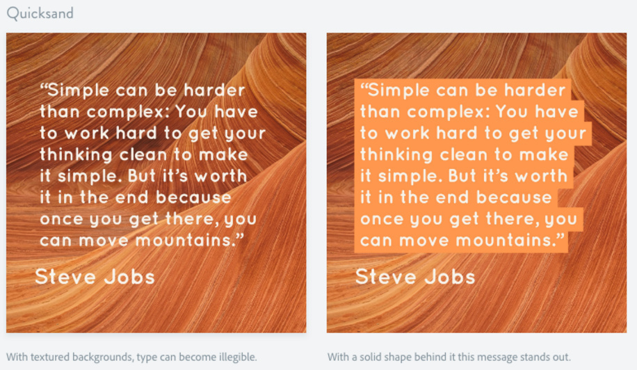
I would say that they missed the mark a bit on this example. The “proper” version on the right should have a fixed polygon (rectangle) behind the text. For the example they show it just looks messy, and of these two versions, I think the one without the background looks better. A box instead of the highlight would look much better.
I feel they accomplished what they intended under the bullet point (separating the text from the background) though aesthetically it’s probably not the best. Centered text might work better with the staggered background with the symmetry it would create - or even justified.
Sure, they got the point across, but like you said, aesthetically it wasn’t the best choice, and essentially this article is about aesthetics. Therefore they should make the best aesthetic choice that they can. Then again, aesthetics are subjective, so who am I to judge?
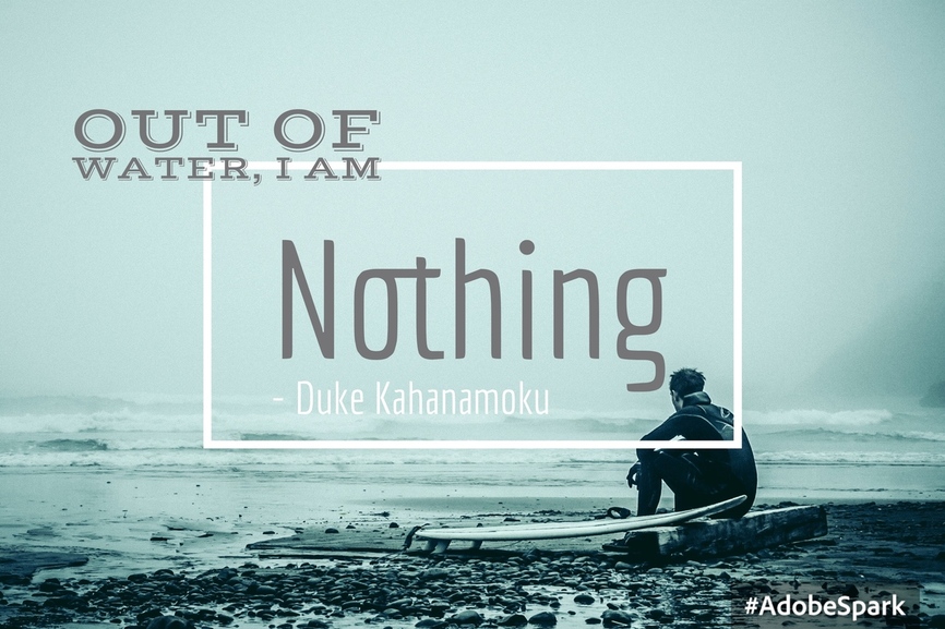
For what it’s worth, (@cynd11) I downloaded Adobe Spark Post to my phone and just used one of the first images available on my Adobe Lightroom cloud sync (which I don’t really use and was ironically from the PNW).
The app is really pretty intuitive. It’s basically a design wizard that walks you through the process and you can alter a bunch of parameters to find a result. You could probably take the time to separate out text components so you could be really specific with separate components of the design but honestly, I’d rather do that on a desktop… maybe because I’m just used to that.
They have a ton of different document size templates, Facebook ads, Instagram, etc. I’m not sure what resolution I have on this file on Lightroom Cloud but it saved the document at 2560x1700.
No problem! Honestly, it’s kind of fun. It really is kind of cool to throw something together in literally 60 seconds that doesn’t look half bad. It’s not a replacement for graphic design - but for the lay person, it seems to be a cool tool. It actually saves my “posts” (what they call them) in an editable format so I can go back and make changes.