Here is a useful photo processing technique to improve results. THis is based on an analysis that I have described in detail in the thread here.
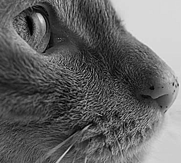
This photo is my baseline:
From the original, it has been converveted to grayscale and sharpened to bring out detail. I did three engraves based on this:
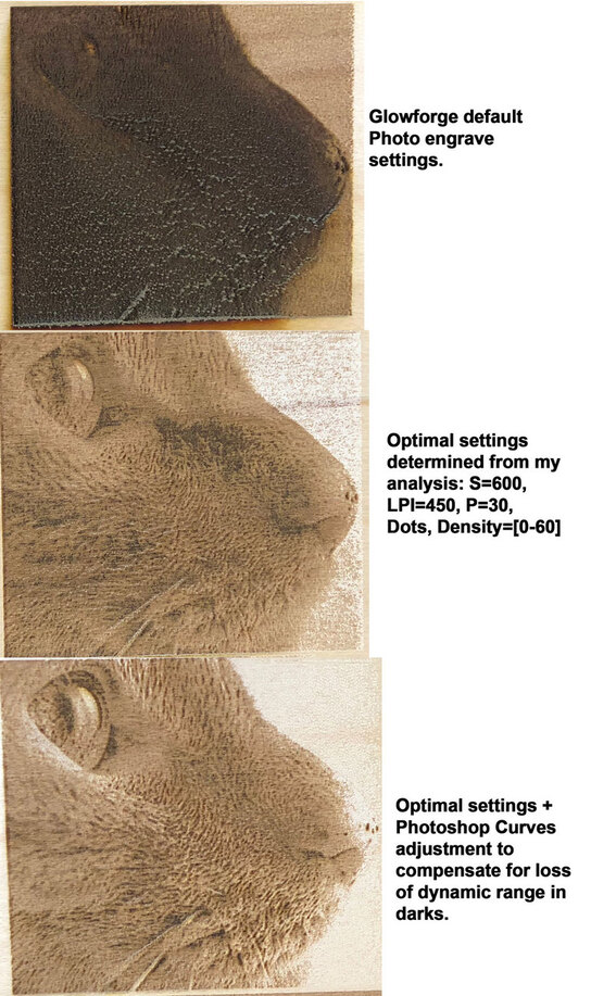
Default proofgrade settings.
Optimal settings determined from my analysis in the thread linked above.This was Speed: 600, LPI: 450, “Power”: 30%, Grayscale: “Convert to Dots”, Pattern Density: [0 - 60].
Optimal settings, but with an additional adjustment to the photo (describe below).
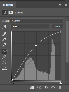
I think you will agree that the 3rd engraving is the best, and much closer to the original photo. The detail in the eye and whiskers area, is much better, and the overall engraving is more natural looking and with an exposure matching the original. Given the determination that there is less dynamic range in the darks, I used Photoshop’s Curves feature to compensate for that. Here is a screenshot of the Curves adjustment panel:
So, I’m off to use this technique and re-print some previously botched engravings.
Nah. This is the internet. Why would anybody agree about anything. I think the second one looks the best particularly for the end of the nose. Though the eye looks better in the 3rd.
I think comparison with the original also yields the same opinion. The end of the nose looks more accurate in the 2nd, but the eyes more accurate in the third. I could go either way on the shadow along the nose.
Of course, they both beat the pants off the preset.
Ok, interesting.
It is good to get another opinion. I may be biased a bit by being able to see the actual engraving. The photo doesn’t entirely do it justice.
Nice detective work. The best way for me to learn. Please keep sharing your results.
Yes, In the announcements Dan said - Photo The key to great photo engravings is your photo editor. You want lots of contrast and liberal use of the “sharpen” effect!
If you took the LPI down with those default settings it would look a lot better. Not as good as yours did with the ‘Curves’ adjustment, but that’s what he meant when he said the key is your image editor.
Between contrast and lightening, you can get some really good results.
I think the problem with the presets is the LPI. Somewhere around 200 LPI the beam starts to overlap. With higher LPI the power needs to be reduced. An engraving I did at 340 looked ok, but at 1355 it burned a hole through the material.
I had also noticed an image in the design software that some details in the image lightened to the point of disappearing on the monitor engraved just fine.
You are not alone man, everyone has had to do the treasure hunt to find the best settings for the image and the material.
You have an unfair advantage of having the actual output in front of you but by the photos, I’ll go with everyone else in that it is a wash between 2 and 3 depending on where you look. Kind of comes down to your own artistic view as well. I don’t want an exact duplicate when I do an engraving, I want something that looks good and is interpreted to the medium.
Thanks for this. However, it seems counter-intuitive to me. The issue I am seeing is that grays above some threshold (~60%) can not be distinguished from each other. That curve you have there appears to be lowering the color space range assigned to these darks (those from point 1 to 2 in your diagram), expanding the mid-range, and flattening the highlights.
BTW, this looks like the standard monitor gamma curve, no?
It’s also a curve that’s used (or used to be used) regularly in print media when you had to halftone an image for newspaper printing. For that, though, we’d also pull back the whites to not be 100% pure white, but rather closer to 95%-97%, which might also help here bring back some of the image lost in your example #3 around the nose and mouth.
I noticed in photo 3 you lost some of the bottom end of your dynamic range, which is why I recommended bringing in the lower end a bit. The S curve would bring some of those dark ends back, but you definitely need to tailor the curves for every image individually.
Also something I normally do is print a standard grayscale on every material type first to get that dialed in before printing images to ensure I can get the full dynamic range, and not waste material in the process. (which I see youve done something similar). Ive gotten it pretty well documented on my PRU. unfortunately those settings dont work for anyone else.
I personally only use 340lpi or higher for photos. Generally 340 is more than enough, but I try to never go under it. I will only push it lower if im reach print size limitations. I also always use 0-100.
On my PRU Ive found that if I set power to full, and scale off of that I get the best dynamic range, but this could come at the expense of some tube life. Again this could be something that I completely change when I get a unit with a good tube.
Either way, I think if you added a few extra points in your curves to keep your mids and highs where they are and bring darks back in, it would be pretty close to perfect.
When I get my forge maybe I can try to reproduce it and follow up
I do personally, but I’m using a PRU, so it’s gonna be a bit different on a release unit. I haven’t been able to achieve the same level of darkness with an alternate speed power combo.
I see, so I understand there are differences between the PRU and the release units, but you must be running at a much higher speed value than me. But the equivalent energy density of my 30% @ 600, would be 50% @ 1000. So still no where near what you are hitting. I guess there is more difference there than I would have expected.
Have you tried rinsing the original result? I’ve found the initial char looks quite bad, but the contrast you get after cleaning winds up looking pretty nice in a lot of cases.
I haven’t played with the gforge settings like you, but I have tweaked my photos after doing a test engrave. I don’t use the default photo engrave settings as they don’t seem to produce the quality of image that I enjoy, but I will use the default engrave settings. With that said, if I notice that there is a section a little darker than I like, I will go into Photoshop, add a mask to the sections I want to brighten, and then edit only those areas. In the case of your image, I would have either gone with an exposure change on the nose area specifically, or I would have just used the Burn tool (with an increased exposure value) to slightly darken it. I prefer the second method with a lower 20-25% exposure because it will stack, and you can control where you’re brushing over so you’re not going too far with each pass. I recently started using the pen tool in order to create my masks:
Select the pen tool and create anchor points.
If you need to bend or curve your line, continue to hold down on your click when placing the next anchor and you can adjust the curve. Be careful when placing your next anchor as it will also try to follow your curve but in strange ways. Here’s a video that explains excellent techniques when wanting to select secific parts of your image: youtube link
After getting your selection ready, you can hit the “create new fill or adjustment” option just beneath the layers panel and choose whatever option you’d like; this includes the brightness and contrast, exposure, levels etc.
I think the third image is the best overall as it’s more vibrant, but the nose is a little bright. At the end of the day, it comes down to personal preference, including what the image actually looks like IRL, and had you not posted the second result, I doubt there would be anyone to even mention anything but positive remarks. Great work, and thank you for pioneering into specific settings. I will test these as well and post my results with my methods included as I have been working on a friend’s wedding picture.
More or less, a light brushing helps. Depending on the level of char is makes a rather large difference with minimal effort. Just make sure to dry it off and be mindful of warping in thin wood.
I would try engraving a set of gradient bands, clean them up and then scan them to measure the grey value. Then generate a correction curve from that. Repeat until the scanned grey values are linear.