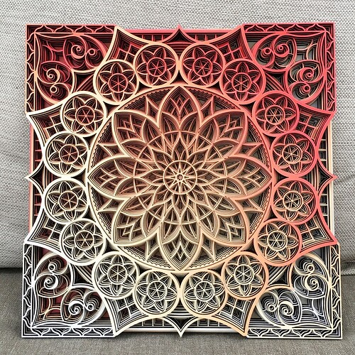
Continuing my exploration of different ways to decorate mandalas. I’ll give away the secret in a minute, see if you can figure figure out what I did here.
Previous installments here and here and here.
A few notes:
- Start with flat materials. Warp is more of a pain to deal with than you might think at first.
- Registration pins are also clutch, I use brass rods, but you can use dowels or what have you. I like the 1/16" brass because the holes are really small and easy to cover up.
- After each cut, label the back of your layers with the layer number and orientation. It’ll help you assemble and get perfect alignment later.
- Prepare to have lots of cutouts that you won’t want to throw out. They are cool shapes and colors, it’s kind of irresistable.
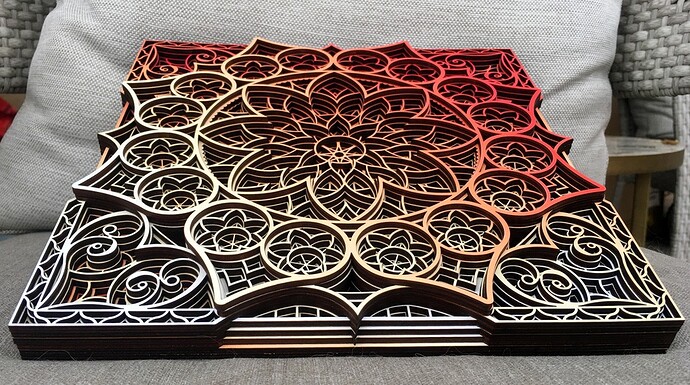
- Overall size: 10.5 x 10.5 x 1", it’s 8 layers deep and cut from 1.8" baltic birch.
So, onto the color scheme. I wanted to get a color fade that rotated with each layer… it should have led to a low-contrast center with a flowing light yellow to red fade surround. There are probably lots of ways to do this, but I was shooting for precision and didn’t trust my color blending/painting skills.
I looked into a bunch of possibilities about how to do it and settled on something I am pretty pleased with myself on: custom printed cardstock. I made a bunch of gradient images at different angles and had them printed in color at the local fedex. I then followed the same glue-up and cut routine that I followed with my purple cardstock mandala before it. (Including the acrylic sealer at the end.)
Alignment was a bit of an issue, remember I was trying to get really accurate positioning, but that’s pretty easy to work out if you’ve ever done any kind of precision cutting before. I would say I probably got it to +/- 0.01" in both X and Y, with probably < 1 degree rotational accuracy. For this project that’s more than accurate enough.
Color reproduction is a bit lacking at the local fedex, this was the general concept I had in mind and I was open to a range of outcomes, no no big deal here. If color were important, I would probably spring for photo printing, but 16 12x12" photo prints that would not be cheap at fedex. Maybe purchased online would be better?
Oh and yes I said 16 prints. Get yourself extras, especially if this is your first time doing it. You’re bound to mess something up and have to recut at least one. (so I’ve heard, I didn’t screw up two layers, not me, nope. How dare you suggest that I would make a mistake…)
Anyway, I’m happy with the end result. The sky is the limit on color schemes with printed layers like this. I am not sure what I’ll do next, but if /when I do another mandala I’ll be sure to post it.
Also, if you wanted to give this a shot with off the shelf cardstocks, there are ombre cardstocks out there by bazzill but they are very hard to find – maybe they were a limited run?
Oh also also: I like the way this one looks at oblique angles more than I like the others at off angles. Not sure why, it’s just pleasing.


 What are you planning for them? I am thinking about what all of them put together would look like.
