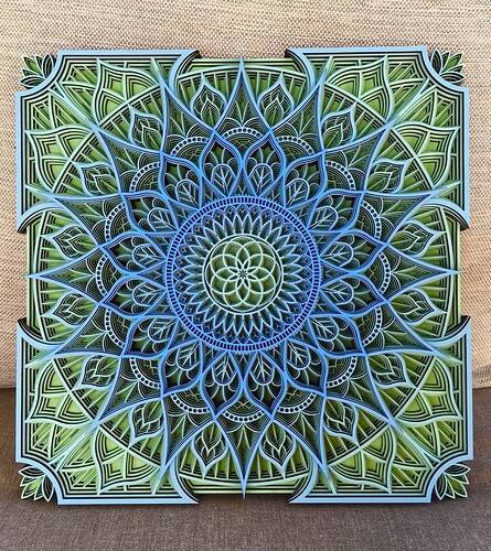
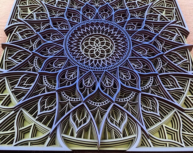
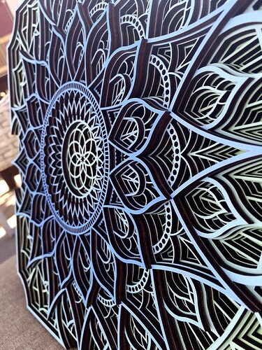
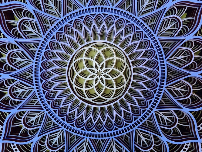
So, this is my attempt at a first-surface painted mandala. I wanted to try to achieve a gradient from a pure blue to a pure green, I think it went well. I’m fairly new to paint mixing and color theory, so this has been an interesting learning experience.
This is the third mandala in this series, links to the others are below if you haven’t seen them yet. It’s different from the blue one in that I didn’t paint the edges, I’m trying to find that sweet spot between vibrant custom colors and labor. This was a good result, but it has some pluses and minuses as compared to the cardstock method.
A quick breakdown on the two methods.
Paint:
- Truly custom colors
- Messy (prepare your workspace thoroughly, you need a lot of room)
- Slow (drying time, multiple coats, etc)
- Correctable. If you nick the paint or smudge it, you can mix it up and repaint part or all of it.
- Imprecise if you’re mixing your own colors. It’s definitely an art to match colors and make a nice gradient, if that’s your goal.
Cardstock:
- Locked into colors of cardstock that you have on hand
- Very vibrant colors are possible, there are lots of cardstock types and finishes available
- Faster than paint overall, the glue up and drying process is faster than the paint process, especially if you are mixing custom colors.
- Less correctable compared to paint. If you damage the cardstock you can blow part or even all of the entire project
So, what would I recommend? I mean either is very good, the end result of paint and cardstock is very similar – the darker edges versus painted edges makes a much larger difference. I will say that peeling the masking off of the cardstock or painted panels is such a pleasure, it made me laugh at the bright colors every single time. It’s a very satisfying project.
What’s next? I’ve got ideas about incorporating motion into these, using mixed media to paint them, using metallics, experimenting with higher contrast techniques, experimenting with painting specific areas different colors, using acrylic as the primary material, even projection mapping. The sky is the limit.
(Quick note, the blues and greens are very pure, this next pic makes it look purple-ish, and there is not a hint of red in this whole thing. Trick of the camera and white balance.) Still it’s a good look at the details, so I’ll put it up anyway.
