I’ll end up using this as a fundraising item in the future, but for now it will sit in my office at work. This is Rest lake in Northern Wisconsin. Do you like it with color or without, as I’m planning on cutting a few of these in the future.
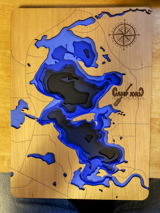
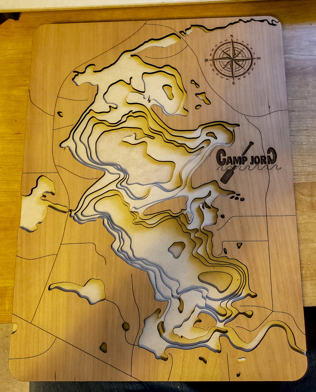
I like it both ways but I think I like it best without the color as it looks more like a chart.
6 Likes
Since you asked… maybe a balance between the two; softer colors.
9 Likes
Nice work! I agree with @jbmanning5, I would love to see it with paler blues.
3 Likes
I love it with the strong colors 
You probably can’t go wrong either way. It’s just a matter of personal preference and I bet you can find people who will pay money for both.
6 Likes
A translucent blue might be interesting, it would layer and become darker with depth…
8 Likes
First of all, congrats for your wonderful work. My choice would be without color, but maybe a single pale blue that gains intensity from the layers.
2 Likes
Yes I definitely think that perhaps the water areas might be of acrylic in different colors of blue and if feeling extreme LEDs would be amazing.
3 Likes
Love the map. A richer gradient in the blue (striking) would denote depth. Both are stunning!
3 Likes
Honestly, I studied them both for awhile and I just could not decide. They both look great!
3 Likes
I lean towards the natural wood tones, but they both look fab! 
4 Likes
I want to make the same type of projects, I was sure i’d be doing them in color but I prefer the white here.
Maybe the blue is too rich, something more subtle maybe?
1 Like
Maybe a darker finish on the front face piece would ease the transition into those awesome bold blues. Great work!
I agree. A pale enough blue stain that still shows the natural grain and still shows as water.
4 Likes
Beautiful. How did you do that!
1 Like
Which part?
is the map cut from multiple layers of wood, stacked on top of eachother? or is it burned into one thicker piece of wood? Sorry, NEWB to lazering…
1 Like
Very nice!
@jbv’s comment using a translucent blue is a great suggestion! (he must be a graphic designer!)
Other cartographic advice (if you are interested):
A scale bar and bathymetric contour interval would be nice additions. Fancy compass north arrows are nice, but I have always felt that they can focus the viewer’s eye away from the map content so I make them smaller.
Most ancillary information is usually put in a legend / keybox with a neatline, possibly add a small outline of Wisconsin to show location in a broader sense. A Rest Lake title at the top could be nice too.
Basic components of a map include title, frame, scale, north arrow, legend / keybox and data sources in case you are interested in basic cartographic style / standards.
Keep making them and posting them!!!
8 Likes
is the map cut from multiple layers of wood, stacked on top of eachother? or is it burned into one thicker piece of wood?
Yes! The map is cut from multiple layers of 1/8th material and then stacked on top of each other. The top layer, in this case, was cut from proofgrade cherry. The remaining layers were done with draftboard.
1 Like
How did you create your files? I’ve been wanting to create a great lakes map and tried two different guides online and didn’t have good success. Any tips or guides?
1 Like