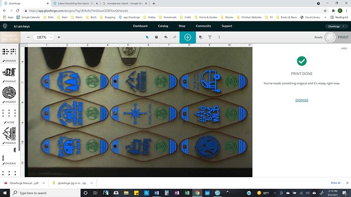
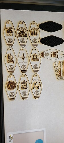
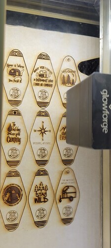
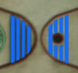
I’ve been trying to make keychains that I’d like to try to sell to a local RV dealer. These are just examples for them. Here’s what they’re supposed to look like. As you can see, there are lines at the top that are supposed to engrave, but they didn’t. (I haven’t removed the board from the GF.) I’m sure it’s something easy, but I don’t know what or how to fix it. If possible, I’d like to just be able to print just the lines at the top without removing the board. Could someone help me please?
I know how I’d do it, but it depends on how you created the files.
So… how’d you create the files? What software were you using?
Can you upload the resulting SVG? It may be a problem with the file (I suspect multiple copies of the “top” lines on top of each other, resulting in ignoring the engrave. Pretty standard stuff.
The gist of how I’d fix it (regardless of what software I made it with) would be to take the file, look for defects, especially doubled shapes on each other. Once I have determined that the file is ok…
Break the top lines out into a separate color. Then I’d go into the UI and make a note of the exact position of the existing art by doing a control-A (select all) then use the precision placement icon in the bottom left to get exact coordinates.
Write them down. Also take a moment to write down your settings for the engrave.
Delete the existing faulty art from the GF UI. (alarming, I know!)
Upload your new color-corrected file. The top lines should be their own step now.
Select all, and use the precision placement to put it exactly where the old art was. Since you haven’t moved the board at all, alignment should be perfect. Don’t lose your nerve if the camera looks wrong, it is wrong. Ignore it.
Turn on the top lines only, and engrave away.
Make sense?
@evansd2, thanks! I “ungrouped” them, found that the top lines did have two copies. So I’ll take the time to fix them all, changing the color, and try again. I so appreciate your help!
Again, not sure what software you are using, but my trick for this:
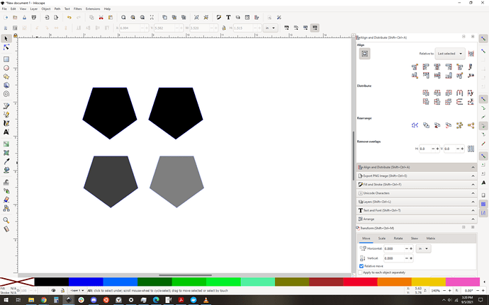
Select all, ungroup all the way down, then (in inkscape) break apart the paths. This makes all the shapes into independent objects.
While they’re all selected, I set the opacity to 50%. Doubles will look much darker than singles, so it gets really easy to spot the doubles at a glance.
get rid of the dupes, then turn the opacity back to normal, and you’re ready to roll.
A quick illustration: The top row of pentagons, one is doubled and the other is not. Can’t tell which by looking. Bottom row? Opacity 50%, it is really obvious that the left pentagon is a double.
Gotcha. I did get it fixed and they’ve printed out beautifully. Good to know about changing the opacity. That’ll help me next time.
I know you solved it, but you can tell you almost certainly had overlapping shapes in the first pic - note how the “top” engrave shapes (around the holes) are slightly different color than the “bottom” ones on adjacent parts. That’s because they were (at least) doubled up.
I think you might have that wrong… the colors definitely look different but I think that’s not why.
All the shapes in the ui have an opacity of less than 100, meaning they’re slightly transparent. I think the “bottoms” look darker than the tops because they’re already engraved, and the dark background is coming through the blue engrave step. The tops are over a nice bright background so look lighter.
Of course the way to test this is with controlled job/material setup, screen caps, and an eye dropper tool, but I think this is what’s going on here. That being said you may be right, this may be about the overlaps stacking just like my opacity trick, I should really take a closer look at this.
Jules illustrated it nicely in this thread:
Depending on the view, it can be obvious, or subtle.
You’re one of only a couple of regulars that I respect because you actually post accurate information vs failbook-style speculation (or “yay how cute” comments), so I would have thought you would have checked. Edit - I see now you said you would look into it more. Simple to try:
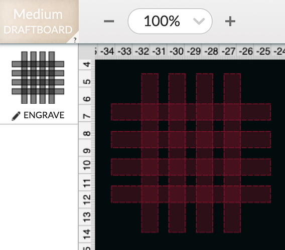
Here - overlapping rectangles. Even in the “old” view (which is my preference), it’s obvious as day. It’s even more obvious in whatever view Jules had in the thread I referenced above.
(Apologies for the deep dive here, but if you want to geek out with me for a minute here, read on…)
First:
I’ll take it! OK, onto the real point…
Normally I would have but I wasn’t at my computer, but now I am so here we go.
Short version:
“Can I look in the ui and see duplicate overlapping shapes just by looking?” Yes, generally the duplicated shapes will be “darker” – but it may be subtle, so be careful if you’re relying on it.
Your example shows what it looks like when the shapes are not set to be engraved, i.e. outside the art area (yours is way to the left of printable) , or if they don’t have settings, or if they’re ignored. That’s why (in your example) they are that color and have dashed outlines. Let’s start with that:
For art that is disabled
So you’ve got your art in the UI, which of these four shapes are doubles?
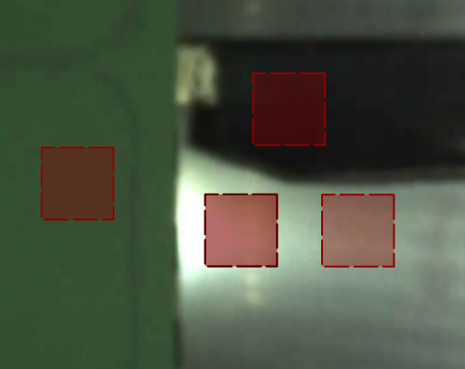
If you said “just the bottom middle”, then you’re right, but clearly the background image impacts how they look. In fact, the top single shape on the black background is darker than the actual double on a very bright background, so it it gets impossible to “eyeball” this if your material is not uniform.
Taking a look at it another way, sampling colors with the eyedropper tool and comparing them directly:
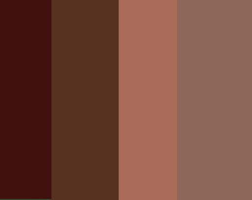
Which is the double? The third from the left. So there is a difference between overlapped shapes versus singles in the UI – but the difference will only be clear where your material and lighting are uniform – and even then it might be too subtle to count on. Add to that that it will only work when you have something to contrast it against, so this will only be possible when significant, noticeable portions of your design are doubled, and won’t help if your entire design is duplicated.
A special note: for shapes that completely overlap, the dashed outline is even more different than the background colors, so if I were looking for this, I’d be looking at the color of the dashed outlines.
Now let’s make that artwork ready to roll, and the colors completely change:
For art that is ready to be printed
Once you set the art to be engraved within the printable area, the colors are completely different and it’s a lot more clear.
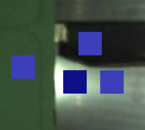
All of the singles are the same color (confirmed with an eyedropper) they are not opaque at all. Background color does not impact the actual color, but it might change your perception of the color and make it difficult to differentiate at a glance. A famous example of what I mean:
In this case, the result is pretty clear: the bottom middle stands out right away as different, so doubles are much easier to spot when the art is prepped.
Here's how it looks in all the visibility modes
The UI supports visibility modes for differently sighted users, here’s the current way that they look.
Default:

High Contrast:
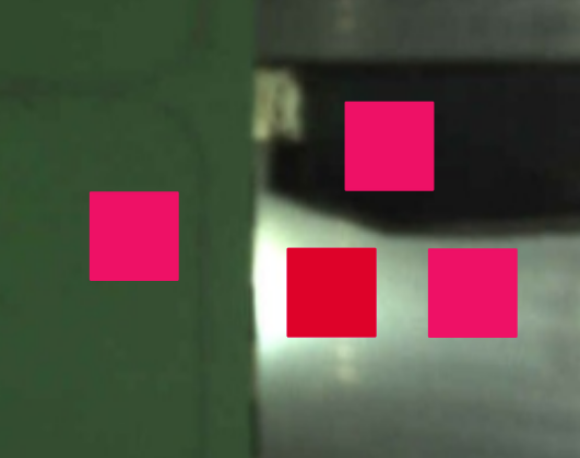
Protanopia:
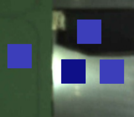
Deuteranopia:
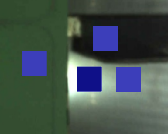
Tritanopia:
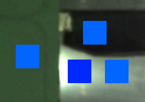
I prefer high contrast, not that I can’t see the default, just that the high contrast is poppier and more fun. Now that I’ve compared them… I do find it easier to see. Science!
So yes it’s possible to spot differences visually in the UI, with certain caveats. Hopefully this saves someone some trouble someday, but even if it wasn’t it’s been an interesting investigation.
This topic was automatically closed 32 days after the last reply. New replies are no longer allowed.
