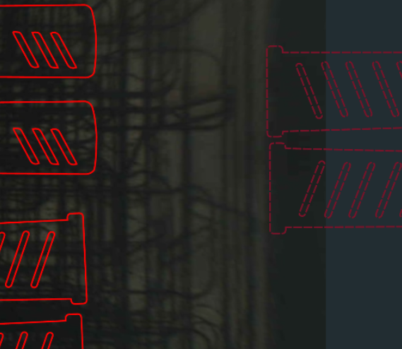
Ah, what you’re describing as “neon pink” most people see as a dark red…I’m guessing you’ve got the colour balance on your monitor set really high.
2 Likes
I’ve never touched the color balance on my laptop in the 5 years I’ve had it. Its factory setting. And its not red, its neon pink. There are items in my cutting area (cut shapes) that I’m looking at right now that are definitely RED. Everything outside the cutting area is a completely different color; its neon pink. And all my engraved text (which is small but I could always read it very clearly before) is now completely illegible even when I move it into the cutting area. It looks like a blob of text. This is a file I’ve used many times before so I know what it is but this is going to be a huge problem if I’m designing text based things within the GFUI on small items (like if I just want to knock out some simple cut shapes for keychains with text on them to use up scrap material). I won’t be able to make out the text at all which is going to be a challenge for placing things.
I respectfully disagree – I love it! It’s much easier for how I use the GF.
3 Likes
Sadly posting an image here just shows me what it looks like with my monitors settings…which is dark red. If it helps, it’s closest to Pantone 202C while “neon pink” would be closer to 225C
but vision is vision, and everyone’s varies even without monitor settings getting in the way. Luckily, you know that if it’s that colour it won’t print - and folks who have a hard time distinguishing between dark and light grey can also see it. If it really bothers you, drag it further out to the side and then you won’t see it at all unless you zoom out into the 1000s.
1 Like
This new design bold outline is making it impossible to see where everything is lining up. So upset. No matter how zoomed out or in you go, it’s impossible! Thumbs down from me.
For years I have struggled with trying to line up dark gray on black and find it easier to do that now that there are colors. When a part got lost before (quite a while back) I could no longer find it as it was always gray on gray. Now it shows up well. and even when something was cut only, I would apply a fill so I could see it on the dashboard, now it shows up even with no fill.
Some bits I might make different choices but overall a big improvement,
4 Likes
That’s all fine and dandy and I can see where the grey now being a color could help but, the outlines to everything now are soooooooooooo bold that it makes other things just impossible. Now my intricate designs look like a huge blob of slapdash. No need for all the lines to be so thick.
Eh. If you’re zoomed out, the strokes are pretty bold from what I’ve been seeing, and can definitely eat up small fonts, etc.
Personally, I think it should just be a 1pt line, since that would pretty much mimic the laser kerf - and it should still be visible, I think.
Tough parameters though since people are working with light and dark backgrounds.
1 Like
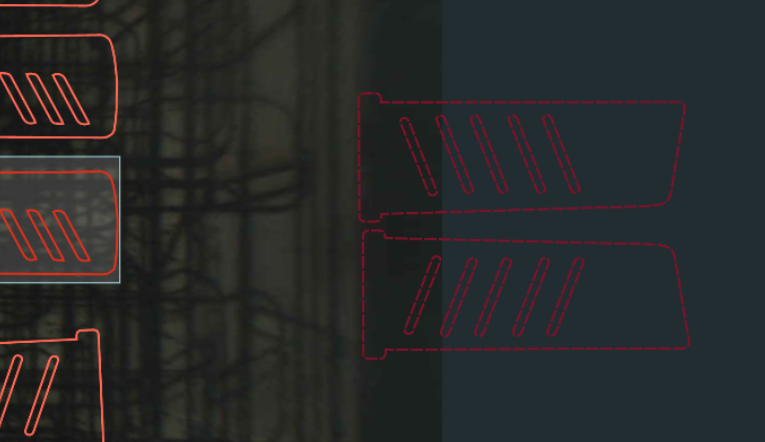
Can you post a picture of how it looked before the color change ?
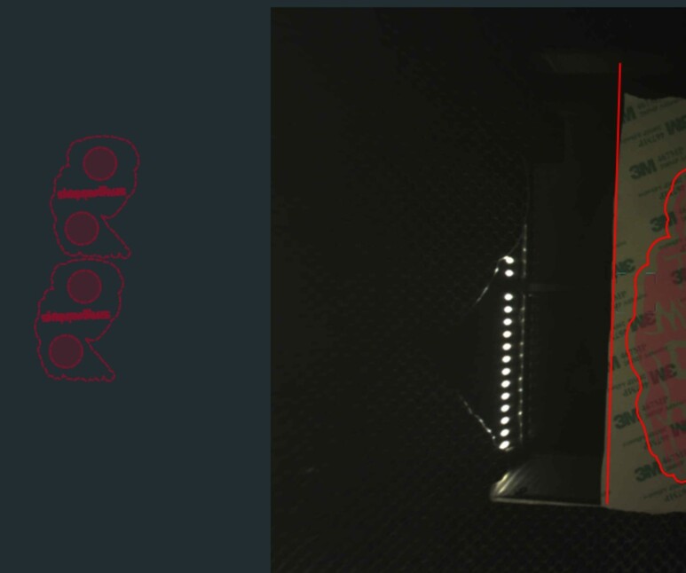
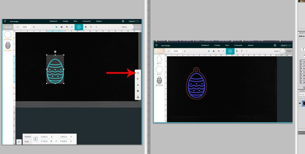
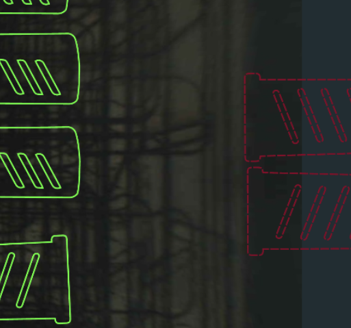
I can post a shot…left is the old version, right is the new version of the same file (further along) that was still hanging around in my Dashboard. (Don’t have too many training shots left under the old version that y’all can see. I clean them out pretty regularly.)
It’s different, but it shouldn’t take too long to get used to it. (I like the periwinkle, although the turquoise was also cool.)
I’m guessing that the turquoise was too close to green and people with red-green color blindness were having trouble with the older colors.
We’ll get used to it pretty quickly I imagine. And being able to select from the inside of the design is going to be a big plus. (Different selection boundaries now.)
Oh, and I also think that I’ll wind up liking the dashed line effect…it’s pretty hard to miss and that will cut down on accidentally having part of your design off in a margin. (Sometimes “In Your Face!” isn’t a bad thing.) ![]()
9 Likes
I’m not a happy bunny with it either.
I find the difference between selected and not-selected is not strong enough - would prefer the old “blue when selected”
I find the dashed version not as easy to spot either - prefered the old “grey when out of bounds” version.
I’m an older user with poorer eyesight - that’s the trouble when your GUI is designed by young things with 20/20 vision!
1 Like
I resemble that! The main difference I am thinking is screen-rez. The laptop is pretty good but as a result everything is tiny but I have a cheap second screen of lower resolution that fixed things like text are bigger and easier to read, but a variable thing like the design if three inches tall in both screens would have thicker lines un the second screen, and if I were using an Android screen thicker yet. But that would not be a GFUI issue as much as a choice of screen as doing a decent job from your phone is problematic anyway.
My bad eyesight was exactly why I hated having gray on black that it took a lot more effort to align and an engrve blocking everything was worse, though I would still wish it just color the area than hide it even now.
1 Like
My vision isn’t what it used to be either, but I used to have serious problems trying to visually align on that older gray tone when something was set to Ignore…there are a couple of processes I follow for depth sculpting that require the addition of additional raster images over the existing ones on the board…if it wasn’t done in the outside design software it was damn near impossible to pull it off in the GFUI.
We’re having to slightly rewire our brains to use this, but I can see some potential benefits, so I’m willing to give it a shot. (It just adds another wrinkle to the old walnut.) And I think once we do get used to it, the benefits are going to become apparent. 
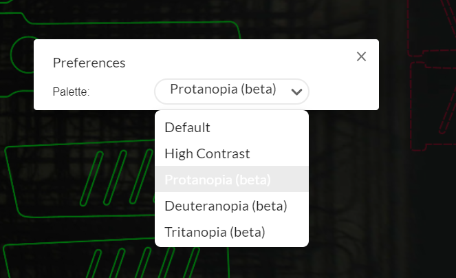
On the other hand, I wonder how difficult it would be for them to add a color scheme to the choices for “Legacy Palette”? For those who absolutely can’t stand it now.
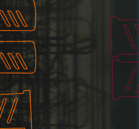
Or let me get in a vote for Mardi Gras colors…Green, Gold, and Purple. Or Pink, Purple, Blue and Aqua is a good palette. 


2 Likes
as long as they don’t call it the “old people” toggle button. 
6 Likes
It’s great people who had issues are now happy.
It’s not great they didn’t consider the majority that had no issues are now forced to accept these changes.
I’ve worked in the software industry for over 20 years and blanket changes without regard for those who have to use the software on a daily basis is one of my “pet peeves”… Just chalk it up on the list. Terrible implementation.
1 Like
There is any other sorts of “upgrades”? Even Blender and Inkscape have done that to me, AutoCAD was particularly bad about it. And Microsoft? ![]()
Presuming “the majority” agrees with you is definitely a look. They do extensive beta testing on every release with focus groups of users, and they have access to actual user data so they know what the actual majority is doing. I’m sad that you don’t like it, but it would seem that you’re in the minority.
you have no idea if the majority had no issues. neither of us should presume our preferences are “majority” based on what a small group say on the boards out of 10k + GF owners.
i do agree that if there are a number of people who miss the old settings, they should add them back in as another option.