Maybe this belongs in the Everything Else but here goes.
What is a general guideline to making a picture fit to engrave at the largest size onto wood?
There are other topics I know but most seem pretty dated and lots of changes have happened.
I know I should turn it to grayscale, but 8 bit or 16 bit make a difference? I know to crank up the contrast but how much is too much? And I also read to Sharpen it, just a bit or a lot?
Lots is in the eye of the beholder but trying to find a good baseline.
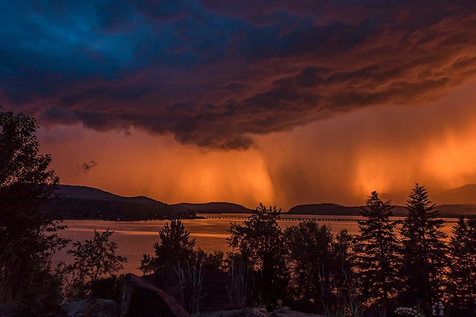
Here is the photo in question. Any and all advice is welcome
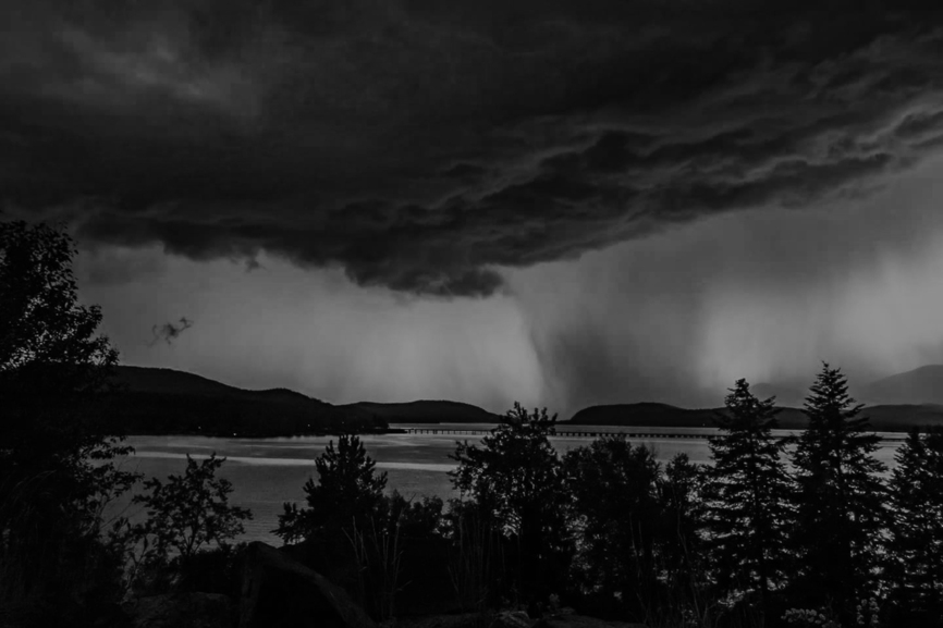
(Convert it to grayscale and see if you still like it. It might not be the best candidate for engraving…there isn’t a lot of contrast, but it’s still beautiful!)
The colors are what makes that so beautiful - maybe you should print it and make a lasered frame for it.
My aunt wants it lasered, shes the one who took the picture. My hands are tied
I tried to talk her into that orange colored wood to kind of replicate the color but nope, she wants the largest size. Stubborn one heh.
This looks like a poor candidate but I’d absolutely love to be proven wrong. Like @Jules said, make it B&W, play with contrast, print small samples, experiment.
Maybe this is a candidate for true B&W instead of grey scale? Experiment, experiment, experiment!
And good luck.
i’ve played a little. it may end up a little interesting, but it will never have the drama your aunt is expecting because the drama in the photo is the color. in black and white, especially when you work on creating more contrast, just looks like storm clouds over a lake. and the storm clouds themselves don’t look that special in B&W.
Gosh that’s an amazing photo. As others have said, I can’t imagine it will translate to other media very well. But it’s art… somebody will like it engraved into wood. I hope that person is your Aunt! Thinking about this in black & white terms, I wonder if it would be better suited inverted and etched into slate?
It’s beautiful!
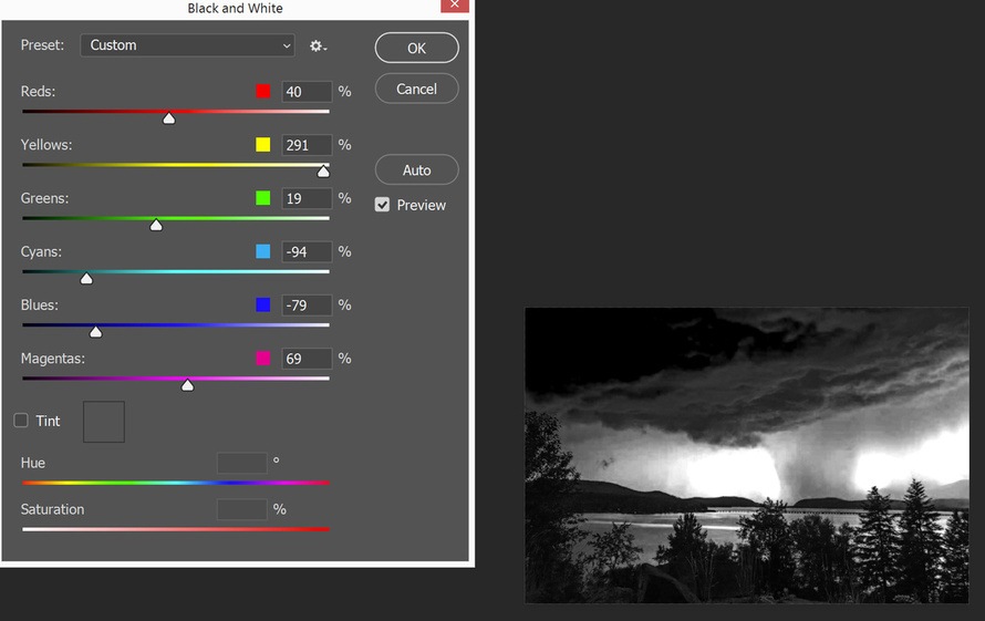
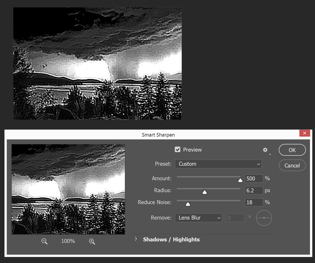
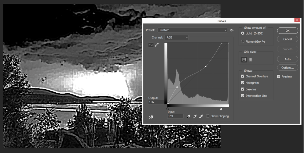
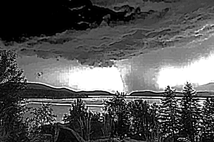
OK, not as a bitmap, but I expect it’ll be a fascinating engrave. The one problem with this is that the black and white conversion method really highlights the JPG artifacts and quantification errors (the squares in the center). You might want to use less aggressive B&W conversion settings, then more aggressive adjustment with the curves.
huh. I think this shows why I’m not ready yet to do photo level engraving. I look at what @dan put together and think to myself that I wouldn’t want a photo that looked like that. And I have no concept about how that would look engraved, but I don’t think it will look like the original.
The Photos have I’ve played with (only using GIMP and Inkscape) have come out poorly when I’ve attempted (badly) at “preparing” them. But I’m still at the stage of attempting my mistakes on my own. I’ll get time to work with them using the tips and tricks section soon. But today is not that day, yet.
Great photo, great advice, great teamwork. I am excited just seeing all the help offered. I really like @dan last offering. Very much like a Gustave Dore’ engraving.
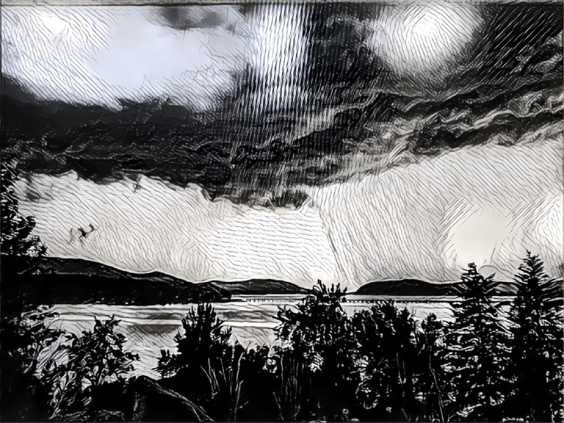
The issue with Prisma (and the other commodity ML style transfer apps AFAIK) is that they generate low resolution output. It’s disappointing because I like some of the results but they are more fun quality than production quality. I have printed Prisma output as big as 12"x12" on canvas after some photoshop post processing and that was pushing it for sure. IMO canvas works pretty well with low res images and the laser is likely to be less forgiving on wood.
I’m planning to deploy my own tensorflow. Style transfer examples are pretty widely available and it will be interesting to use my own training images.
I like what Dan did to that pic in Photoshop. The Prisma filter, not so much. That made it look like someone tried to make a lithograph while on acid, though in fairness, Dan obviously knows a lot more about what works in a GF than I do. My own $.02 as a photographer would be that if you followed Dan’s steps in Photoshop using the original image, you might get better results. I assume that what we see here is a reduced image, and that your original is in much higher resolution. You’d get less .JPG artifacts that way, and some selective application of the blur tool would help reduce the ones that remain.
Although I haven’t received my GF yet, I do have experience converting photos for use in laser engraving on both wood and glass. The operative word is always contrast, contrast, contrast! Subtle gradients and fine detail tend to fall by the wayside. You’re facing an uphill battle with this particular image, because as Shop already pointed out, the beauty in that pic is from color. It doesn’t have a lot of inherent contrast, so adding some is essential, but brings its own set of problems as well. I think JBManning is right. I have a gut feeling this will end up looking better on slate or glass as opposed to wood. But I look forward to seeing it one way or the other.


 ️
️