So I’m going to ask this question but I think it might get misinterpreted. So I may need to revise as we go.
Power vs Speed vs LPI. I understand what these things are. But I don’t know when to use what to get my desired result. So let’s presume that visually, in a particular wood, 100/335/225 looks very similar to 50/335/340 which looks very similar to 25/100/340. (It doesn’t. Those are for example purposes only since I’m at work right now.) Is there any benefit to choosing one over the other? (And I’m not talking about the obvious “faster is faster.”)
Interesting. That’s the way I’ve been rollin’ as well. It made the most sense to me. But then I remembered I don’t know a damn thing about lasers. I don’t want to get into any bad habits.
Aside from in times where you’re at full power and not getting the depth/shading you want, is there some reason one would prefer to use slower speed instead of more power?
I’ve found some interesting effects of ash and soot residue according to how much power and how much speed was used on acrylic engraving and having the lens defocused. I did about fifty different squares testing different focal lengths and adjusting the three engraving parameters. I am working up a post about it, but I’m still trying to draw conclusions. And then the power profile change happened. But at this point, it hasn’t affected my Pre-release, so I’m debating whether this is going to help anyone.
Only went below 340 engraving at BAMF and then a few pencils that I didn’t need to be too precides after.
At fast speeds sometimes cuts can get sloppy. Mostly it’s just to make sure that you get enough darkness/depth. Sometimes upping power instead of lowering speed will just ablate more material instead of darkening it more quickly which would be the opposite effect you want.
For example low power, low speed might make something very dark while high power high speed might just remove more material. (I use that to clean up 3d engraves)
That’s the general barrier to where the eye starts to lose the ability to see the lines/pixels unless held extremely close. That’s why most print is in 300dpi and why most phone displays are at least that or more these days.
Well, you could go lower LPI and avoid some of the jaggies by defocusing the laser higher above the material, just like you did with your acrylic engraves.
If that works in what a person is doing, then lowering the lines per inch means fewer passes and defocusing the laser means a fatter beam, which means less time to engrave.
Ah gotcha, i’ve known about that 300DPI for print forever. Just curious what made you go 340 and not 330 or 350. Sounds like if we treat it like print we’re in the right ballpark.
It hasnt really worked that well for me TBH. Also defocusing only really seems to work well on materials that melt, like acrylic/foam. Woods dont tend to do well with it. I tend to stick with 340LPI, and if I need a really clean edge ill run a really light score around it to get rid of any jaggies that might be there. The one time I have run at a lower LPI and not had too much trouble was some really soft/thick leather. 270 was ok on it, but thats because it didnt hold definition quite as well.
Its just 340dpi vertically. Horizontal dpi is some magic formula based on speed that we arent privy too quite yet. LPI = “Lines per inch”, DPI = “dots per inch”.
Yes, but beam overlap at that resolution should apply the magic to the vertical results as well. I’ll have to do some digging to find the source for the 650-700 perceived DPI.
It might in the areas where there is overlap, but the problem arises at the edges of the engrave, like on curves, which is where there wont be any overlap, and which is the only place aliasing is noticeable. The only way to mitigate this pixelization is to use a higher nominal LPI.
Thats a good question.I would say that would depend on the outer shape of the area being engraved. You can see on the picture below the aliasing is much more noticeable at the top and bottom of the circles than on the sides. (this was done in 270LPI which I redid later at 340 but is a good visual example)
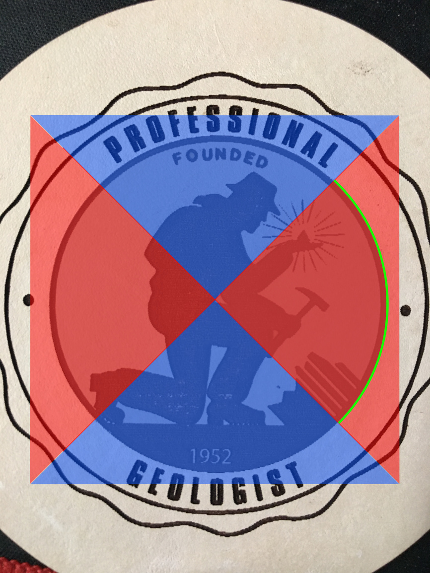
This means we are essentially working with pixels that are 3x1 (rectangular) when using 340LPI. So we can follow that train of thought to determine that if we needed to draw a 90 degree arc, having it running from 45 degrees to 135 degrees would come out more smoothly than an arc from -45 to 45 degrees. Ive illustrated in the photo below. The areas in red show the better orientation for those arcs. Those in blue are going to have more aliasing because of the limited vertical resolution, while those in red will be superior because of the superior horizontal resolution. If we were running at 1355 this would be reversed. Ive denoted the optimal 90 degree arc in green on the right side (for anything where LPI < DPI - e.g. 675lpi).
I hope this illustration is clear enough. Sometimes I have a habit of overcomplicating explanations =P