Practical limits of LPI in Baltic Birch

I wondered what the upper limit was to the “resolution” of wood when it comes to engraving, so I tried to test it.

Lessons learned:

  • LPI matters. All of these pictures are the same speed and power, but higher LPI definitely yields better detail and darker contrast.

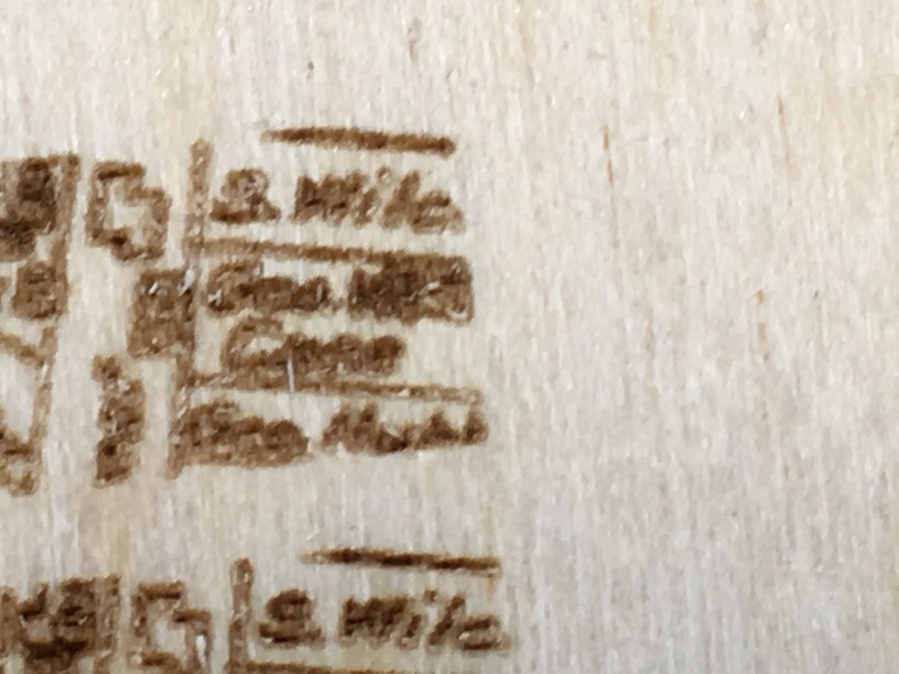
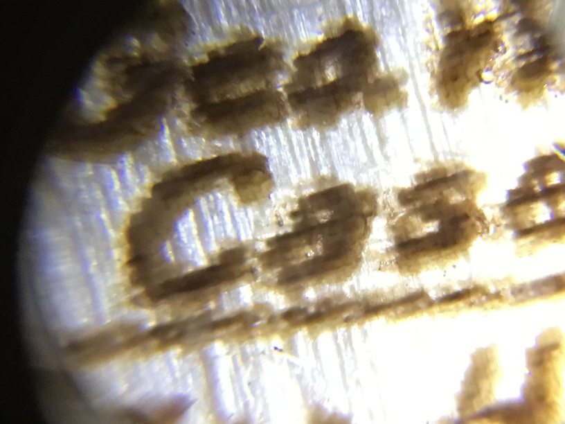
225 LPI: Note the muddy details, “Case” is almost illegible.

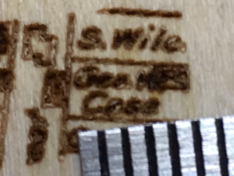
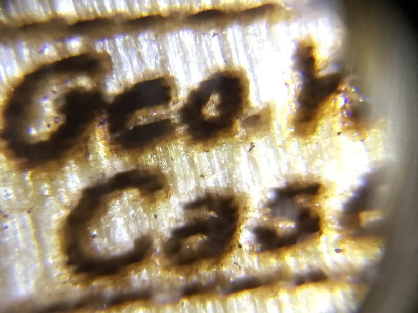
370 LPI: Clearer and crisper with darker engraving.

  • Cleaning matters. Cleaning the smoke residue from the surface will make your details much more legible. At this scale paper towel lint destroys the engrave, so be gentle. I recommend denatured alcohol.

  • There is an upper limit to the practical resolution of wood fibers, and while it probably varies by species, for birch it’s somewhere in the area of roughly 220dpi (features 0.0045" in size or larger) in terms of features that can be resolved, and a good bit larger to reliably resolve them. This is where it gets tricky, because expressing it as a digital DPI doesn’t make a lot of sense – because wood is an analog system – so I saw serious differences between LPI settings, getting a much better result up to 340 LPI.

At the very smallest scale I was able to get results:
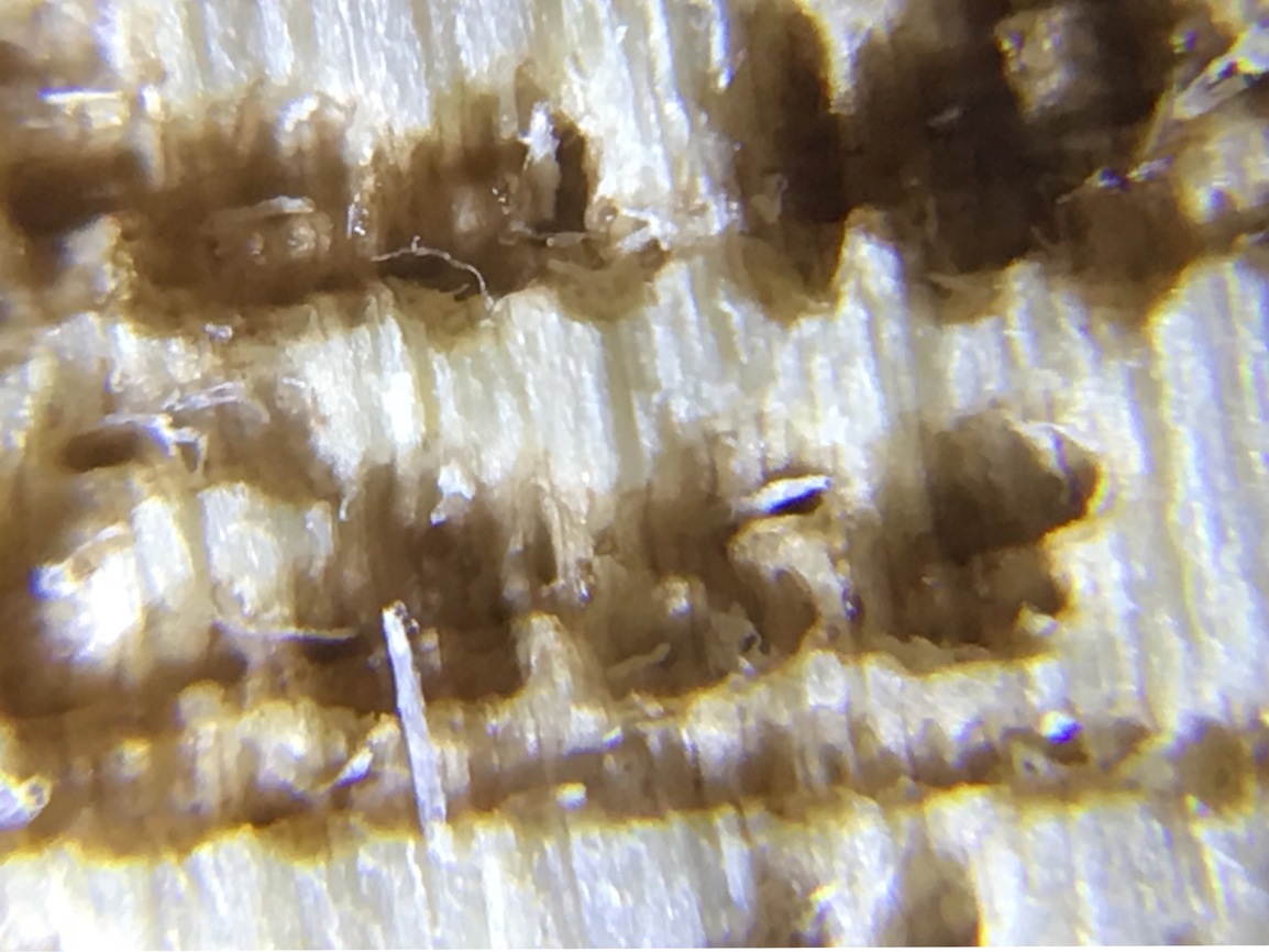
225 LPI:
image

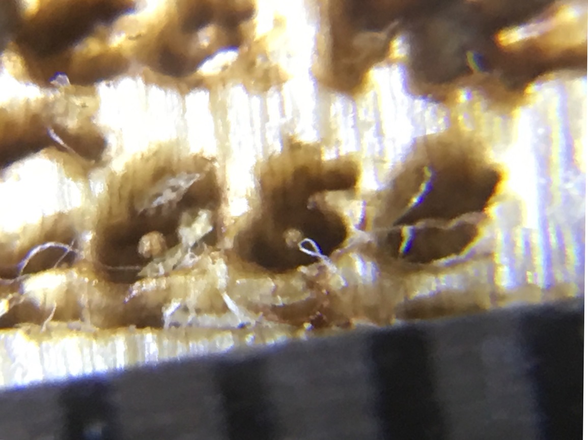
340 LPI: The fibers are from paper towels. Again, do not use them :slight_smile:
image

At a much more reasonable scale (about 1.5x the previous examples) , the text differences are immediately obvious:
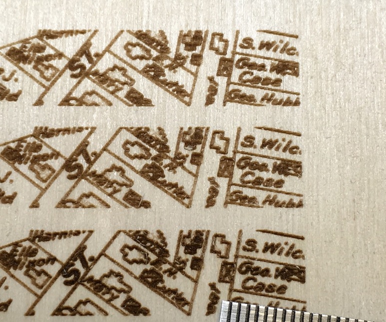
225 LPI:

340LPI:

Testing method:
I started with a very finely detailed source file and imported it into Inkscape, and scaled it to various sizes to see how small it could be resolved.

I used the settings 900/80 and increased LPI from 225->340.

The 340 LPI engrave is far clearer, and much more detail is resolved.

Once I had pictures I went back to Inkscape to measure the shortest dimensions of the smallest features that could be resolved. The lower part of the “e” in “Case” was it, at about 0.0045" tall. This is highly subjective, and will depend on lots of tiny details, probably down to exactly where in the wood grain you’re engraving

I’m not sure what practical stuff to take from this, except to say that the LPI and cleaning makes a huge difference, and keeping your smallest desired features to at least 0.01" across (probably 0.02) is good practice for yielding the best engraves.

Time to revisit my older engraves and see if I get similarly improved results with higher LPI. I suspect I will.

16 Likes

Thanks for the test results, that will save a lot of us some time.

One of the issues muddying the waters here is that above 225 lpi, the scan lines actually overlap, so some of the extra contrast is just more power hitting each spot on the wood which you could also achieve by just turning up the power. I suspect the resolution would still be noticable since you can see the lines at 225, but the contrast difference would likely diminish.

2 Likes

I considered that, but the amount of detail you see in the 240 is clearly reduced when viewed through the microscope (which I posted). The extra scan overlap is also a function of laser focus, and this is focused tightly on the surface.

As I said early on, this is a tricky thing to quantify, the number of variables is daunting.

Some of those look like they’ve got substantial depth to them, so you might be able to reduce power and get a touch more detail with a smaller effective beam spot.

1 Like

Well, there’s this thing called the Nyquist theorem, which says when you are sampling an analog (continuous time) signal digitally, you need to sample at twice the rate of the highest frequency at which the analog signal varies (I’m butchering it, because it depends on the frequency spectrum of the signal, which is not exactly the same as the maximum rate at which the signal changes, but that’s the general idea). If you sample below that rate, you get aliasing.

So I always figured if you think of the maximum DPI at which the individual dots can be distinguished in a medium, that to avoid aliasing, you would need to use an image at least twice that DPI. I haven’t fully thought this through to see if the math supports this, but that was the intuitive thought I had, from years of previous work in digital signal processing.

So this might explain why even though you see a practical resolution of 220 DPI, you get noticeably better results up to a higher value (340 LPI).

4 Likes

They need to make something larger than “like” here.

My instinct says Nyquist doesn’t apply here. We’re not trying to digitize an analog signal. The signal you start with has been digitized already. The conversion algorithm can use the entire signal to improve the conversion. It doesn’t need to do sampling in the same sense as digitizing an analog signal.

2 Likes

I like cheese.

Just wanted to add my 2¢ to a conversation I don’t understand but am impressed by. Unfortunately I can’t even add 2¢ of value…

But hey! I know where the ¢ symbol is on my keyboard, so that’s worth something, right?

Fades back into the shadows from whence he came…

6 Likes

Yeah, it is…where is it? :wink:

True, it’s sort of the opposite direction. But I think the principal still applies. When you build a signal generator using direct digital synthesis, you need to be generating samples at least 2x (ie NY questions rate) the max freq in the desired output.

1 Like

HA! First time I’ve heard that one.

1 Like

On a Mac using the US English keyboard layout (as well as a few others), it’s option-4. (mnemonic: shift-4 is $, so option-4 is ¢) … otherwise you can get to it from the Character Viewer. (Its exact location has changed a few times, but in High Sierra it’s at Edit→Emoji & Symbols.)

On Windows you have to hold down Alt while typing 0162 on the numeric keypad.

In X11 environments that have a Compose key you hold the Compose key and press “|” followed by “c”.

2 Likes

Or…control-C, control-V on PC, command-C, Command-V on mac. :wink:

Like so:
¢

1 Like

¢ool! Thanks guys! :wink:

1 Like

It is this iPad. Worst autocorrect ever.

2 Likes