Proofgrade Material: Maple Veneer Inlay Letter on Walnut Plywood

I’m not done with the inlay question. I was not satisfied with the result of the compass rose. Even though it was really a first time putting all these materials together, it went remarkably well. Yet I still have to understand a few design issues, especially how Inkscape works to get the engrave size and the inlay veneer size adjusted correctly. I also can play around with the engraving settings to make sure the depth is correct for the substrate material receiving the inlay.

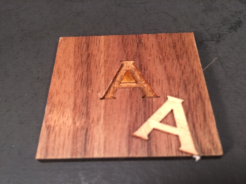
So this cuts to the chase. It’s not too bad. It is very tight. I had to press it in hard to go in. I also had to clean up the shoulders of the engrave slightly to ensure I had a full depth. Just used a pin and a razor.

After I pressed it in, I sanded it a little bit with the masking still on the walnut. Then I went ahead and took the masking off the walnut and sanded it down some more. The depth of the engrave was just slightly shallow.

Sanding took off the walnut’s finish and smoothed down flush the maple inlay. That was very quick with some 600 grit and then steel wool. Then I sprayed shellac on it.

So the process of getting the engraved recessed and the inlay veneer sized correctly was the big challenge. Here is why:

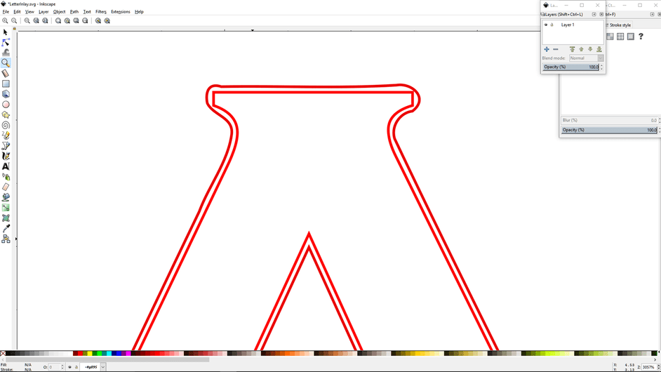
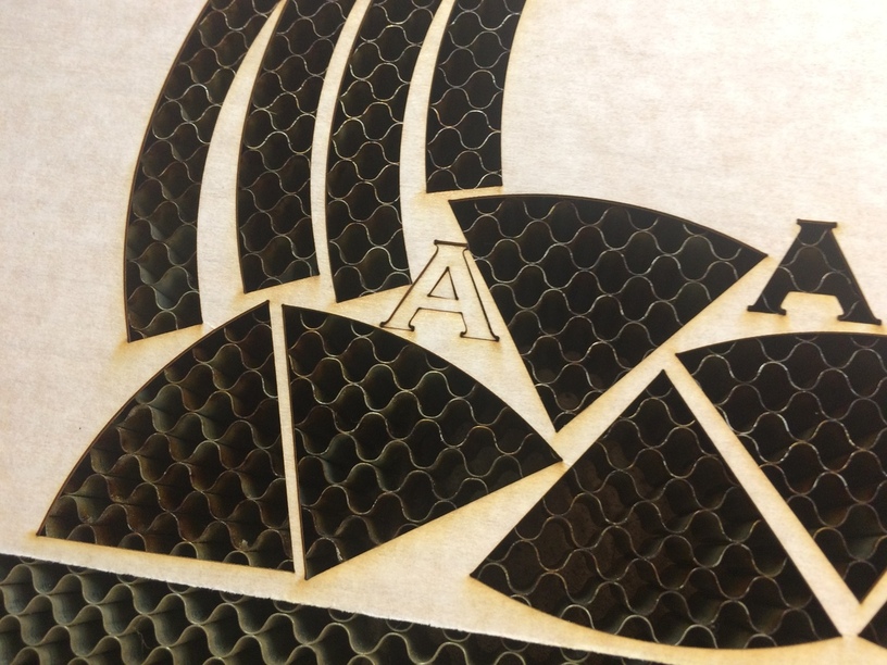
Note the outer ring around the “A”. I used the offset command in Inkscape. And as has been noted in the forum before, the outset command does not make a perfectly sized copy that is sized proportionally. It rounds it out. Using the scale command also doesn’t work to make an outset copy.

The task is to make a cutout of the letter “A” that is .005" bigger than the inner “A”. Can it be done automatically? Can’t find how it is possible, but am open to getting schooled. The way text is resized as you go to higher font sizes (this is 60 points. Making it 65 points doesn’t resize it correctly for an inlay either.

So I did the tedious hand tweaking of the outer “A” to fit right. My first attempt was just a little too big. I used .007 as a 1/2 kerf allowance. Just about half an eyelash thickness too big.

Also the engrave at 460 LPI was just a bit too deep. 340 DPI worked better but was not quite deep enough by about a half an eyelash again.

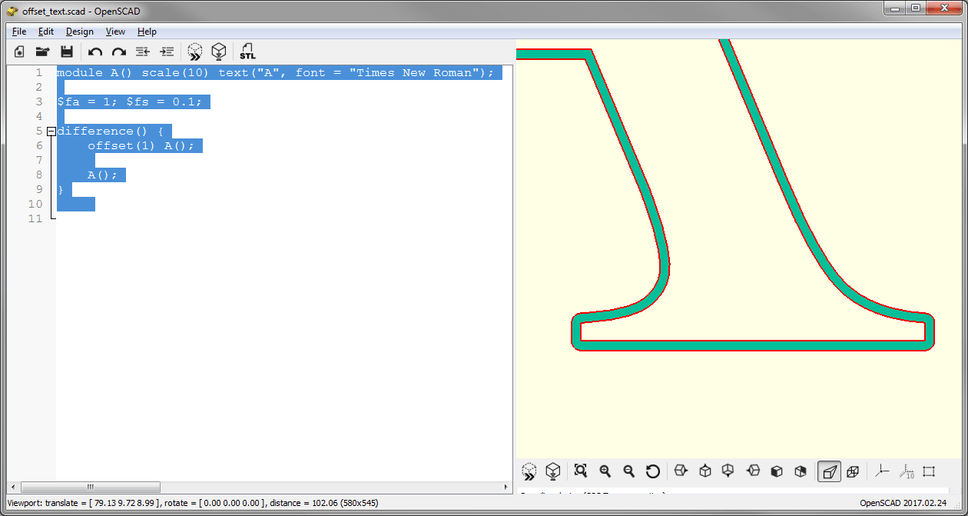
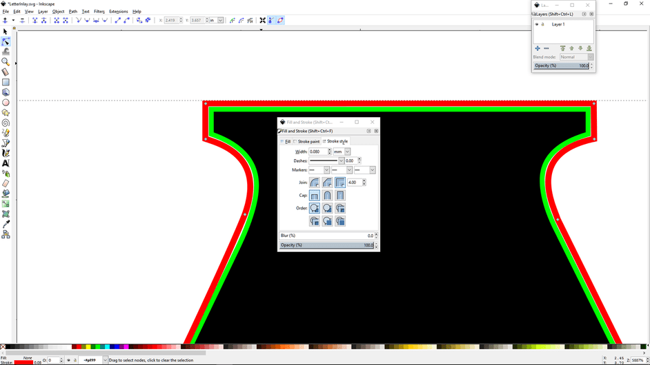
So then I did a little bit of math and conversion and played with stroke thickness settings to make it easier to follow the contour. If I make the stroke of the inner “A” engrave .065 mm and the stroke of the outer “A” which will be the cut outline for the veneer inlay .080 mm thick, then I can have the outer stroke just touch the inner stroke. That leaves a perfect sizing for the inlay. So I added the nodes and tweaked the handles to reproduce the letter with the right size adjustment.

Once I figured out to use the stroke width as a guideline, it made it a lot easier to tweak the nodes and handles to follow the contour. One letter down and 25 more to go.

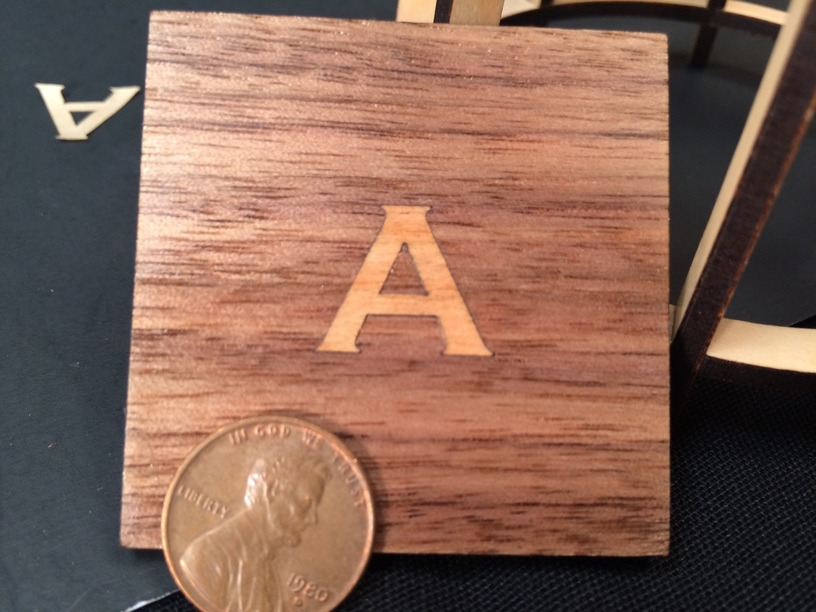
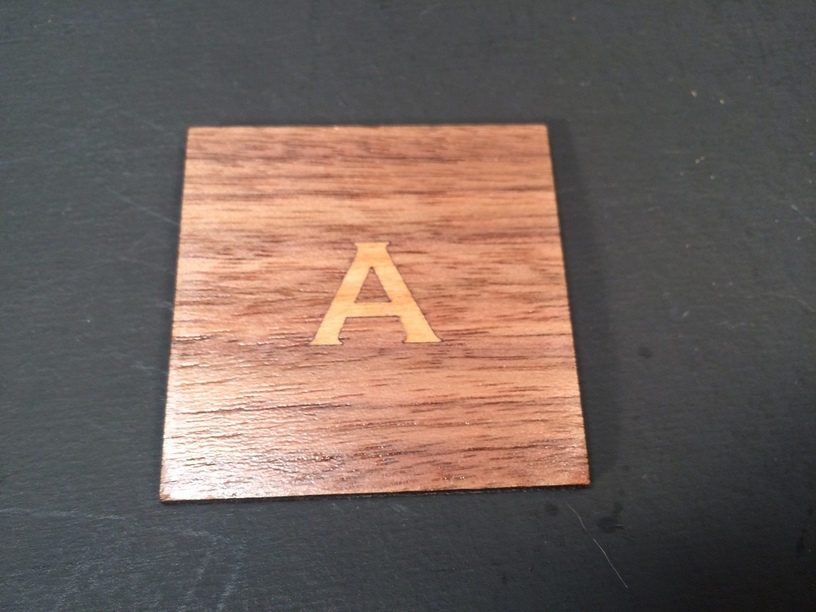
This last picture is to give a size reference.

So all this inlay work is doable with the Glowforge. The Glowforge is a great tool for doing inlay. It will cut exactly what you want it to cut and engrave exactly what you want it to engrave.

But getting the design file correct takes time. Ultimately that is where the challenge is. One thing though, once the design is tweaked and works, you will have it for repeated jobs. I think that would be a cool project. To take my wooden alphabet blocks and do a veneer inlay on them. Once the design is set up, I can make as many sets as I wish.

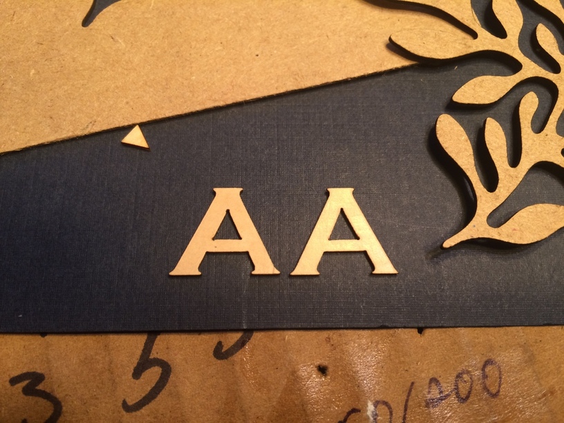
Forgot to add this pic. You can really use every bit of material if you position correctly. Note the letter “A” stuck in some unused area.

90 Likes

Cool! (Did you see the tutorial for adjusting for kerf in Inkscape? It’s even easier than tweaking the letters.)

Turn the text into a path first - quit messing with points, and you can set the stroke width to be the exact size you need to adjust for kerf, in the exact units that you need.

Take a look at that tutorial again - it might help. If not, let me know, you can proof it for me before it goes live. :relaxed:

28 Likes

I love the work you are doing on this. You are getting so good at this and I am so happy you are doing all of this. Thanks for taking the time to explain all that you are doing on your inlays. :grin:

8 Likes

Wow! What meticulous work you have done. I was thinking it was a really big A until I saw the penny. It’s going to make a gorgeous set of blocks. Thanks so much for showing us the process!

This may be one of those few instances where Illustrator may have the advantage. I just tried the Offset Path command in Illustrator on a capital A and it did not round it at all. Looked like your example after you tweaked it.

If there is anything I can do to help you convert the rest of the letters, I’d be glad to!

Edit: oops, looks like @jules has a solution for you. I’d still be glad to help if you need it.

12 Likes

Are you talking about the one for creating an offset path in Inkscape?

I’m using paths. I just made reference to the point size of texts to show that you can’t resize that way.

I don’t see where you reference in that tutorial using stroke width to compensate for the kerf. Where would I find that. I tried to use stroke width and it didn’t give me an outline cut that fit the underlying engrave correctly. The bottom serifs are pointed and not rounded. The one I made with a wider stroke width is on the right. The left one is the file I used.

I have set the default offset steps for Inkscape to be .005". It does offset, but only approximating the outline of the original as shown above.

I really would like this to be simple so please let me in on what I’m missing.

14 Likes

No, there is another one specifically for setting the kerf using the line width. It’s one of the last few loaded into the repository

https://community.glowforge.com/t/training-tutorial-repository/5683/198?u=jules&source_topic_id=6475

You should be able to click that link and go right to it, since you have access.

(And as you discovered, you can’t use path offset to do a kerf in Inkscape, although it works in Illustrator and CorelDRAW. Inkscape has got some kind of a weird rounding thing going on. The method in that second tutorial is exact for Inkscape.)

11 Likes

I love the way you document every single step of your projects…with written description and blow by blow photos. You have made this process so much easier for me to understand. Thank you!

8 Likes

I remember this tutorial now and I did try it before. I have not been able to get it to work on text. The steps say put it into outline mode and then convert to path. Outline mode does not work on text that I can see.

Then after you convert to path, it won’t pick up the outline like you have when you make a box or ellipse which gives you an inner box and an outer box. When you convert text to path, you just get one path after you break it apart. Give it a try on a large letter and see if you can get it to go. I was able to do this with the compass rose and that was no problem. It’s specifically text that is a challenge.

7 Likes

Sorry, if this is a known thing, but what is this training tutorial repository and how do you get access?

I’m guessing it’s something for people who already have glowforges to play with, just not sure of the reasoning for locking it down?

Thanks!
edz

4 Likes

They are still working on the tutorials. Basically only open to those that are helping to write them at this point.

9 Likes

Follow these steps, in this order:

  1. Make the text the size you want.
  2. Convert the Text to a Path.
  3. Set the stroke width for the single line that now appears on the path, and follow the rest of the tutorial.

I’m going to go take a look at it - I probably didn’t specifically mention that you have to always convert the text to a path first, and then you can treat it like any other shape.

(Good thing you took a look at it…that’s the kind of thing that’s easy to overlook.)

Update - Oh crud…I hate Inkscape - yep - just tried it and we’re gonna need a couple more steps for text…give me a bit to poke around and see if I can make this thing do what we want it to do.

15 Likes

We haven’t got a place to put them up yet. They’re working on getting something set up for us.

7 Likes

CAD programs like Autocad or Draftsight handle things like kerf offsets very easily. I would recommend them over an illustrator type program for this type of work.
Also keep in mind that there is no such thing as an inside sharp corner with a laser cutter. If the kerf is .005 wide you will have a .0025 inside radius. Not much but it could be an issue when doing right fit ups. I always put small radii on both pieces to ease this problem.
Nice job by the way.

12 Likes

Okay, I’m going to rewrite this tutorial @marmak3261 to include separate treatment for text - text requires several extra steps - and you have to do them in a particular order (of course).

I’ll try to get it corrected by tomorrow sometime…you can try again tomorrow evening.

17 Likes

Have to say it again to you guys, thanks for all the time and effort you are putting into the tutorials.
You guys are great. :grinning:

7 Likes

I don’t know what InkScape is doing for offset, it looks hand drawn. Technically the outside corners should be rounded for a path equidistant from the outline.

Here is what OpenSCAD does:

5 Likes

Regarding these tutorials… I’m curious… There are sometimes differing opinions or simply more than one way to singe a cat. Will the tutorials be peer-reviewed prior to publication?

2 Likes

In some cases, if we have more than one expert in the team for a particular program, the tutorials have been reviewed. Most of them have not been, since we lack volunteers with sufficient expertise willing to donate their time.

And no, they are not intended to be all-inclusive in any way - they just give newcomers an option for how to accomplish something they might be unfamiliar with.

9 Likes

Good enough. Just curious.

2 Likes

Inkscape just isn’t built for something like this and the CAD programs do it so easily.

That is beautifully simple. Another reason to shift to the CAD programs.

2 Likes