My suggestion for testing: take a little crop of the image and test with that, no need to do the whole thing while you’re dialing settings in. You sound like you’re a pretty good hand at this stuff, you know how to crop an image, yeah?
1 Like
Here’s how I’d do it…

Same as evans but making the words the same shade, and removing the shadow from the roots.
2 Likes
You know what, i got annoyed with that fringe and used a few other tricks to get a cleaner fix, and also really pumped the dynamic range. I’d use this one.

1 Like
Actually hmm ROOTS may be too dark and not enough separation between the word and the shadow, This is very subjective.
2 Likes
yep, i’m not a total noob…have quite a bit of CAD experience but not so much with graphic shenannigans. and yea, tried a little test crop, will be adjusting the settings. would you recommend convert to dots, vs vary power?
yea, the little test i did, couldnt differentiate between the letters and the shadows. will try some different settings though.
See above:
I mean this is really a preferences thing though, try it out. I am a big fan of vary power, but it’s up to you.
1 Like
im sure that would turn out great!! would definitely like some shadow under the roots, but yes that looks like itd work well!
ive had some neat results with vary power, so was hoping to go that route as well.
You probably overpowered it a bit. It’ll also depend on your material. Like cork engraves pretty much jet black, it’s really hard to get different shades of grey on it. Difficult, not impossible. Maple, on the other hand, takes greys pretty well.
1 Like
3d engrave might be what im looking for. I’ll read more into it, ya’ll have dedicated enough of your time.
damn thats so cool!!
I brightened the ROOTS a bit.

Still good separation between the words but now the shadows are shadows for real.
3 Likes
sick! alright, I have a bunch of maple scraps, will run it on those this next run, instead of draftboard. have done a bunch of cork coasters/stickers, and know how dark it engraves, so yea will try it on scraps of what the final product would be.
Also, this is going to look best on solid hardwood, not plywoods.
Well, ok caveats. This is the thing with engraving, it defies simple blanket statements.
The trick with plywood is that if you engrave all the way through one of the layers, the color of the layer underneath may be radically different. Plywood engraves can look great if you don’t go too deep.
See this one from a million years ago on baltic birch plywood:
3 Likes
I’ve gazed upon that masterpiece, many a times. Also use baltic birch frequently, and its a major inspiration.
1 Like
Too kind, I think it’s not bad, but masterpiece may be a bit overstating things 
Another example of a material that doesn’t take greyscale much at all is slate. You bascially are either black or white there.
omg i didnt realize that was yours  anyway, you have saved fathers days!!! results in 5 mins!!!
1 Like
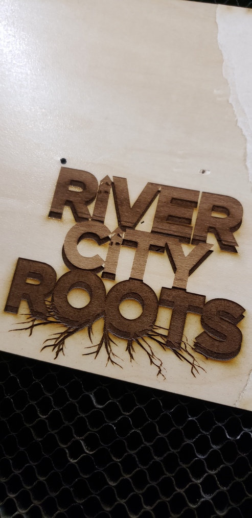
That turned out all right!
You got a damp paper towel (water or denatured alcohol)? You can clean up those smoke marks and it’ll look even sharper.
(damp, not wet)