A little ways back I told @Jules I would do some Depth Map tutorials for the repository, and had started some basics. Then @dan released the Glowforge logo usage guidelines, so I decided to start fresh using the logo.
This is more of a conceptual approach than a specific How-To, because of the various methods and software to go about creating the artwork. Whether you’re using vector software like Illustrator, Inkscape, Affinity Designer or CorelDraw, or raster image editing software like Photoshop, GIMP or Corel PhotoPaint, you can achieve this.
The only “trick” I’m using here, is ZBrush 3D sculpting software to help visualize the Depth Maps into 3D models, just to show the impact that different design ideas have on the end result.
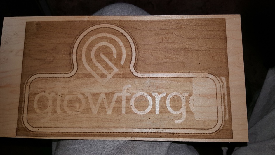
One thing to keep in mind is I have no Glowforge to test actual output, and based upon the final result, the files may need tweaking. Also, because of the limited Z-axis, we’re likely not looking at as much depth and detail as may be represented by the rendered models below.
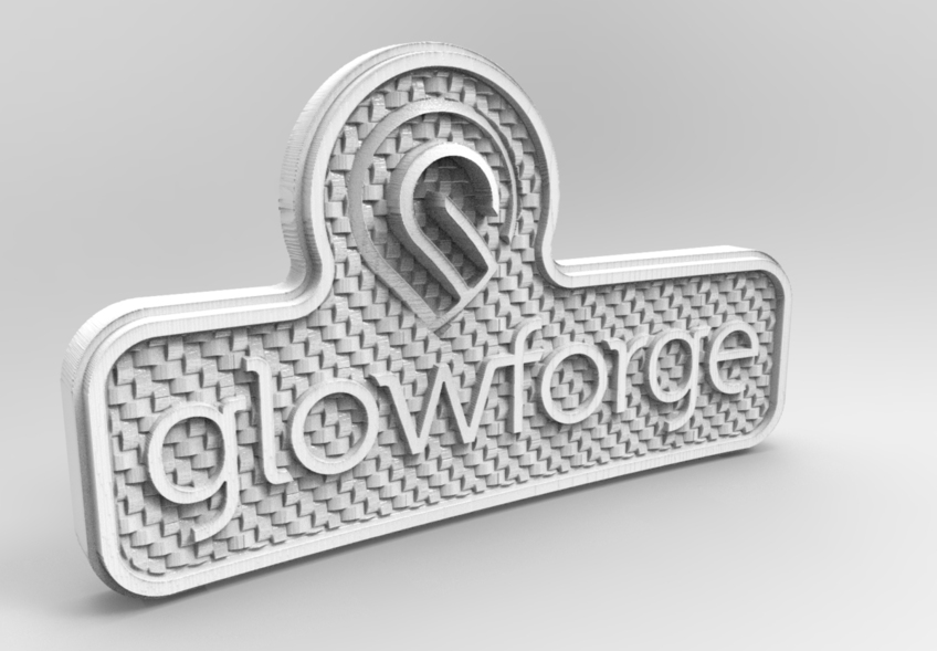
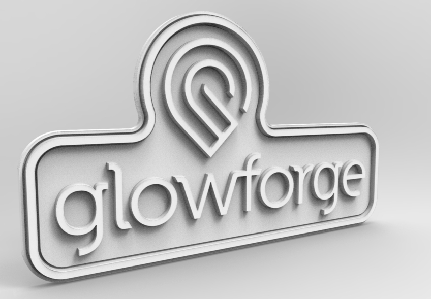
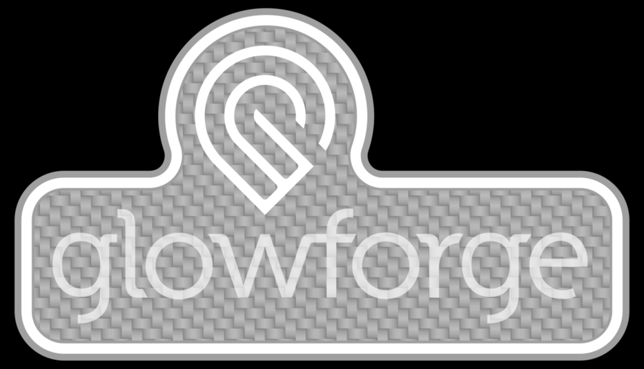
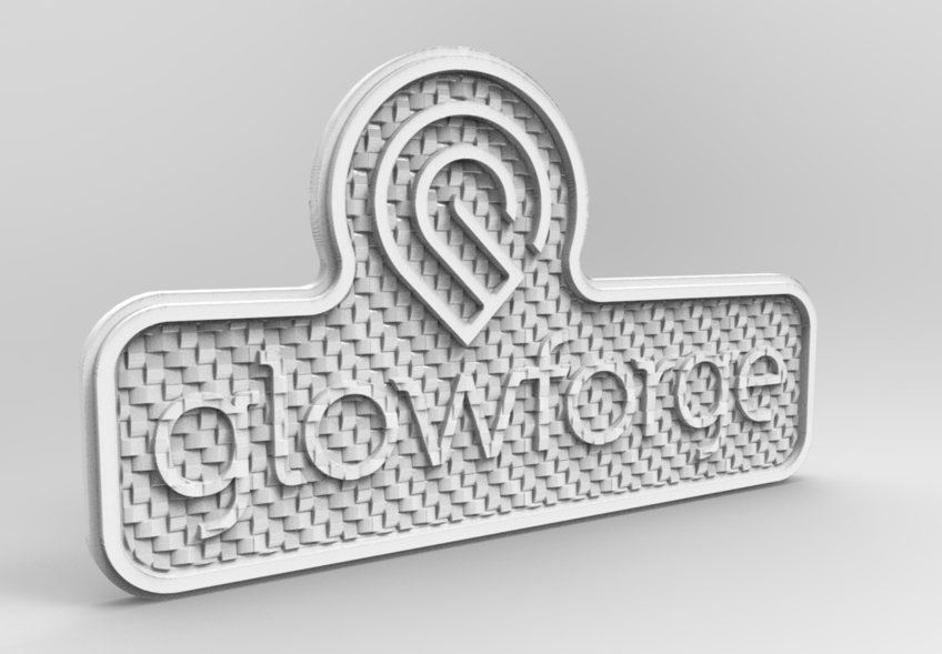
The first pair of images shows the most basic concept that the values of white/black/gray correspond with laser power levels and thus height. White areas would not be lasered at all, consider this that "White = 0% power. Black would be 100% of the laser power allocated to the project. This does NOT mean it will cut clean through the material. It means that whatever the Max power level is selected for engraving, Black areas will be the deepest part of the engraving. That power level may be 1mm deep, or 6mm, or anything in between and possibly even greater depending how many passes we can configure in the GFUI.
Make sure you click on each of these images to see more resolution and detail.
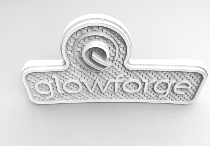
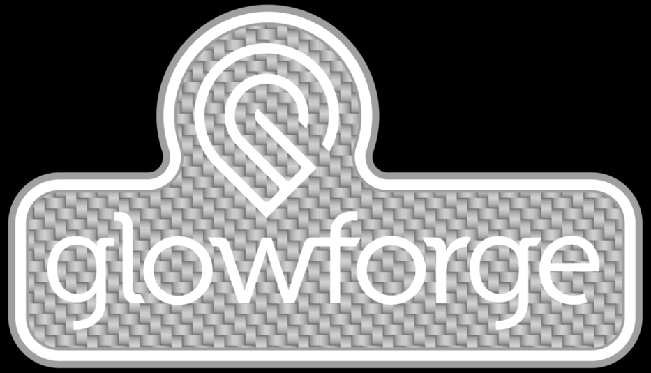
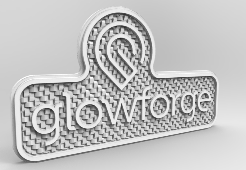
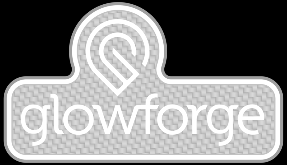
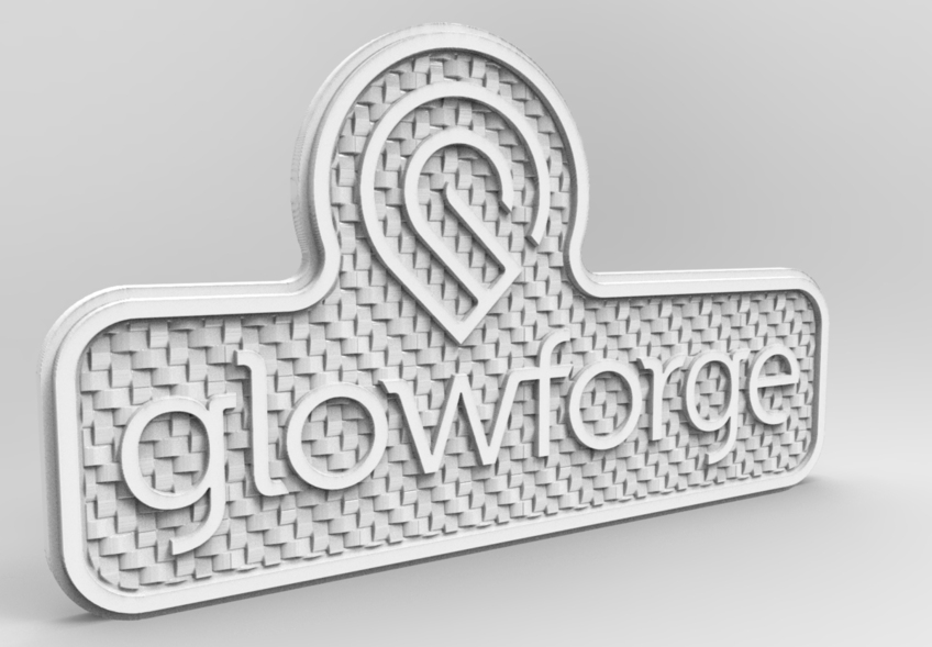
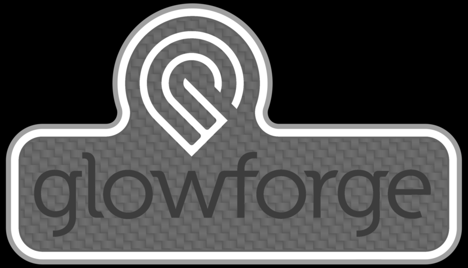
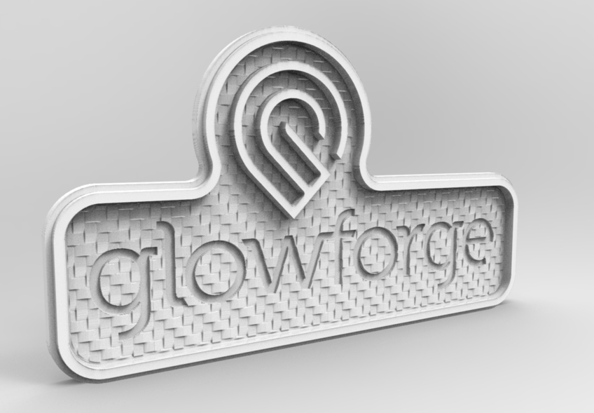
This next pair of images shows what happens when we use a tileable bitmap image as a background. It’s a quick way to add texture to a design. This image is the carbon fiber tile that I posted in the Free files section of this forum.
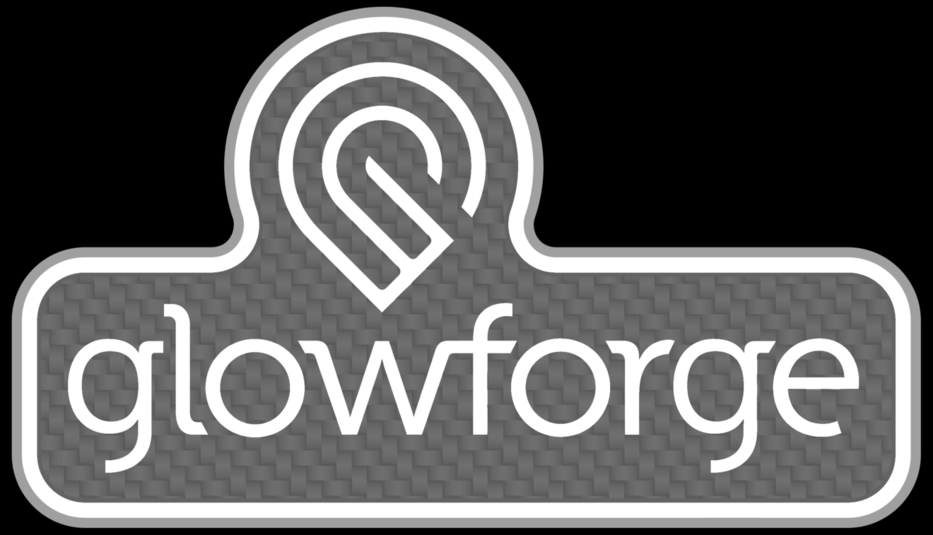
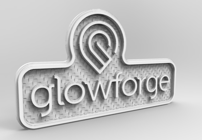
So, let’s say the above result is too drastic and I want to tone it down some. I want to reduce the depth of the 3D engraving, as well as toning down the texture some. You could adjust the contrast by using the LEVELS command in your image editor, this is more flexible than using the Contrast adjustment itself. Or if you want to be able to modify it more easily in the future you can add another path (vector) or layer (raster) with 100% white fill, then adjust its transparency.
The same concept works in the opposite direction. Using a path (vector) or layer (raster) with 100% Black fill, then adjusting transparency helps create more depth in the design. You can see in this example that while the engraving would be deeper overall, the texture has still been toned down. If you wanted to keep the definition in the texture, you would need to boost the contrast in the pattern itself. This will generally require going back and forth between texture contrast and the fill transparency to get the desired result.
Now if we decide we want the Glowforge text to be engraved instead of embossed, it’s as simple as changing the color of the text to something a little darker than the darkest part of the textured background.
Now, if we want to make the text (or any other shape) pick up the texture from the background, we can do that simply by assigning transparency to that item and let the texture show through it! This is a balance act getting the right amount of detail. It may not be too particularly useful in actual use for things like background textures, but the concept here is you can easily build layers and heights using transparency instead of absolute values. You can then change the ENTIRE design very quickly by only adjusting the color value of the very bottom layer. Everything else above it will change automatically because they are built in reference to what lies underneath when transparency is used.
Building upon the “Relational Design” I hit on above, here’s what happens when we combine a “cylindrical” color gradient to the entire design, and a “spherical” color gradient just at the logo bug. When you combine transparency and color gradients, you get variable heights in your engraving. This is a very powerful modeling tool and it’s all done in 2D design software!