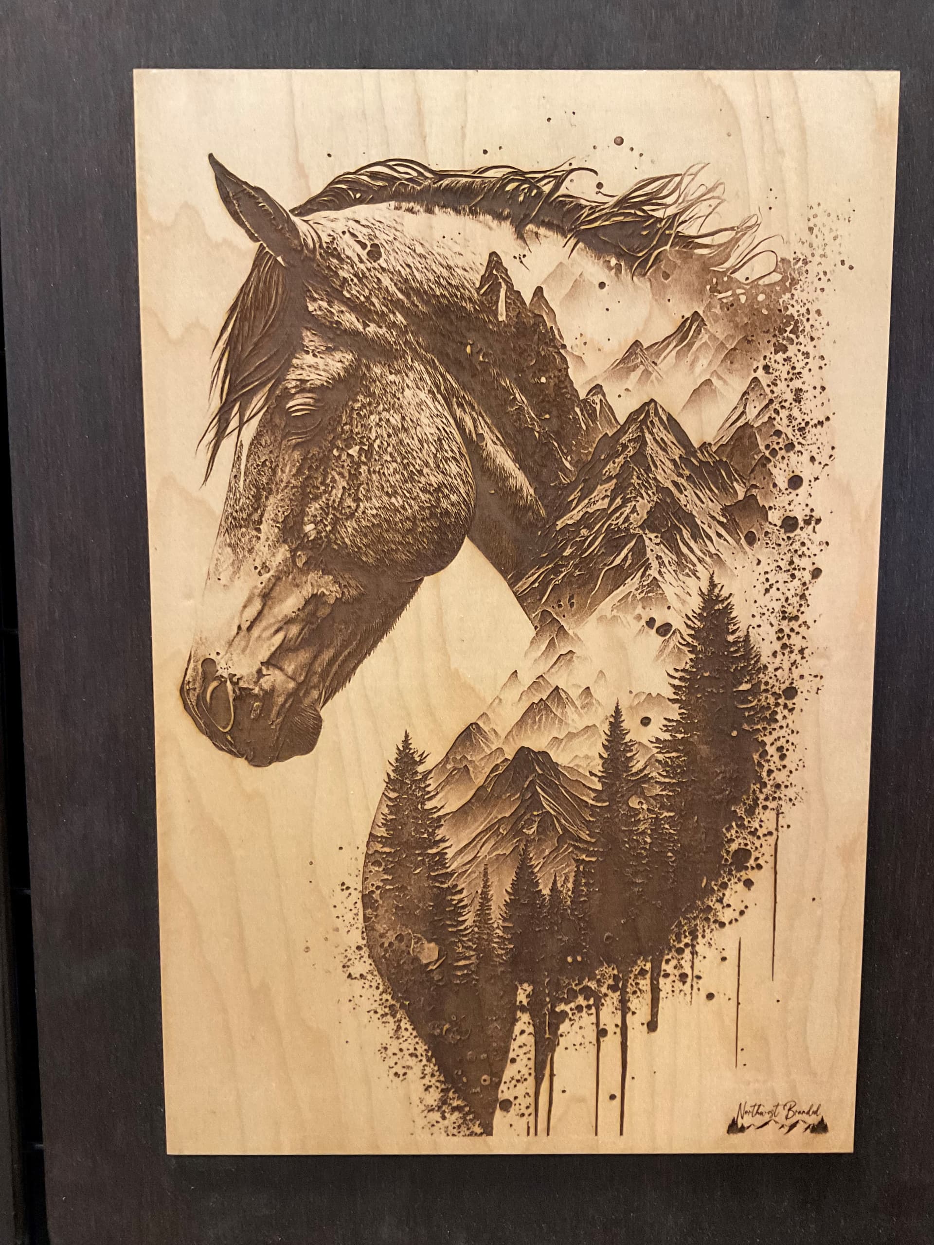
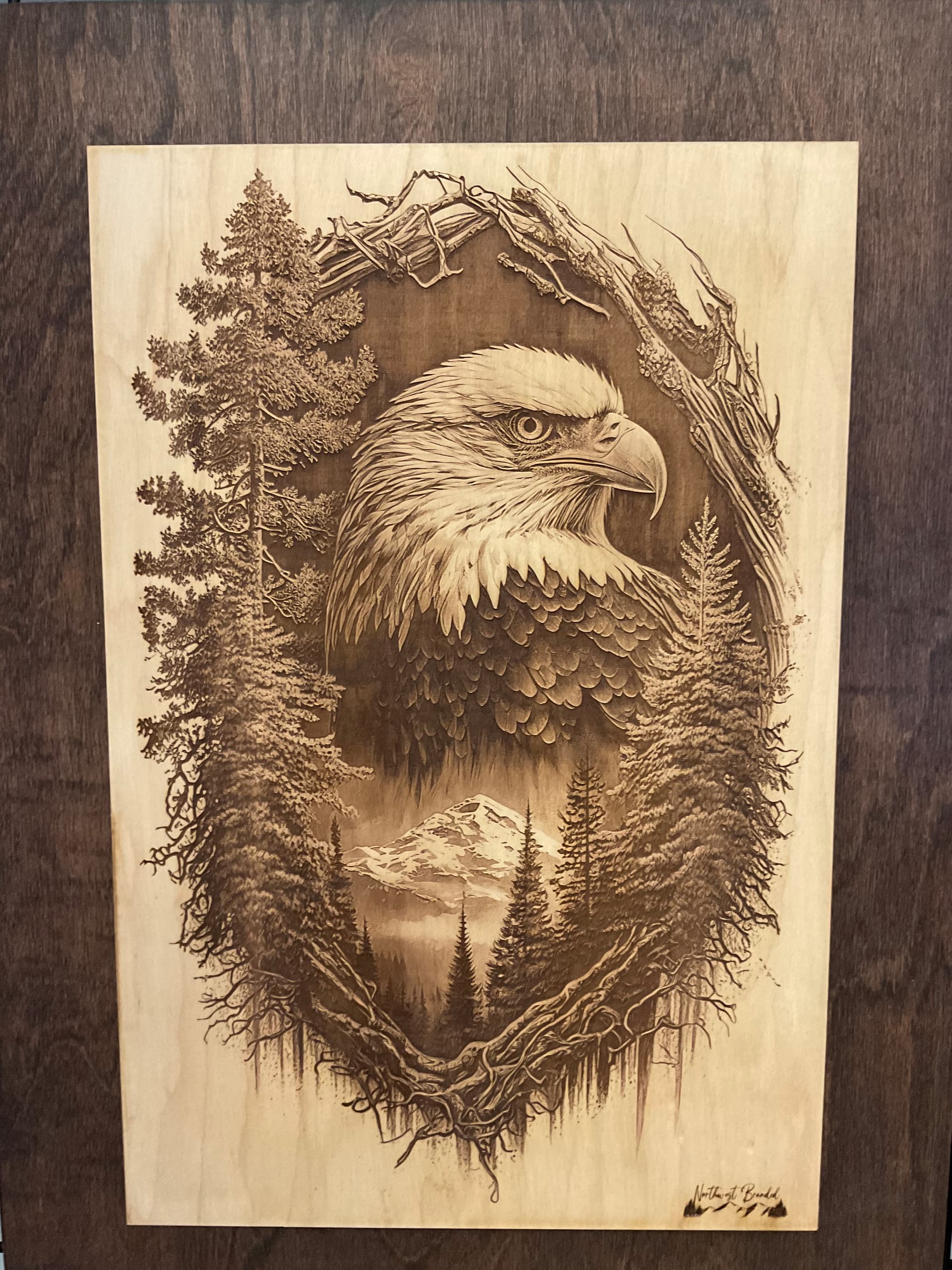
Hello, I have been making these engraves and they sell really well however, I am looking for advice on improvement, I currently use convert to Dots simply because I dont really know what I should be using these are 10x15 engraves and take an average of 4 hours on my GF Pro. Could someone please evaluate my image and tell me if Its ok where it is or advise the other settings (vary power)?
Vary power is great if what you want is a depth difference for the different colours. Convert to Dots or Patterns everything is the same level, but with a different concentration on the engrave.
I concur that what you’ve got going looks great. This might help you get an idea of the differences though:
With images, dots or patterns is best, and higher LPI makes for smaller dots, but longer times.
For an image like your horse you may want to fiddle with the minimum and maximum dots where the edge is hard to see (like the nose area that you may want to increase the definition a bit or at the other end in the trees where there could be more definition from all black). In Gimp I have found great pixel manipulation possible to accomplish the same thing or creating a light score line to bring out what would be hard to see otherwise.
Thank you all so much for the great compliments you all made my day! heck more like my year lol I just seen these replies tonight (28 days later) hahaha