What happened with this one? alignment went all wonky, looked fine in UI

Hmmm. I can’t find the Gift of Good Measure you printed – did you post the photo?

i have printed one. lemme see if i can find the post…

right here -> Bad engrave

It is a pretty complex file. There are places where there a many nodes right next to each other where there were errors in the print. Also, there are lots of overlays. Since they are different colors, it should go, but I’d be curious at what this looks like engraved on some cardboard with light settings or some type of cheap plywood just to see what happens. Of course, there are signs that there are some alignment issues like some missed steps, head bumps or slipping belts.

1 Like

Generally, if it does it exactly the same way each time you try it, it’s in the artwork. If it’s a bit different each time you try it, your machine is misbehaving…

2 Likes

I have a couple of suggestions for you regarding your files, to cut down on issues in the GFUI.

When you are designing Cuts and Scores, do not give your shapes a fill color. Give them a Stroke color and no Fill.

Engraves should have a Fill color, but no stroke color.

When you do that, the interface will automatically set the file up the way you want it to be, and you don’t have to convert filled shapes into cuts, which frankly can introduce errors when you have overlapping fills.

This is the way your SVG file looks in AD…very colorful and lots of fills. (Note that the fills might have been created when you saved the file to SVG format…I have no way of knowing that since I can’t see the original AD file…if you have these set up as strokes with no fills, then the problem is in how the AD program is saving your design as an SVG file.)

The issue with that is that you have a yellow filled layer on the bottom, with an orange filled layer on top of that, and pink filled shapes on top of that. The GFUI is going to probably pick up errors trying to interpret it.

(Going to switch to AI, which is what I mainly use because it is faster, but the process would be the same in AD:)

If you save the cuts and scores with different colored strokes and no fill, you wind up with something like this:

You also have an error in the Text. (I suspect winding error on that, because it is a known issue with AD.) The centers of the text have not been subtracted out. In addition that engrave behind it is going to take a LONG time to set up all of the engraves for, since each one is going to require you to set up individual settings for it…and if you don’t intend to use individual manual settings for each one, there is no earthly reason to keep them separate. You will get a much faster and neater engrave by rasterizing that.

Okay after temporarily turning off visibility for everything else, and fixing the issue with the text (much easier to do in AI, it doesn’t have the same issues with winding rules) I rasterized everything else in that engrave. I kept it separate so you can treat the text differently if you want to.

All of this is rasterized into one image while everything else is temporarily hidden from view.

After rasterizing:

Then after all of that, I just turn back on the invisible parts and save it as an SVG file with the image embedded in it.

This is how it loads into the GFUI…Two engraves which you can set different settings for, and two cut operations. (You can slow down the little interior cuts by a few points, and have a better chance of things cutting all the way through.)

If you want to test this file on your machine to see if you are still having issues with it skipping and getting out of whack, I’ll include it below. (Hope this one works.) :slightly_smiling_face:

Buffy.zip (472.9 KB)

4 Likes

hey jules, thanks for your thorough exam of the file.

i have been using fills for both cuts and engraves because if i used only a stroke for items i wanted cut on a design i would watch the forge cut the shape twice, once on the outside perimeter and again on the inside of the stroke. these were not expanded strokes either. these were simple shapes that were supposed to be cuts and i watched the forge cut them out twice! so i went back to using all fills and then selecting what i wanted cut from those operations and that has worked fine thus far in my recent projects.

the fills are all mine and those are based on some previous forum posts (here) that explained that they were the colors that the GFUI would process in order so that “layers” would show up as separate objects in the GFUI. anything i want to be in a single operation gets the same color. 2 operations, 2 different colors, in the order you can see on my glowforge swatch list on the right in affinity designer. these were setup by someone else a while ago and i just added them to my setup. those also seem to work fine for me.

here’s another file from a similar project. a table stand for my upcoming wedding. DnD-final-v1
it was made in 3 steps:

  1. engrave and first cut operation. remove piece from bed leaving excess material in bed (taped down to prevent moving about.
  2. second larger cut operation to allow for wiggle room. remove the sliver of material from the second cut operation.
  3. replace original piece upside down in bed and perform second engrave pass.

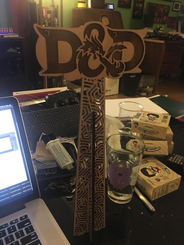
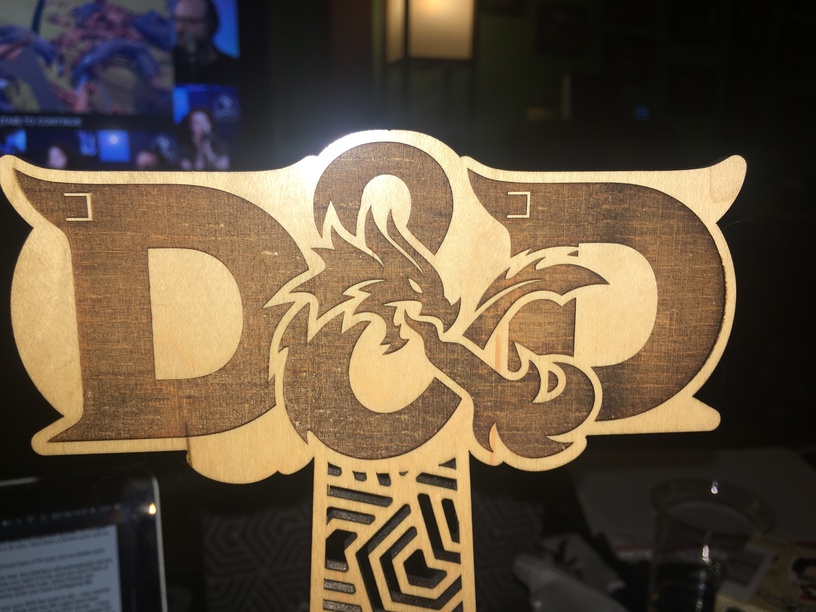
granted, this stand uses a MUCH simpler engrave pass and shape but the process and theory is still the same.

the bottom most layer is the second outline cut so that i can pull the piece out of the machine and replace it in the bed exactly where it came from, but upside down. without the second cut operation (slightly larger than the first, i could not always get the piece 1) out of the bed and/or 2) back into the same hole because of the angle the laser cuts the material at making the back side larger than the frontside.

the engraves are purposefully left in 8 separately colored fills so they are different operations in the GFUI so i can a) tune the darkness of each engrave pass and b) one whole set of them is the reverse image so it can be engraved mirror on the reverse side of the piece. in my previous tests i had horrible trouble getting the engraves to be either dark enough or not burn right thru the material. i expermented with the varying power and dithering options but they were still not getting the contrast i wanted. then i had to experiment with pulling the masking tape off first before the engrave passes. each of those engrave layers is manually set to a different power to get the engrave to be teh darkness i want, or at least not destroy the material in one pass and let me perform a second or even third if necessary to achieve the look i’m after.

i hope that clarifies why i’m doing some of the things i’m doing. i haven’t chosen these methods randomly. they are what i have had to resort to to get things to do what i want them to. once this wedding is over (or i can get a free moment to run more tests) i intend to explore these issues further. meanwhile, once i get my latest batch of proofgrade maple ply i’ll try again.

2 Likes

I just have to add that your wedding looks like it will be amazing.

2 Likes

thank you dan, once i get some time i’ll post the files and pictures of the rest of the table stands for everyone.

That sounds like maybe you had a traced outline made up of two vector strokes right next to each other.

2 Likes

here’s the original AD doc i used to design the stands. each of these semi-circle cutouts were being processed twice by the cut operation. the stroke is .001"

stand deco larger holes.afdesign.zip (80.4 KB)

when i get home i’ll take some pics of the one or two stands i did get cut out that became burned because the cut operation went twice.

You’re right, it’s not in the design. I hope you didn’t email support, so we get to find out what the solution to all of this is before they close the thread!

so i modified my buffy stand layout to take the recommendations you’ve all offered and now i’m getting this:

image

here’s the new file. i rasterized the stake (mr. pointy) and i did it at 400dpi because i want that kind of resolution. two engraves of that (one regular, one mirror for the other side), the buffy logo as a vector engrave, and then the rest of the details all done with a stroke of .001"

here’s the new AD file and the SVG i’m trying to load.

buffy-final-v2.afdesign.zip (1.4 MB)

interesting… chrome is not rendering the SVG properly (nor the second one i made). no raster images embeded and there’s some weird line. here it is zipped… ONCE MORE WITH FEELING!

buffy-final-v2.svg.zip (3.3 MB)

dropped resolution down to 300dpi and it is at least uploading now… this is untouched in the GFUI. i made no changes at all…

some extra engrave on the buffy text that appears to be the same size as the stake outline, no idea where that is coming from. is this one of the mythical clipping paths?

also those cut jobs are all a stroke with .001" and no fill and you’ll notice that the patterns for the stand are being recognized as an engrave!

the outlines are both cut jobs and that’s correct.

at least each of the two raster images are coming thru as separate so i could do them one at a time.

buffy-final-v4.svg.zip (2.4 MB) buffy-final-v4

so in the first svg you posted, the curvy design in one post of the stand had 618 nodes. no problem.
(outline view)

In the second one, those curves are doubled up, and contain over 178,000 nodes. woof.
i wonder if AD has an issue similar to what AI has with goofing up certain stroke alignments (align inside and align outside)?

zoomed to 51000%:


Anyway, i might try using your original filled-shape method for the legs, along with the rasterized graphic for Mr Pointy. Having to swap between an engrave and a cut in the UI is way better than having an over-anchored shape that won’t load!

Also, I would personally never bother rasterizing something at that high of a resolution to be engraved into wood. Wood just isn’t a particularly high-res material.

3 Likes

i have noticed that AD does make a TON of nodes sometimes after certain operations (subtracts mostly). i’ll try going back to the fill for this one.

what resolution would you suggest for the raster?

went into the source doc and redid the main cut outline. it did have a LOAD of nodes. this looks more reasonable

wish AD has a node selected count tool or something.

Well… there has been some discussion regarding the ‘best’ raster DPI for a given engraving LPI… DPI at 2X the intended LPI was one conclusion. But if I have to rasterize, i normally just use 300DPI at the scale I intend to engrave. I also rarely engrave wood at higher than 270 LPI.
But it’s really personal preference. Doing some side-by-side tests of a smaller chunk of the main graphic might point you towards a look that you prefer… once you get the file to load into the GFUI.

wow two svg exports of the same original file. one where those cut objects are fills (under a 1MB) and one where those cut objects are strokes (9.7MB)!

Fill Version buffy-raster300-node-cleaned-fills-v2

Stroke Version buffy-raster300-node-cleaned-strokes-v2

reopened the stroke version SVG in AD and HOLY CRAP! all of those nodes were not there before i exported to SVG!!!

fills version loaded in under 30 seconds… still has a clip path issue but its loading great with those two rasters.

stroke version… never loaded…

i say this pretty much explains my issue with using strokes instead of fills for cut operations.

1 Like

and here’s more evidence as to why my AD svg exports are coming out like they are

You should have your strokes set to center anyway, or you’ll have more problems than just lots of nodes. :wink:

2 Likes