Redesigned my business cards. Any suggestions or feedback would be appreciated!
New version 6/11/18
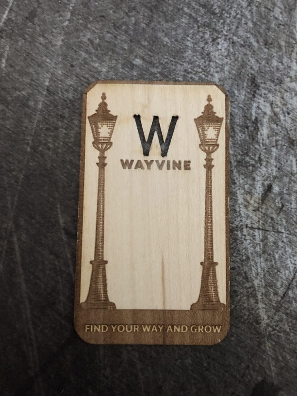
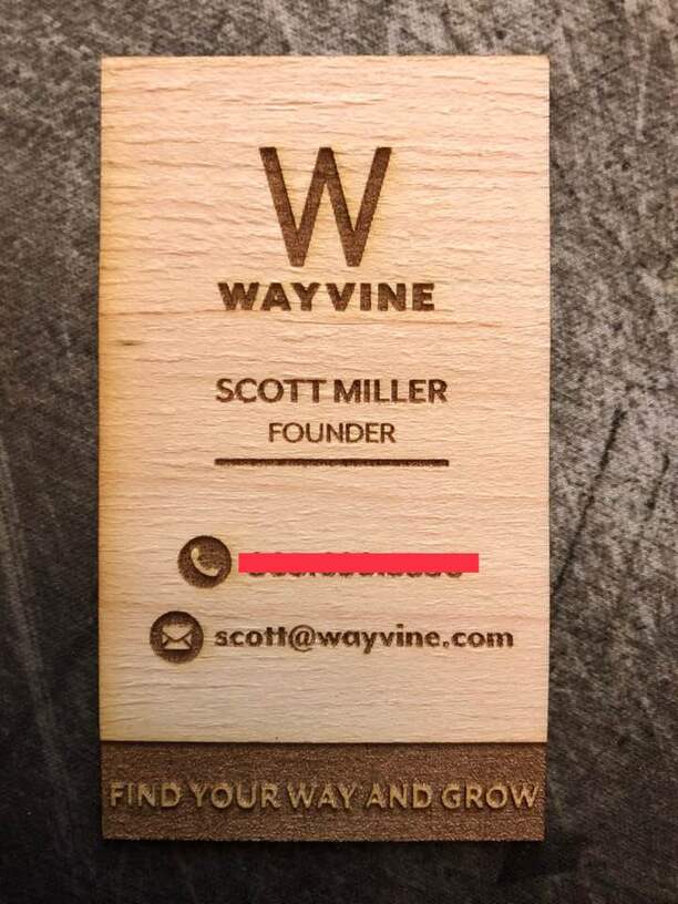
OLD VERSION:
Redesigned my business cards. Any suggestions or feedback would be appreciated!
New version 6/11/18
OLD VERSION:
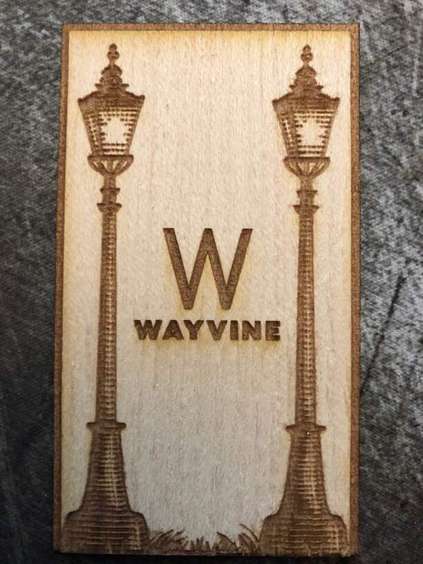
I’m wondering if I should redesign the front so the W is n the same spot on both sides, then cut it, rather than just engrave it.
Probably quicker to cut it than engrave, and a W reads the same both ways. 
That’s what ai was thinking, but I’m not using proofgrade as they don’t have any unbanked maple veneer. When I did that on the last set of cards in April, I often had problems with the back of the cut.
I really like that idea! It’s one that not every one could do.
Nice design. If you have Twitter or Instagram accounts, might want to include them.
I really should do that. I will start an Instagram this weekend ![]()
We put just those social sites’ icons on our biz cards
I really like the lamp posts and I second the idea of cutting out the W. It adds a lot of visual impact I think. I also like the juxtaposition of the more traditional lamp posts and the modern W. I like the “find your way” engraving too.
FWIW, my only criticism is I don’t know what it is you do. I don’t think it matters much if the card is given out to people who would know what it was in reference to, but to someone coming across the card randomly, it might matter.
It can help to have a sacrificial piece of cheap material under your product in cases like this. Just be sure to clamp everything down tight.
Interesting, I hadn’t heard this before
What you were seeing on the backside is flashback - where the laser is cutting through and then bouncing off of the crumbtray and marking your material.
Sacrificial material will absorb whatever makes it through your primary material.
Thanks guys! I’m going to try this tomorrow. Any suggestions on what I should use to hold the materials together?
Thanks for the feedback, in this case I’m being intentionally vague. The people who will get this card are in my industry and for the most part know what I do 
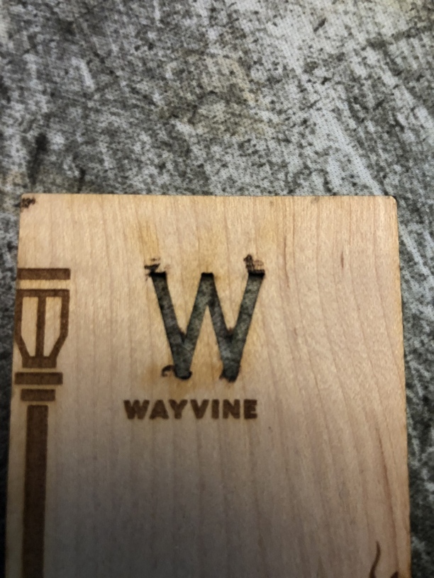
Would it be worth a change of font on the W to something that has the peak and valleys more rounded to reduce catching on something?
I think one of the advantages to having a laser is that you can do things that would be more difficult or cost prohibitive through traditional methods. Things that would require a special die for example (I am a fan of rounded corners). Being able to cut through (like you’re talking about with the W). Inlays. A contrasting cutout in a different type of wood or material.
Good point. Some of the feedback I got yesterday was the sharp corners and people also seemed to think they would get splinters, but were surprised how smooth it was.
Changing that in the next iteration.
Something to keep in mind if I decide to cut the W all the way through.
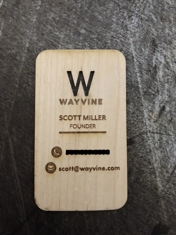
I actually like it not cut through. But I do like it located the same on both sides. I am wondering how a different color insert (perhaps a circle around the “w”) would look. Overall, I like the design. 
Interesting, I am going to try that on the next version.
How long did they take to make each card?
What material are you using? I have found 1/16th to be a little big… ?
Cheers!