The tutorial of gimp on the glowforge site for photo engrave isn’t even close to gimp. Is it using an older version of gimp? So the question I have is do I want my image to be as light as possible. My images have looked like everyone has a really bad dark spray tan !!
3 Likes
Yeah i think it is an older version. You can run a test pattern to dial in your settings on a similar piece of material as the final product.
Like this one i use before doing photos and 3d engraves to dial in the finish or depth im looking for before i run the end piece.
Adjust your settings so you can get as much detail to show across the gradient and then it will get you close where you want to be. I do multiple at a time to help dial it in faster. Start off with 10 unit incriments in power or speed finf the area that looks the best and then break that down into units of 5 or 2 till you get it dialed if that makes sense?
Engrave pre test.zip (81.8 KB)
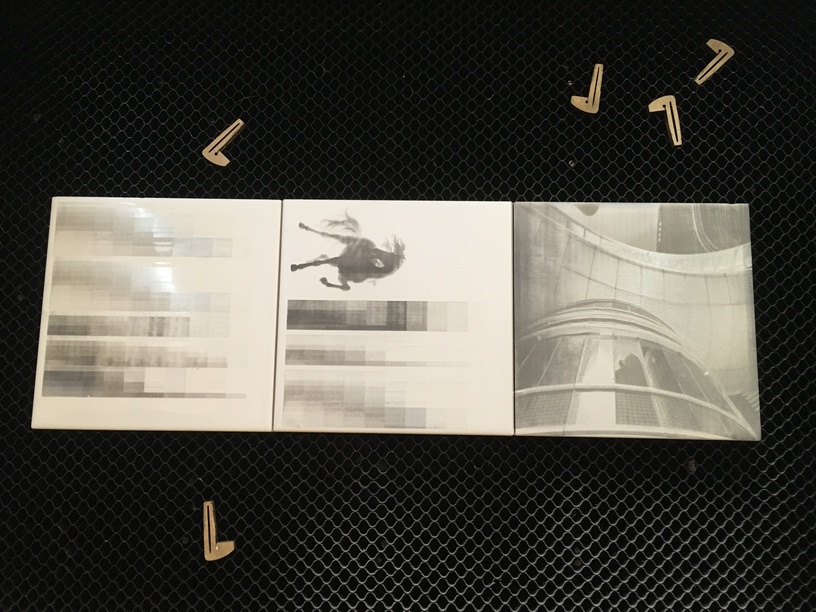
(some tests i was playing with doing tile engraves)
I don’ t process any of my pictures before i print them so i wont be able to help you there sry, hope this was helpful in some way.
3 Likes
Uhhh I think I’m in over my head and need to do more research lol.
Photo prep has been covered a lot and it takes some practice to get good at it. (And some photos just will never work well.)
Here’s a few to get you started and they have lots of good links to other tutorials in them. (Keep in mind that some settings discussed in the links may have changed a bit, but the concept is all the same.)
I like this video too. It’s not specific to GIMP, but it explains the concept pretty well.

and this one too.

8 Likes
My bad lol. its simple once you have done it once but im terrible at explaining things hehe
No I totally appreciate it, I have a habit of jumping in before looking. I did some photo engraved a few weeks back that are ok but I’m playing with 1/4 inch Baltic instead of 1/8 and I don’t know what the heck I’m doing 


2 Likes
So let me ask another question , the smaller the size the worse the image is ? Should I stick with making them larger ?
Depends on what material you are working with/ file. The way I think of it when working with wood is the resolution you get from the material can be limited to the size of wood fibers in the material so there is only so small you can go without running into issues. A lot depends on your source image as well if it is low quality or pixilated that will cause issues where detail is lost or non existent. Material orientation comes into play also if the laser head is traveling across the grain, with the grain or across the end grain with it you will get different results. Again ignore me heh, i make things too complicated because i tend to obsess over things like this. My brain is full of all sorts of useless info 
3 Likes
I actually got that !!! I decided to go back to photo shop and take it a little slower and do the tutorial that kittski offered up, I watched the two other videos that seemed to make sense, my brain is not to tech savvy but I’m like a dog with a bone and whenI want to learn something new I don’t give it up.
5 Likes
You can have a really good image but if you use variable power instead of dot dithering it can still be a huge mess. The range from barely scorched to totally black is in the top 10% of the available power, After that it is just all black or as b lack as it will get. Dot dithering uses the same fair amount of power for every dot so by how far the dots are separated sets the shade.
The setting area has two widgets top and bottom so if the light looks untouched you raise the settings for min dots, and if solid cut and no left over “outside” between the dots you lower the maximum dots. The higher the LPI the smaller the dots.
Experimenting with that will yield easier results than playing with Gimp, Gimp can do an amazing job but in that issue it is not that special. (Like turning an image into vectors)
1 Like
So this is where I get confused. Is dot dithering the pattern density ? If so the left is less dots the right is more, so I’d want to move my left side up ?
The left side increases the minimum dot density, so it will effectively add more dots to the lighter areas as its starting point - making them appear darker visually. The right side is the maximum density.
1 Like
And I see what you mean by when I move it the dots lessen or the image tuns black . So basically are you saying I want a good mount of fairly spaced out dots ?
1 Like
Think Newspaper image, They had only black or white, and dithering was the solution they came up with. For practical purposes you have the same issue, but with a laser you can make smaller dots and thus higher resolution.
2 Likes
Thank you that makes a lot of sense
1 Like
Thanks so much for the help, everyone—I’m learning from this, too!
4 Likes
This is a good trait to have when working with all of these different ideas and processes!
2 Likes
Back to making smaller dots. Is the dither making less dots or smaller dots ? Or is it the lpi that makes the dots smaller ? I think I was getting less dots confused with smaller ones or is that the same?
Wait just re read… my bad
The dots are the same size - all that changes is the density of those dots.