So, Day Two and this happened

I needed a PDF to test, and didn’t have one worked up, so I grabbed one from our local expert… and the result is totally squeee worthy! :hedgie:

(For those of you who haven’t been hanging around, @smcgathyfay created this adorable Narwhal phone stand and shared it with everyone earlier last year…I’ve been planning to make one for myself ever since. You can too…I will post the link to her shared file at the end of the post.)
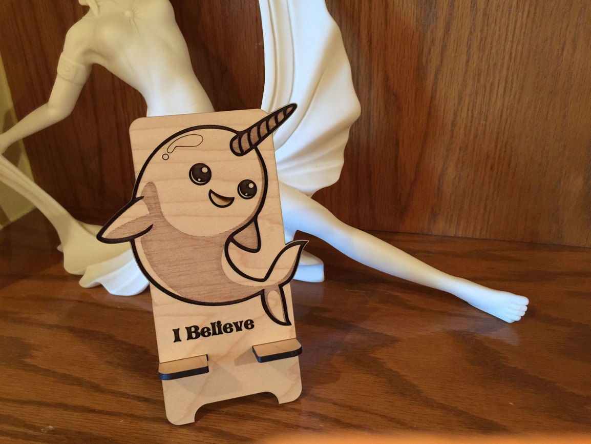
If you had any idea how excited I’m getting over this thing you’d probably hose me down. (Two days ago I had never touched a laser in my life.)


And now…the rest of the story.

This gets into the details on vector designing for the Glowforge for those who are interested, and if you’ve never done it, it might be a bit confusing. So if you’re not keen on that…you can skip the rest of this. The files that you purchase are going to work just fine, as will any drawings you make, without having to know this.


That was actually the second Narwhal that I created, because I made a mistake on the first one. My mistake was in assuming that all lasers worked the same way, and apparently they don’t.

So the first one I loaded up for printing was the file that was shared, exactly as I downloaded it.

But other lasers apparently give you the option to perform operations based on different things than the Glowforge does…mainly color, I think. The Glowforge is doing more, and looking at color and fills and strokes and some other magic that I haven’t figured out yet, but it seems to be trying to do most of it for me.

So I’m going to show the one I messed up, and tell you why, and show how you can tell by looking at the screen settings for the Glowforge Interface that it isn’t going to do what you want it to do. Because I had to print the whole thing before I realized what I’d done. And that can be avoided very easily if you pay attention to the options that Glowforge gives you.
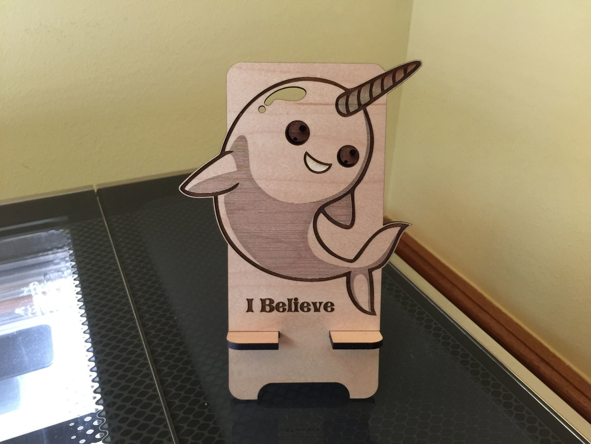

So for this first one, I wasn’t paying attention, and I cut a hole into his head instead of scoring it. (Not cool…poor little Narwhal!) But the real problem was with the eyes. See how dark they are?

That’s because there were areas in the original file where white layers were laid over the top of the dark circle to represent the highlights, and while that might work for other lasers, that isn’t the way it is handled here. The Glowforge interface treats all vector fills as engraves, even white ones, and in this case, because we did not want those highlights engraved, but wanted everything around them engraved, we needed to subtract the highlight shapes from the eye, and create a Compound Path (aka: subtract the highlights from the eye shape) for the Glowforge to engrave.

Fortunately it’s an easy fix in either Inkscape or Illustrator or CorelDraw, involving selecting the affected shapes and hitting one button.

But if I had been watching the screen I would have seen this and stopped it before wasting beautiful maple plywood, and that’s what I want to show everyone, because I know you’re all curious about how the Glowforge part of this is going to work.

Here’s what the first file offered when I loaded it up:
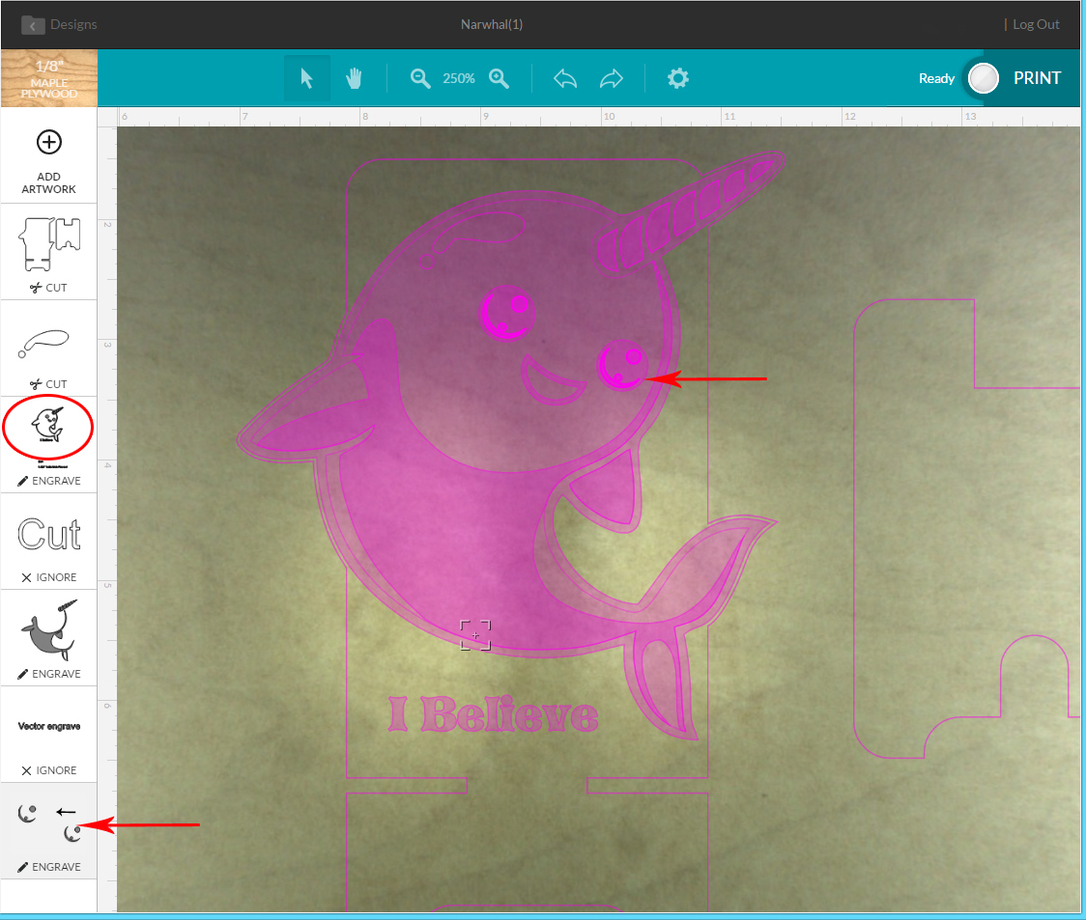
If you hover the cursor over a thumbnail in the column at the left, it lights up on the render. You can see that the highlights are treated as a separate engrave, and that wasn’t what we wanted here. We want them to be cut out of the round eye engrave area, so they stay white.

The round eyes are included in the little circled icon on the left. (They lit up when the mouse was hovered over that thumbnail in the left column.)

After the quick fix, the interface rendered the image below. (I also removed some of the text because it was just explanatory, and I didn’t want to have to keep telling the Glowforge to ignore it.)
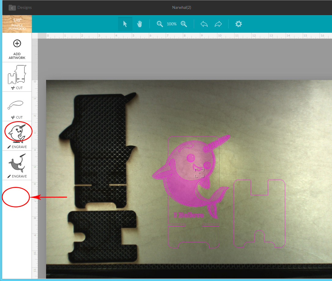
Here you see that the highlights have been included into the little circled Narwhal, and the separate engrave option for the highlights is gone. That’s what we wanted and that is what produced the first Narwhal at the top.


So anyway, I could have saved some time and material if I had thought about it a bit instead of just hitting “Go”. Which is the moral of the story I guess…remember to check the render before hitting the big glowie button. :grin:


81 Likes

Awesome!!! Thank you for the detailed explaination of how the Glowforge interprets the colors and fills. That will help in designing for it since its quite different than my Universal.
Glad you made yourself the phone stand​:grinning::grinning:

20 Likes

I have an ulterior motive…I think you could knock out a dynamite hedgie to be his little buddy! :wink:

18 Likes

Hmm I have the day off tomorrow and a hedgie graphic…
A/C guy is SUPPOSED to come by but if he doesnt…I may find myself at the office…lol:grin::wink:

18 Likes

The only thing I have to say to that is…squeeeeeeeeeee! :hedgie:

15 Likes

I keep looking at the beautiful color variation and wonderful lines and I just smile with anticipation. :slight_smile: Thanks for taking time to do the file tutorial, that kind of information is invaluable!

11 Likes

Fantastic Day 2 (3 if wasn’t for that hubby :neutral_face:) lol I say glue a pair of googlie eyes on that ffirst atttempt and send him on his way ! :astonished:

15 Likes

I imagine hubby number two would likely feel much the same. Chuckle! :wink:

7 Likes

Just when I am fully fatigued of waiting… You know you have to keep these coming until I have mine, right?

8 Likes

I meant the narwhale !!!:hushed: :grimacing:

8 Likes

Hooray! Narwhal’s adorable!

We have some ideas in the hopper that will make potential problems like that easier to avoid, too.

28 Likes

Fantastic! Don’t waste the first narwal stand though - stick on a couple of googly eyes and cut the highlights out of some lighter wood or white perspex and stick them in the holes.

edit: I didn’t see @PlGHEADED’s answer before posting. Great minds obviously think alike :slight_smile:

16 Likes

Your explanation is so helpful! I remember a collaboration between you and @marmak3261 some time back regarding compound paths, but seeing the result rendered in wood really brings it home. Thanks!

11 Likes

:+1:

4 Likes

Thanks for taking the time to share your experiences in such detail as well as your fixes for potential newbie mistakes!

Good to hear!

9 Likes

lovely. i wouldn’t say you wasted anything. besides, judicious use of white paint in the eyes will produce a happier looking stand instead of a haunting one. i’d fill the hole, if it bothers you, with something like a neon orange or green or pink plastic for a pop of color.

10 Likes

Bummer…but good to know! I don’t know if it would work for this, but sometimes when I need to send a 1color logo out for print and don’t want to merge everything, I use a transparency mask, then expand the appearance for a quick one off. Might be an option here.

3 Likes

I always do new projects using chipboard first. Yeah, it doubles up the time because I’m doing it twice but I almost never get it all right the first time :slight_smile:

It’s pretty cheap if you recycle cereal boxes, etc. but not that much more if you buy it as stock from Amazon or Blick.

9 Likes

I was hoping you were going to give a narwhal related mistake based on the first sentence. Like “My mistake was assuming that all narwhals have a horn with a…”. Although this post was far more useful, and helpful to know. It seems to work similarly to those of use used to doing extrusions in a sketch based parametric CAD package (what it defines as “outside” vs “inside” which is something that can really trip you up in complex extrusions)

Also, I love the cut out specular highlight above the eye. Leave it as is!

10 Likes

I am laughing so hard I can’t breathe! :laughing:

(Thought the googlie eyes seemed a little harsh, before I turfed him for making me wait…)

I’ll see if I can find some googlie eyes for the narwhal. :smile:

Gonna try to do a few now and then. :wink: (Testing first, then play).

By the way…the interface works just fine on PDFs as well as SVGs. And I wanted to get the various engraving shades into the narwhals this time. That dark engrave is a rich dark chocolate brown that almost looks black from a distance. Really exquisite.

The hopper is a great place for it right now. It’s not something that a designer is going to get caught by once they know the specifics on how to design for the machine, because it is super simple to set it up the right way. (This only happened because I wasn’t paying attention to what I was doing, was still learning what I need to do, and was using a file that was not originally designed for the Glowforge.)

This is fine for now, you give us a light-up sign post to check the design over before we print, and several options to wait before getting down to the actual lasering process…it’s about as idiot-proof a procedure as it can be, with humans in the mix. :wink:

(You guys have really built one hell of a machine.) :hedgie::hedgie::squeeee::squeeee::squeeee:

Thanks! That’s why I posted it. It’s so easy really, but the User Manual hadn’t been done at that time, so we were shooting blind back then. They have done a super job of listing the design specs in the manual - any designer is going to find them a snap.

And (since you’re working on the team) you know how we’re working on getting non-designers started in designing if they want to get their feet wet.

It’s gonna be so sweet! I can’t wait to see all the fantastic things that people will come up with!

No, masking doesn’t work with this. There are technical reasons why.

It’s a simple process to just subtract the white enclosed areas out though, and I’ll probably write up a little step-by-step tutorial for everyone for Illustrator and Inkscape, so there will be no struggle for anyone else.

Another great idea that needs to go into the “Handy Tips for Using a Laser” category.

Chuckle…I know it’s a tooth, but it’s cuter that way… :smile:

15 Likes