Normally, I love designing. There’s something very satisfying about taking a fresh piece of wood or other material, feeling it, talking to it, seeing what it wants to become…and then being totally surprised when it changes it’s mind and turns into something else entirely.
That relationship gets a bit strained when you try to design to someone else’s specifications.
Case in point, my hubs has been wanting me to design a little “give away” for him to hand out to his clients. This is how the conversation between us goes about it…
Him: (text message): “You going to design something for me to hand out?”
Me: (walking into the study to actually speak to him because I refuse to text him from the kitchen):
“Sure, whenever you want. What did you have in mind?”
Him: “A business card holder.”
Me: “Okay, what kind of business card holder?”
Him: “What do you mean, what kind? A standard business card holder.”
Me: “Well they come in different shapes - you can have one that looks like a little easel that you prop the cards up on, or a little box, or stick the cards in a cutout, or a little one with a drawer that pulls out…what shape do you want?”
Him: “Just the kind that has a front and a back.”
Me: (grinning) “No easel?”
Him: “Right. The kind that looks like a bed.”
Me: (trying really hard to keep from cracking up) “You want a business card holder that looks like a bed?”
Him: (getting frustrated) “Yeah, you know, there’s a foot and a headboard at 90 degree angles to the base, and the cards sit in between them.”
Me: “Got it”. (Had no idea what the heck he was talking about but figured I could look it up on the internet.)
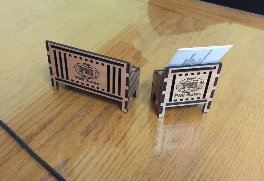
Him: “Put our company logo on the back so our customers can see it from their viewpoint, and put the logo for their company on the front. Make it nice so they’ll be proud to display it.”
Me: “Nice…Got it.” “How many of these things are we talking about here?”
Him: (hands me five cards out of a few dozen on his desk) “You can start with these…Just pull the company logos off of the cards.”
Me: “You want me to pull and vectorize the logos for all of the wholesalers? Off of their business cards?”
Him: “Sure, you can put that on the front of the holders to personalize them. Then the people sitting across from them at the desk will see their logos and know who they’re dealing with.”
Me: ![]() “Riiiiiiigggghhhhht!”
“Riiiiiiigggghhhhht!”
Him: “You’ll think of something…It won’t take you long.”
He was actually right, it didn’t take long, because it ain’t gonna happen. ![]()
_(Makes more sense to put the person’s name on the front, so they can take it with them to their next job…these guys jump around from company to company. He doesn’t know that yet, but he will, when he gets back.) ![]()
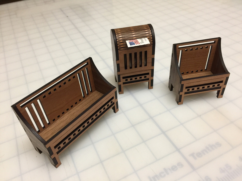
Okay, so after thinking about it for a bit, I decided to design something similar to that stamp dispenser, so that it kind of makes a little set…if he’s got any customers that remember roll stamps, they might get a kick out of that just for the nostalgia value.
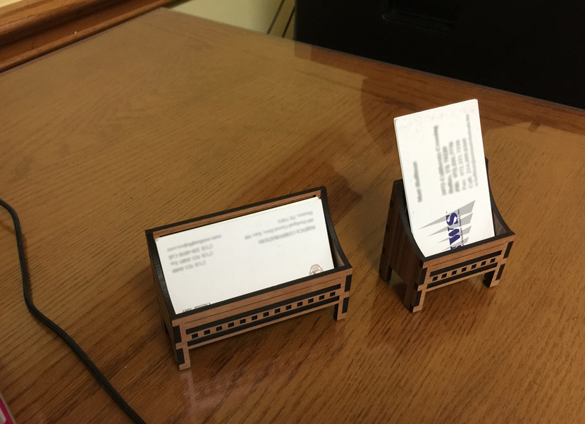
Two styles, one with the cards horizontal and one with the cards sticking up vertically for a smaller footprint. My only requirements for these things was a snug press fit, because assembly of large quantities is going to be tedious enough without having to glue myself to the chair.
So here they are…the names will replace that blank line on the front. Which one works better? Horizontal or vertical?
He’s probably going to hate them both and tell me to just make a little box without all of the cutouts. ![]()


