A couple of entries had me looking at different things and I decided to combine them.
First up was the Turing Pattern explanation. I didn’t go into all the button clicking, since there are ample Turing Pattern image files available. It is described here.
Another link of interest was from @shogun with his canvas works. Essentially engraving paint with awesome results.
I started with some canvas I had, with varying results, then moved to 1/8 MDF (which I have a monster pile of - hubba hubba). Concept works the same. One or more colors with a cover coat. Some work better than others (matte/flat looks better than the shiny). We really went nuts here with this paint engraving. Some things are bleh, others rock. Many failures and many surprises and no one size fits all.
The bottom line. The colors used seem to depend on what it is you are engraving. Same engrave with a different color scheme can have a huge difference (experiment - have fun).
Blue base (sky blue to dark blue) all seem to render faces exceptionally well when covered with a cream or tan.
I had several boards with cream on blue made and did all the ancestor pictures we have. As grainy as they were the results were still pretty awesome ( using the photo parameters at 100 instead of Full so it didn’t just burn thru the paint).
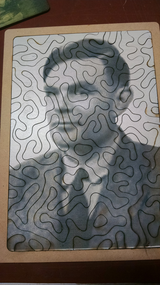
When I ran out of relatives I remembered the Turing link that had interested me and decided to put it all together.
So, here is Alan Turing on MDF and cut into a puzzle with a Turing Pattern. This was a dark blue covered with a matte cream color.
Very nice! The reason that color combination works, is your matte cream color probably has enough red and yellow in it to balance the blue. Blue and orange (red + yellow) are opposites on the color wheel. I’m guessing the puzzle of Turing works because the dark areas (hair, etc) engraved far enough to uncover the blue layer and the light areas were only lightly engraved, if at all.
In the Reichsmuseum in Amsterdam, Netherlands, is a pair of portraits done by one of the Old Dutch Masters. It was one of the artist and one of his wife. The artist used ‘dry’ paint (chalk? pastel? oil crayon?) of only 4 hues: blue, orange, black, white. They looked incredibly life-like because of the expert use of blue vs orange. The other two opposite-color pairs (red + green) and (yellow + purple) cannot create human skin tones near as well as blue and orange.
There are some really great books about color out there. I used to have a collection of books that showed various combinations of process color (CMYK, cyan-magenta-yellow-black) looked like when grouped. Pairs, triads, color used in assymetrical balance… You won’t need to re-create the exact color combination, just use them as starting-off points to select color. Time saver and a great way to get a feel for things that work outside your comfort zone.
Sorry, have to correct your spelling there from German to Dutch…
It’s Rijksmuseum. Went to high school just 10 min walk away and spent a lot of spare time there.