Hello, we are the Tuit family.
First things first, much credit goes to @tjleasa, his glass coaster set and box were the inspiration here. In fact, ignore my post and go read hers, it’s way better.
Still here? OK, I warned you.
So, for father’s day, I wanted to cook up a quick gift. My pop is a big Red Sox fan, so I landed on a coaster set. Of course, it’s my dad, so I wanted to do it right, so I made a box to present/store them in.
Details:
- Materials are figured walnut, hard maple, and cork coasters from IKEA.
- The woods are a mix of 1/8" and 1/16" hardwoods. The walnut and 1/16" maple came from Kim Oberlin, the 1/8" maple from Ocooch.
- All surfaces sanded to 600 grit
- All exterior surfaces finished with wipe on satin polyurethane.
- Final dimensions were determined entirely by the size of the coasters, and I don’t have the piece anymore so I can’t tell you offhand. About 4.25" x 4.25" x 3.5", I think.
- The coasters are pretty nice, they make an impression with their unusual shape. They are just a bit too thick to insert into the GF, but easy enough to wrangle the correct height without the crumb tray. I made a custom crumb tray replacement box out of mdf which was the perfect height to place them on and used cardboard corner jigs to align everything.
–
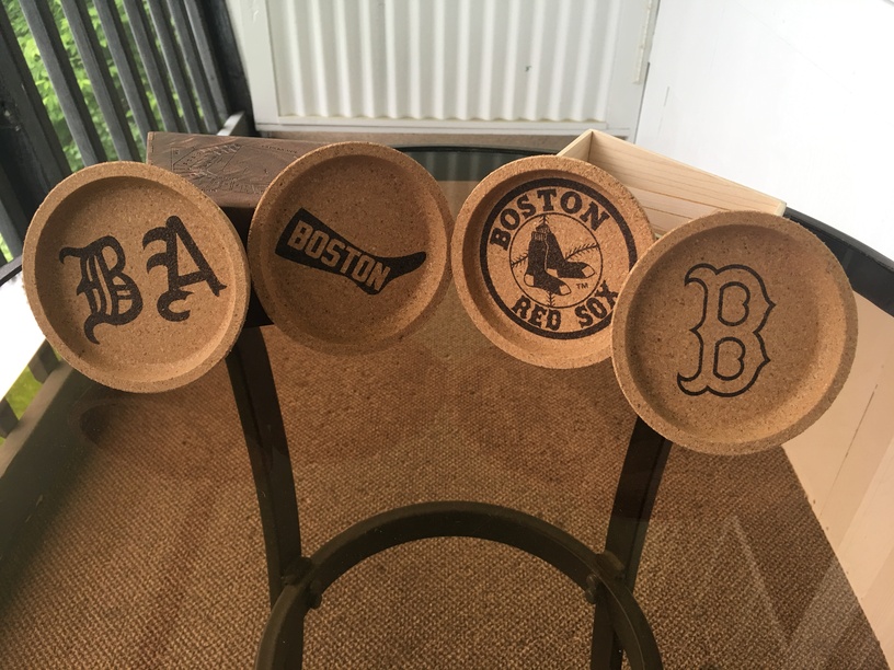
The obverse of the coasters is a series of Red Sox logos through the team’s history. As always with cork, it only takes a very light touch with the laser to get an exceptionally dark engrave.
(Cork, Maple, Walnut)
The Reverse of each coaster gives the dates in which the logo was in use. Unfortunately, I didn’t line them up properly, so if you compare the two pictures, the proper paring, left to right, is 1-1, 2-3, 3-4, and 4-2. That is, the second to left in the top is the 3rd to left in the bottom. If that doesn’t make sense, well, I guess it’ll remain a mystery ![]()
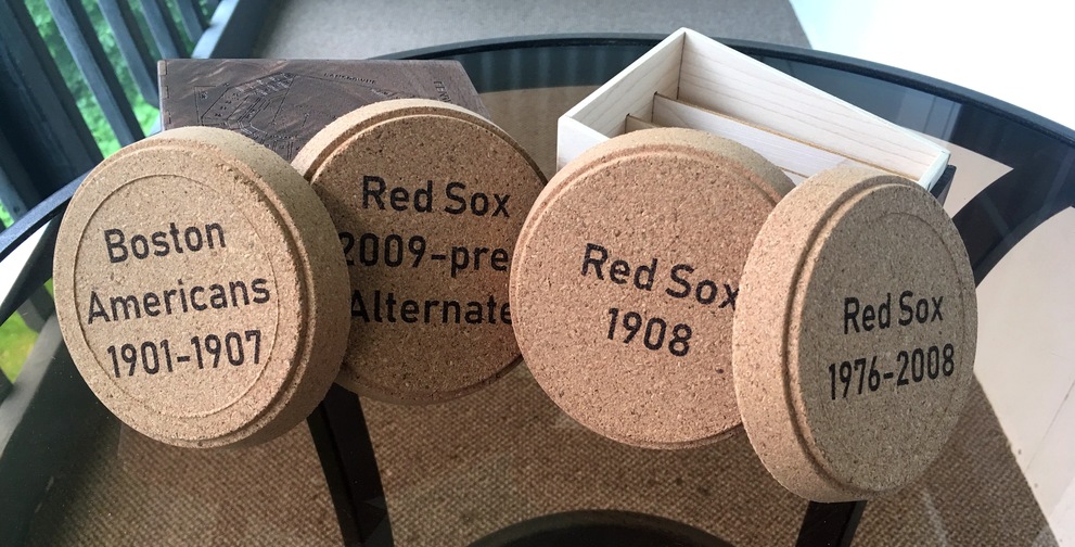
(Cork, Maple, Walnut)
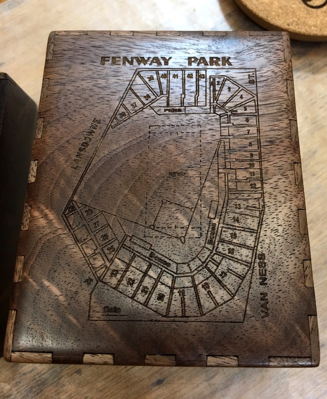
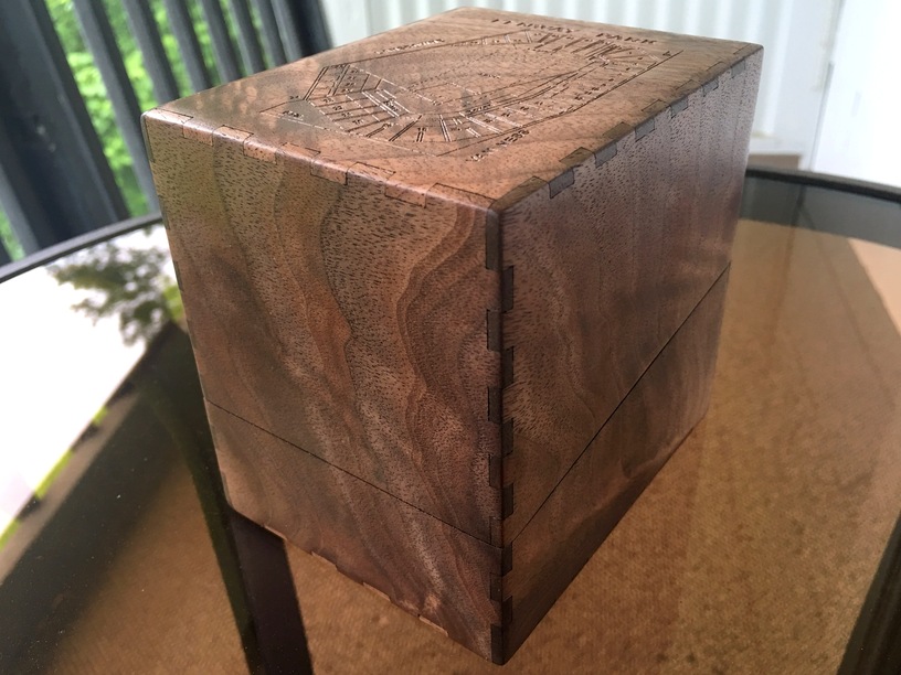
I found an old blueprint of Fenway park on the internet. It’s one of those images that is all over the place and didn’t have a specific source, so I can’t vouch for its provenance, but it had exactly the right amount of detail for the size of the piece. Walnut tends to engrave low-contrast, and so I didn’t want to try to do too much. All I needed was a clear way to make the top of the box stand out so you knew which side you were opening, and a site plan of the park was thematically perfect.
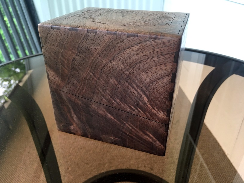
Apologies for the long note here, but I experimented with a new way of doing corners on my boxes, which I am currently calling a “pillow corner”. In the past, I’d always gone for an even radius on the corners, but this time I intentionally sanded the edges to have a progressive slow rounding with a sharper corner. The end result feels a bit more organic. As always, I used a hand sanding block to do it. The shape of it is fairly evident in the reflection on the lower left corner of the next picture.
(Cork, Walnut)
The grain on this figured walnut is pretty in person, I knew this box was going to display a fair bit of a solid wood, so this was an easy choice form my material stack. I cut the diagonal line across the face first, then the exterior of the fingerjointed box panel. This meant that the grain lines up almost with no interruption, only a kerf. The overall effect is that it looks like a solid block of wood at first glance. And seriously, look at that figuring, it’s really special.
(Walnut)
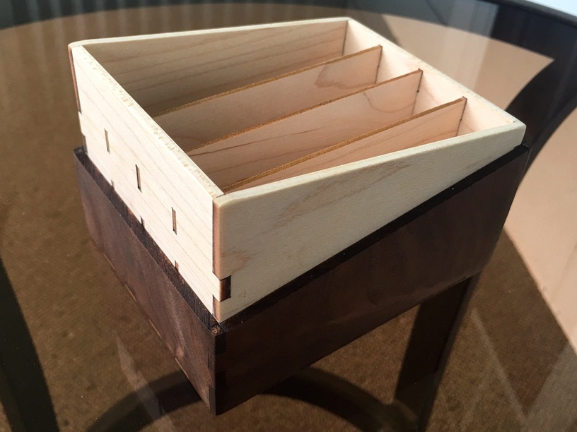
“I want to see more grain”, you say? I got you covered. An interesting side effect of the figuring is that the wood sort of shimmers, so finger joints can appear either low- or high-contrast depending on your viewing angle and the lighting conditions.
(Walnut)
The maple insert was a little quick and dirty, and the only thing I would change. Ideally all finger joints and slots would have been concealed inside the walnut lower half. This way is nice and strong, but if I were to do it again, I will make it a less conspicuous joint. I might also angle the 1/16" inserts to mirror the angles of the sides, but that’s optional and I really only thought of it just now. Next time, I suppose.
(Maple, Walnut)
The entire set packs up fairly securely, I made it have enough wiggle room so that it is easy to get the coasters in and out – my dad is still pretty dexterous, but I didn’t want it to be too tight – and the box slides together with very little friction.
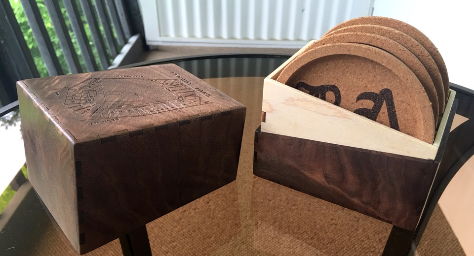
(Cork, Maple, Walnut)
So that’s it, my tardy Father’s Day post. All in all, I think it turned out nicely, and most importantly my dad loved it.

 . Unless the coasters are the size of dinner plates, then never mind. A closeup on a bistro table does strange things to my brain’s vision center.