Testing the Four Scoring Options

EDIT: I realized what is wrong now after talking to support and seeing them fix things. The settings were not mislabeled; it’s that there was an error with the speed in one of the settings! What I thought was supposed to be HQ (300/41) in this post is actually Draft! The actual HQ settings are 125/11, which was set to 300/11 by accident when the feature went live so I thought it was a useless drafting feature. In the OP and the first 13 replies we were all assuming that the Draft settings were HQ settings, and so all the criticism people (myself included) had on the 300/41 were actually for the supposedly bad Draft setting that GF staff said were suppose to not be pretty! I’ll test with correct settings and reply in a moment.

So this means that everything below this line is basically incorrect! Look at my update here instead.


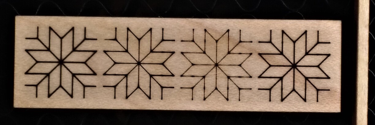
After hearing @dan say in 3D Engraving as Proofgrade Prints get Prettier: 10/23/17 Latest Improvements that the old score settings will be going away I realized that I have access to both the old and new scoring options in my GFUI right now, so I was like what the heck let’s see what they look like side by side… After quickly throwing together a file I had my GF score the same pattern four times, once using each of the scoring options, on to PG maple hardwood.

In the following image, from left to right, we have High Quality, Draft, Fast, Slow:

Yes, the first is HQ and second is Draft. I am pretty sure the labels are switched (especially after having looked at the numerical settings at manual) and submitted a support request on the probable bug. I’m just going to assume that it was a bug and refer to them in order as Draft, HQ, Fast, Slow.

They weren’t kidding when they said Draft is lighter in the middle. There’s practically nothing except at places where the laser changes directions. It’s really apparent if you look at the middle where despite it being a corner there is only one dot since the laser just sweeps across it 4 times in 4 directions and never stops or slows down.

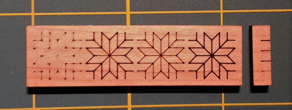
The new HQ score setting looks aesthetically somewhere between the Slow and Fast options. It’s not quite as dark as the old Slow, but it also doesn’t cut as deep. Here’s a side view of the four scores in the same order left to right.

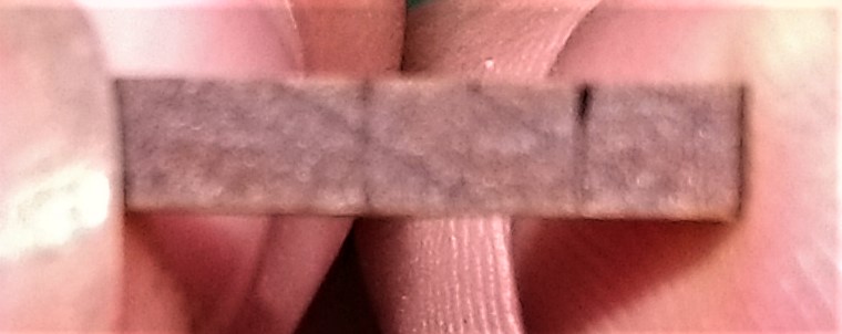
Sorry for the blurriness. it’s so small my camera didn’t want to focus. Even then you can see that Draft is barely noticeable, The Fast is a tiny notch. The Slow pretty much burns through the piece of wood. I mean, it doesn’t, but as I mentioned in my reply to Dan here, Slow scoring along the grain in hardwood makes it basically snappable with bare hands (I am not very strong) along the score so it’s probably doing some work on the structure of the wood.

HQ is as before somewhere in between. I printed a small piece with an HQ score along the grain in the middle and tried snapping it with pliers. It held until the pliers started crushing the wood. Maybe if it was a bigger piece with more leverage it would work? Not going to waste wood testing it though.

When the news that the old settings were going away came out I was afraid that basically only Slow would remain. It looks like it’s not the case and, honestly, if I didn’t have Slow right next to it I couldn’t really tell the difference, so in general I like HQ quite a lot. I still would like multiple scoring settings so I can go darker on plywood and lighter on hardwood, or vary darkness in scores for subtle effects, but it looks like I’ll have to do those manually.

Draft feels kind of useless except for making sure things are placed correctly when prototyping cuts, which isn’t a thing I’ve had to do or immediately want to do. But I’m sure I’ll appreciate it at some point.

For reference, with PG maple hardwood, HQ is 300 speed at 41 power, Slow is 168 at 30, Fast is 194 at 15. So faster and more power, so a dark scorch but shallow cut? Kinda makes sense to me.

_Oh, finally, speed. I saw almost no difference in speed for this test pattern. It took about 10 to 12 sections for all four options. I’m sure that if I was doing a larger thing the difference would add up but I’m not going to bother to do that test since I am not concerned about speed in general. You can watch the video I made of the process here though. It cuts off abruptly at the end because my camera app crashed. :frowning: But it captures 99% of the process. _

I cannot believe I got through writing all these without a four score and seven years ago joke…

29 Likes

Nice demo. :grinning:
(You might want to post it in Problems and Support so they can fix that label problem. Support won’t see it here - they only keep an eye on that one section.)

Thanks! I sent them a support ticket via the support site separately. :slight_smile:

4 Likes

I kept waiting for one!

1 Like

Very nice–I really appreciate this testing!

1 Like

Here you go:

Fourscore and seven years ago I ordered a Glowforge.

6 Likes

As both the old settings look better than the new ones how is this a step forward?

I would expect them all to give the same darkness of engrave by using more power on fast / draft to compensate for the speed. So they only difference should be the time taken and the evenness, not general lightness / darkness.

1 Like

I don’t agree. I think HQ looks best for most situations; Slow is just a little too dark for me (too much burn in the center) and Fast a little too light. But of course we can always adjust to suit the demands of the project. I just think HQ will be the best default.

Crossing in the centre is a special case. Whenever you have lines crossing it will be over engraved and that centrepoint is an extreme case. And acute corners overlap the beam, so again some over engraving is to be expected. Ignoring that, I think that “slow” is the most even between line centre and corners. Seems off that that is better than “quality”. Maybe they aren’t swapped, perhaps the first one simply has a typo and is just wrong.

Regardless though if the choice is between fast / slow or high quality / draft they should target the same engrave depth / darkness by keeping the power density constant while trading speed and power.

From the wording on the announcement I would have thought that the overburning in the corners would have been addressed better in the HQ. As it is, the HQ also is ‘lighter in the middle and creates dark spots on corners’. HQ simply looks like a darker ‘Fast’ to me in this image. This is just one picture of one sample, and might not be the best test of what was achieved, so might just be an outlier.

1 Like

I think the overburning on corners is due to the acceleration of the head. Since acceleration isn’t instantaneous the places where the head change directions or start/stop will always get more heat than places where the head is at speed. This isn’t apparent in Slow because of the low max speed and everything looks dark anyway so it’s hard to tell a difference, but I think it’s pronounced in HQ because of the high speed.

You can actually see that in the HQ engrave on this sample there are places where it’s the middle of a line but there’s definitely some extra burn:

Capture

That’s because this file was originally meant for print and not laser. The path actually breaks there so there’s de/acceleartion going on there, leading to a slightly darker spot. So yes, this one sample file probably isn’t the best test.

I think the differences wouldn’t be as pronounced if the use case was for something like the Gift of Good Measure where the scoring are continuous curved paths with minimal sharp turns (@palmercr: I think the acute corner burns are both from the double burning and the abrupt change in velocity) then it would look great. So yeah what @cynd11 said.

I chose this file because my general use for score is to etch out small, sharp, angular patterns. (See Quilt Block Coaster) The ways I can think of to fix that in the software would be to either have the laser shut off at the corner while the head maintains speed for a little longer (which would probably be hard math-wise and will reduce print area) or to reduce power as a function of the speed decrease (I am not a real engineer but I know enough to know that’s probably gonna be a nightmare to do). So honestly I don’t expect any setting to look perfect for my use case but HQ looks like it’ll be good enough if I make my file better. And by looking at these presets and how they come out I now have an idea on what I’d need to change manually if I decide HQ isn’t good enough.

It’d be cool to see what test patterns the GF engineers used and how those look in HQ vs the old settings, or maybe someone using scoring in a more “normal” circumstance.

3 Likes

Understood about the reason for the extra darkness at the ends. This has been discussed before:

From the wording of the announcement I thought one of the reasons for the new settings was to address this. I was probably reading too much into it.

Ah, didn’t see those before. Thanks!

3D printer slicer software solved this (over-extrusion while slowing in corners) ages ago. It took some sophisticated logic to make it work right, so I’d hope that GF is looking at the Marlin/Sailfish acceleration code.

2 Likes

Turns out I made a mistake on what the bug was. It wasn’t a mislabel, it’s a wrong number in the HQ settings. So what I’ve been thinking of as HQ (and what we have been talking about) is actually for real Draft. I’ve edited the top of this thread with more detail on this and is running an new test now. Will post results in a bit.

Okay now that the settings are correct (thanks support!) I reran the test with the same file.

From left to right: High Quality, Draft, Fast, Slow.

Everything above this post, we thought Draft was HQ. The real HQ is here. It looks pretty much like the old Slow, but darker and doesn’t cut as deep (lost the side view piece before I took a picture :frowning:). I like how it looks and I’m going to see how it does on a bigger piece when I have time. So instead of what I thought before—we get a thing that’s in between the old settings and a useless thing—we actually get improved versions of both old settings.

I am a fan of this change now. Yay! <3

13 Likes

The fixed HQ looks great. Less corner overburn.

The fixed HG looks a bit better than slow and draft is better than fast so there is progress but draft is also a lot lighter than HQ. I would expect them to target the same darkness using different power / speed trade-offs.

It seems that they roll out new settings without testing them. Not good when thousands of people are using them and potentially wasting materiel.

I’ve seen you say this before and I don’t understand. Why would we want two different settings to achieve the exact same appearance? From a user’s perspective, I want a different look for each setting.

1 Like

If they were called light and dark I would expect them to look different shades. If they are HQ and draft I would expect them only to differ in quality, i.e. evenness and the time taken. Draft should be fast andt with a bigger variation but not overall lighter.

Otherwise there should be four combinations on two axes i.e. draft light, draft dark, HQ light, HQ dark.

1 Like