It’s soooooo easy to create files easily in programs like Illustrator, Inkscape, CorelDraw and Affinity Designer if you understand what the Glowforge interface sees when it looks at your file.
(Think of this as a last batch of Tips and Tricks, then I’ll quit bugging you.) ![]()
I’m going to demo in Illustrator again, but the same things will be done in whatever program you choose to use for your designs.
If you have questions about specifics for other kinds of drawing and modeling software, some of the customers here put together a Matrix that gives little quick reference mini-tutorials on how to perform specific tasks…it’s an easy way to find what you need without sitting through hours of videos. (And scroll down in the list for other hidden goodies.)
2D Vector Design Programs Matrix
.
.
And awaaaay we go… ![]()
How to Create Cut and Score Lines in your File:
Cut lines are easy, all you do is create a vector shape or a line, and give it a stroke color. If you give different lines different stroke colors, they will be set up as separate Cut jobs in the interface.
(Expert tip: Leave any closed shapes empty (no fill color) for your Cut and Score lines, but use a different color for the Cut lines as opposed to the Score lines. The interface will interpret those correctly, assign a Cut operation to each group of lines, and you can convert the separated cuts to Scores in the interface.)
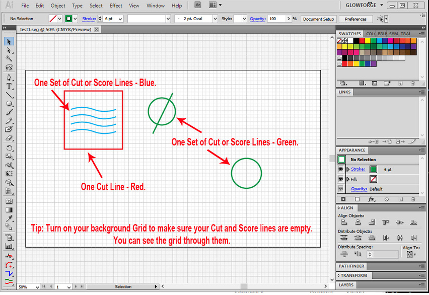
If there are no fill colors in the shapes, the interface interprets the saved SVG file correctly, with 3 Cut operations offered. You can use the shapes in the thumbnails to see which operation attaches to which sets of lines on the bed, or if they are all similar, hovering the mouse over a thumbnail causes the impacted shapes and lines to turn blue on the bed.
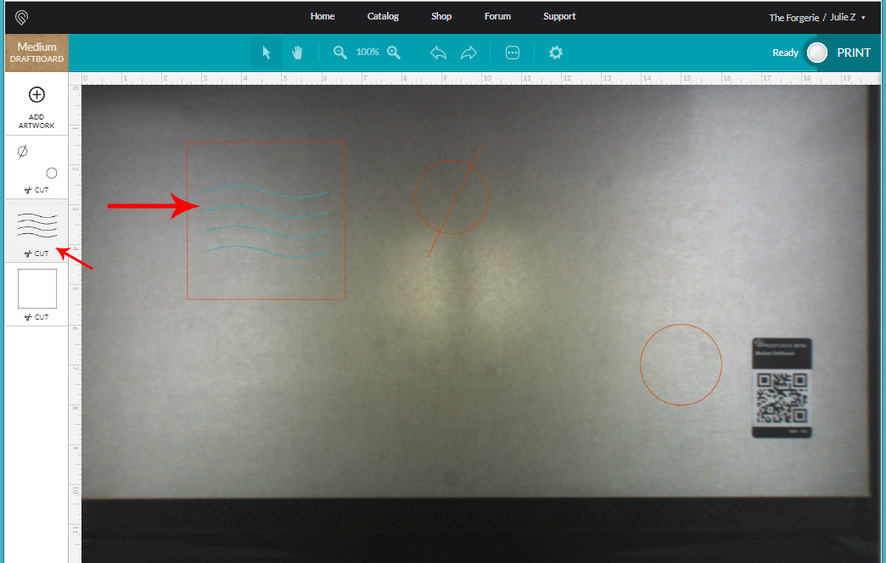
Convert the Blue Wavy lines to Scores by clicking on the thumbnail, then clicking at the top of the popout to choose Score instead of Cut.
.
.
How to Create Vector Engraves in your File
The Glowforge interface interprets vector Fill colors in shapes as Engraves. The best way to create an engrave is to use just a Fill color without putting a stroke color on it. That clearly indicates to the interface that you want that part to be engraved.
If you want to have separate engraves in a file, you can set up different fill colors, just like you do with different stroke colors for separate Cuts.
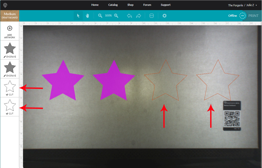
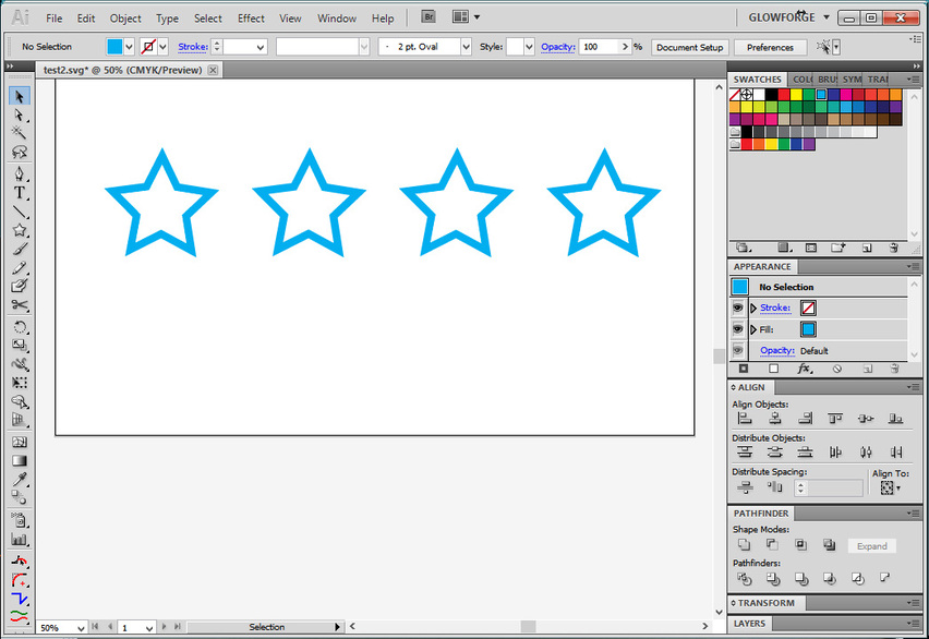
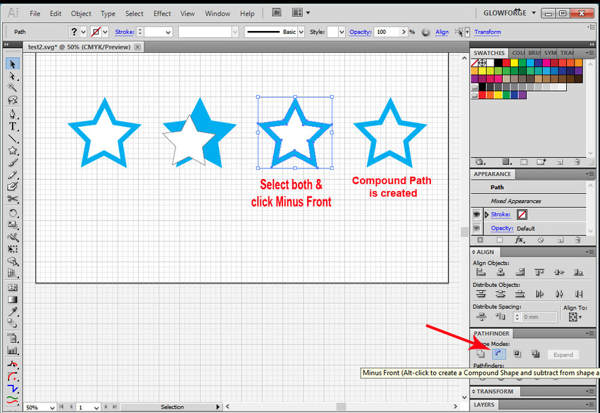
Let’s take a look at what happens when several different vector engraves are submitted to the interface. Four engrave shapes are shown below, two of them with fills but no stroke color, the other two with both fills and stroke colors.
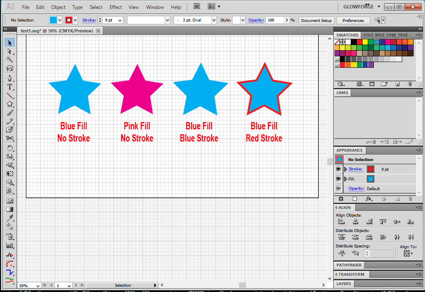
The results of the interpretation by the GFUI are shown below. You can see that for the two stars that had strokes applied along with the fill, the GFUI will default to a cut instead of an engrave. You can convert these back to an engrave, but you can’t use the stroke as a score, and engrave the fill, if the two parts are attached. You just get one operation assigned to the shape.
If you want to have both an Engrave and a Score operation set up on the same shape, duplicate the shape in the same spot, set one up with a Fill (only) and one with a Stroke (only).
Note: If you thought you created an Engrave, and it shows up in the GFUI as a Cut, it probably means you left a stroke color applied to the filled shape. (It’s easy to overlook a similarly colored or small sized stroke line.)
The Trouble with “Tribbles”
(Actually the trouble is with special types of engraves that I call “Island Fills” but I’m a fan of the Trek.) ![]()
It’s easy in drawing programs like Illustrator to create a design with different colored fills that has white fill on top of some other color. The white fill looks like a hole, but it’s not.
Say I wanted to engrave a star shaped ring on something, and I created a couple of stars in Illustrator and line them up and center them. I give both stars fill colors but no strokes, and put the white one on top of the blue one, so it appears to be the ring shape that I’m looking for.
What it actually is though, is a larger blue filled star with a smaller white filled star sitting on top of it, and the interface is going to see it as a solid block of engraving. For vector engraves, the Glowforge interface interprets any fill color as something to be engraved, even if it is filled with white.
My logic for calling it an “island fill” issue, is that it occurs any time you have one color completely surrounded by another color, like an island.
Okay, so in order to keep from making a mistake in your design, just turn on the background grid. You can see the potential problems pop right out at you.
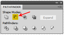
If you want to subtract the front shape from the rear shape in order to make an actual ring for engraving, select both shapes, use the Pathfinder palette and click the Minus Front tool. That punches the top shape down through the bottom shape and subtracts it out, turning the resulting shape into a Compound Path, and it tells the Glowforge interface exactly what you want it to do.
(There are similar tools in Inkscape, CorelDraw and AffinityD, and the removal of “islands” needs to be performed as a subtraction or difference in each design program. The GFUI interprets any vector fill color that it sees as something to be engraved, even white, so we have to subtract it out if we don’t want it engraved. It should be noted that CorelDraw and Affinity Designer users might encounter a problem doing this due to a Fill Rule treatment that is unique to those programs. The easy method for correcting the output for this is outlined by @kennyb here: How to Handle the Fill Rule . Other tutorials specific to the various design programs are available in The Matrix if needed.) ![]()
.
.
Using Text in your Vector Files
Text needs to be converted into Outlines or Paths before being brought into the Glowforge interface. It will be interpreted as an Engrave.
Fortunately most of the drawing programs allow you to select the option of converting your text to outlines automatically in the SVG saving settings. (We’re still trying to find the one for Inkscape, but apparently it has the ability as well.)
The drawing programs also each have a manual method of conversion (listed in the Matrix), and the SVG settings suggested in the tutorial listed here already have the correct settings shown when we know them, so make sure to reference it before saving your SVGs.
Correctly Save a File as An SVG for the Glowforge
.
.
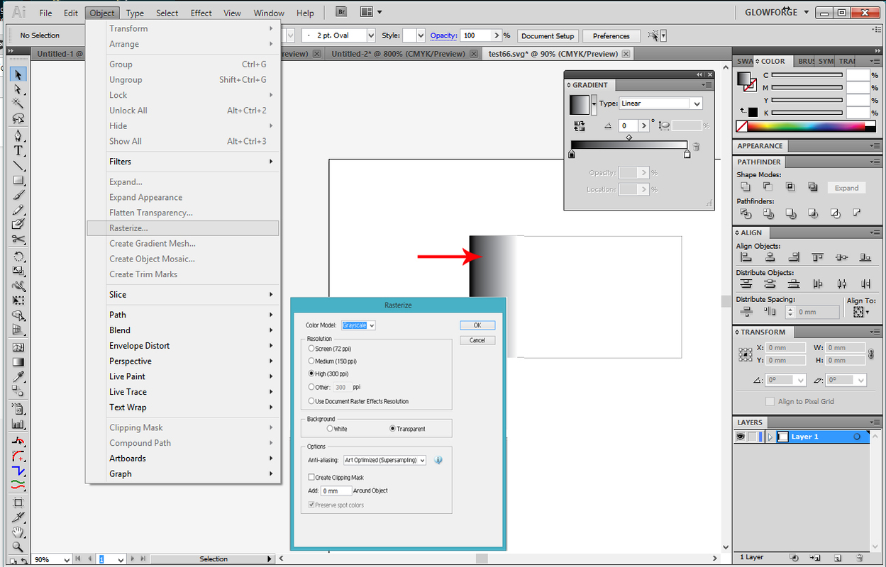
Using Vector Gradients in your Files
GrooveStranger asked a question below about vector gradients in the comments that I forgot to mention here initially …the Glowforge interface (currently) does not treat vector gradient Fills as variable depth grayscale engraves, which is pretty much what we want to use them for. (The darker the color, the deeper the engrave is going to cut.) That function currently is only performed on bitmap style images.
For these, we can rasterize the gradients and have them perform as designed. Just select your gradient Fill, click on Object > Rasterize and select a ppi value. (Bitmaps that you create in the program are already embedded.)
.
.
Using a Bitmap (Raster) Image in your Vector File
The Glowforge interface treats bitmap or raster style images slightly differently than vector engraves. Bitmaps and other images consisting of pixels are treated as engraves by the interface. White is ignored when the interface interprets bitmap images for engraving, and other colors are given a grayscale interpretation.
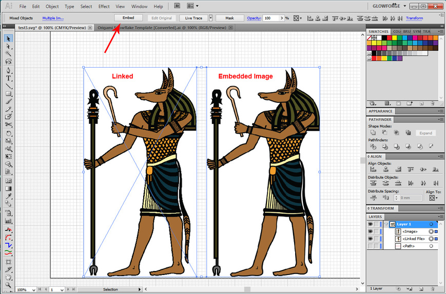
If you want to use the bitmap image with other design elements, it helps to Embed the image into the file. That includes a copy of the image in the file itself, and you don’t have to keep a separate Linked file for it.
To embed a bitmap image in Illustrator - drag the file onto the artboard, and click the Embed button in the top row while the image is selected. (You’ll also want to make sure that Embed Images is selected in your SVG settings when you save the SVG file from AI.)
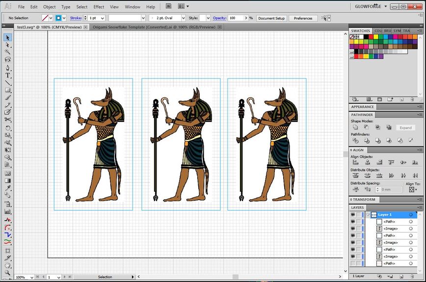
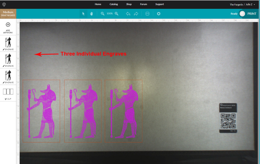
When the Glowforge interface sees a bitmap image embedded in a vector SVG file, it processes it separately from other bitmap images. So if you have three bitmaps embedded in your file, you will get three engrave operations.
.
A Couple of Very Important Thoughts about Bitmap Image Sizes and Resolution
I am using the term “bitmap” in this writeup to mean any type of image that consists of pixels, as opposed to actual bitmap images. I’m not even sure the GFUI can handle actual bitmaps yet.
In actuality, for the Glowforge interface purposes, you will want to use Jpegs or PNG files.
When you are choosing a resolution for your engraved images it’s very easy to confuse the term ppi (pixels per inch) which the Jpegs and PNG files use, with the term LPI (lines per inch) which the laser uses.
Using a tremendously high pixel value in your images makes ink printed photographs look stunning, but I find it’s totally unnecessary in laser engraving, and too much data from high pixel count is one of the things that can cause a file to hang up in the buffer. (ie: Unspecified Error Message.)
So I try to keep the pixel count in my Jpegs and PNGs to 300 ppi or less. (The interface can handle 600 ppi, but it adds processing time, and unless I’m engraving on a grain of rice, I don’t really need the pixels to be that small. So I keep the higher resolution images for the little stuff.)
Internet images are generally set at 72 ppi, and they engrave just fine on the Glowforge…you don’t need really teeny tiny pixels.
.
The LPI (lines per inch) number that shows up in the Glowforge interface is a measure of how many times the laser head is going to move back and forth over a particular area as it fills in solid areas of engraving. There is a sweet spot where it just covers everything with engraving, with no gaps between the lines, and no banding, and that seems to be in the 195 - 225 LPI range.
(Haven’t measured it…can’t prove it…it’s a subjective call. Feel free to run your own tests.)
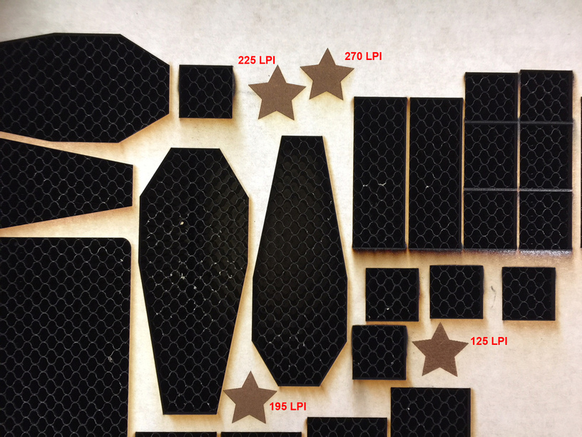
When you start getting into higher LPI densities, the laser starts cutting over areas it has already cut, so the engraving gets darker and deeper. But it also increases the amount of time necessary to process the engrave with each increase in LPI, and I believe it also increases the amount of movement code that gets written to the file that gets sent back down to the Glowforge. So higher LPI settings will also frequently cause the file to hang up with an error message, especially if you are trying to print something that covers a large area of the bed.
The good news is, recent changes to the interface give us a way to deal with large surface area engraves. If you are engraving something that covers over about half of the bed in height, you can use the Draft Graphic (195 LPI) or Draft Photo (175 LPI) default settings that Glowforge provides, as opposed to the High Def settings, and the engrave will process without hanging up. You will still get complete coverage.
People familiar with doing Print work of any kind might find this hard to believe, since high definition is usually needed to get good photographic results, but you’ll do yourself a tremendous favor by speeding up the time it takes to process the engrave if you keep the LPI at or below 225, and you’re not going to sacrifice quality on large area engraves*.
*Caveat: As with all things in life, there are a couple of exceptions to this that are material related. When engraving on metals like anodized aluminum, tiles or other hard non-porous surfaces, you’re going to get a “crisper” result with a higher LPI value. For those I like to use the HD engrave setting. But you can just do an experiment or two to decide which look you’re going for.
Converting a Bitmap (Raster) Image into a Vector Image
You can use your drawing program’s native Auto-Trace function (sorry AffinityD users, you don’t have one yet) to rescale smaller bitmap images into something larger without introducing raggedy edges from pixelization.
They generally give you more control about how the results turn out, and there are tips in the Matrix for how to use them in the various programs.
The one thing you want to remember when using an Auto-Trace program in one of the drawing programs is to check the little box that says Ignore White when you are doing the trace.
(This is an Illustrator thing - not sure if it’s an issue with Inkscape and CorelDraw.)
If you leave that box unchecked in Illustrator, you’re going to generate a whole lot of duplicate information. If you check it, white areas will get punched out of your raster image correctly.
Remember that in vector engraves, white fill is just another color. You actually want to remove it when you vectorize your image for engraving in the Glowforge.
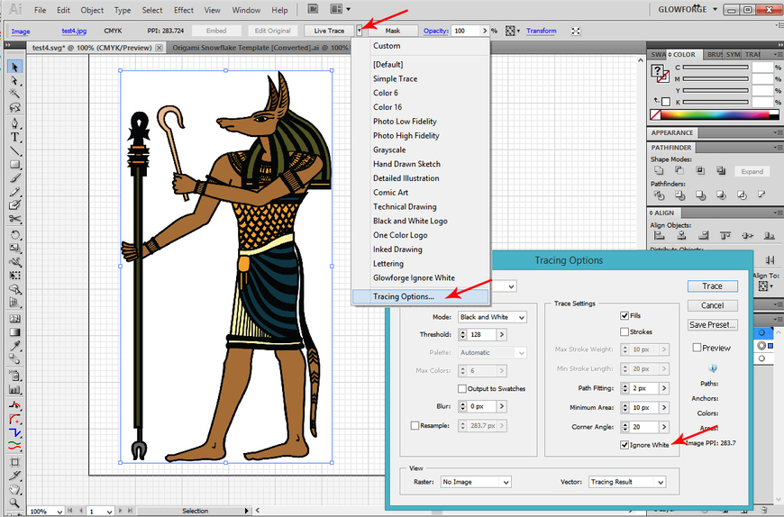
In the ancient CS versions of Illustrator, the Ignore White option is hidden deep in the Live Trace options panel.
And here’s where it is in the newer versions:
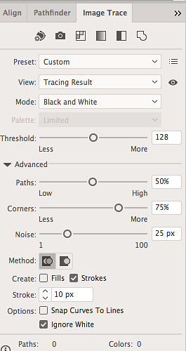
Don’t forget to check the box…It will save you a whole lot of grief. ![]()
Okay, that’s about it. Several easy concepts to remember when you put your files together…the rest is just getting comfortable with it.
Go make something cool. ![]()


